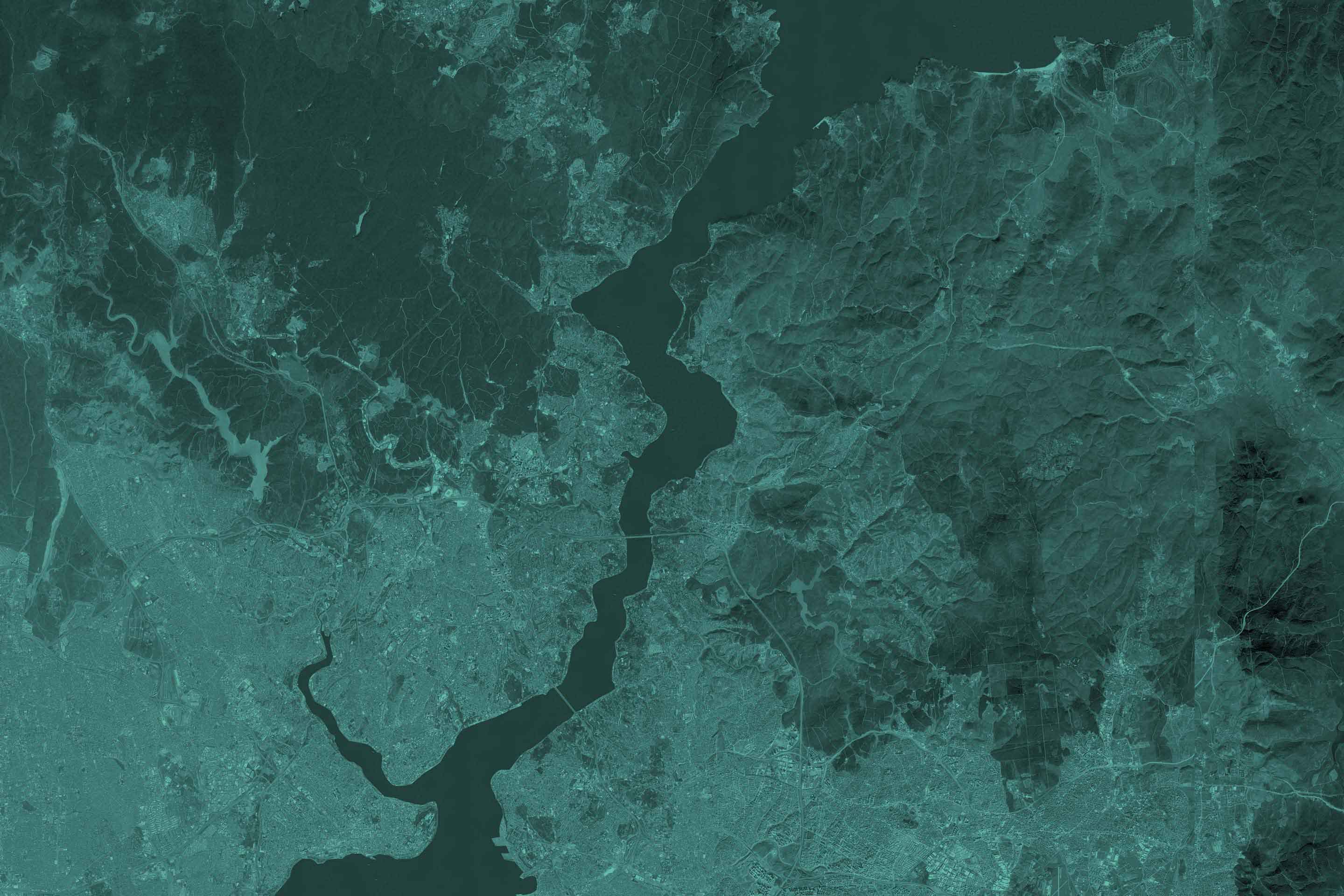
14th Istanbul Biennal
Follow the green
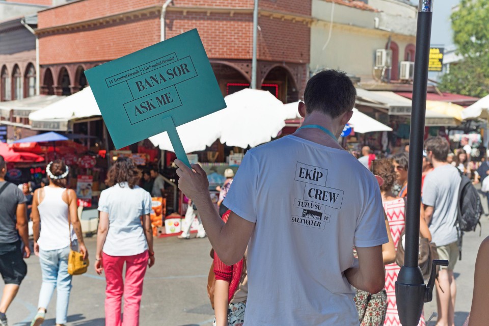
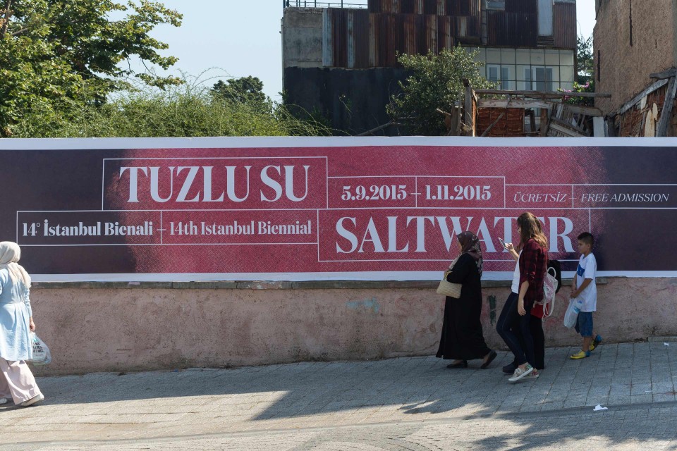
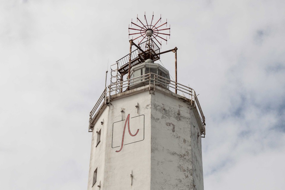
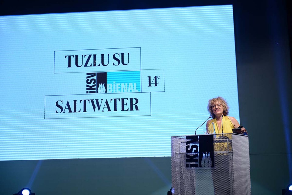
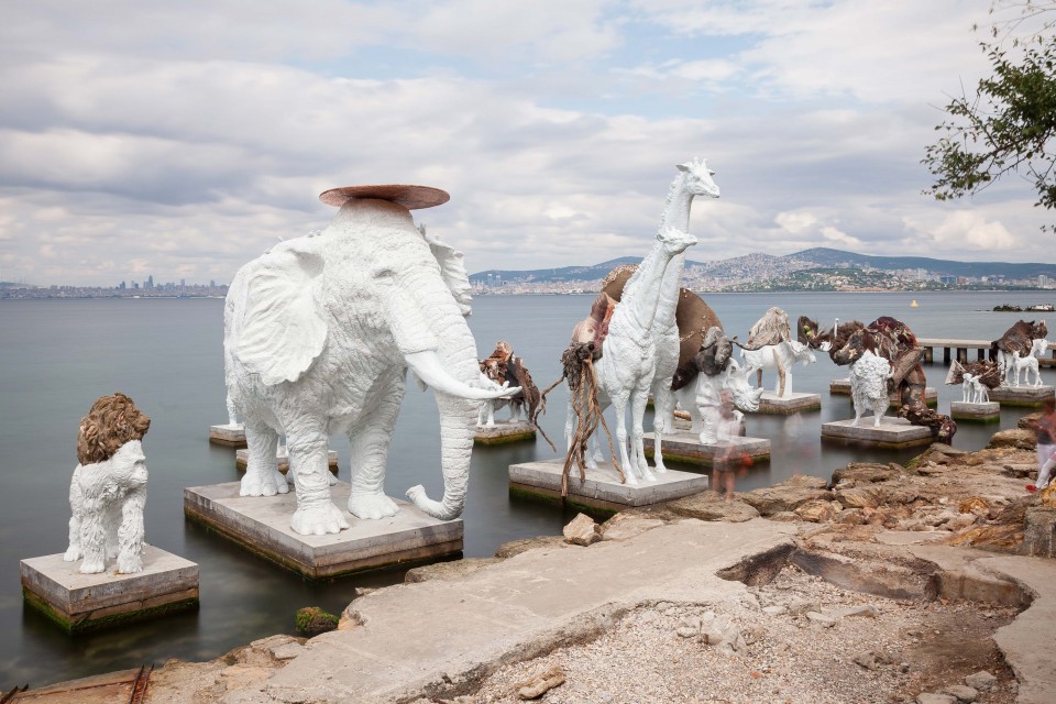
The 14th edition of the Turkish Biennial is called "Saltwater. A theory of thought forms". It is organized by the Istanbul Foundation for Culture and Arts, and it was conceived as a "dispersed" biennial, that "hovers around a material – saltwater – and the contrasting images of knots and of waves"; a city-wide exhibition that takes place all around the Bosforus, and invites its audience to follow and get lost in the multiple waves, currents and densities of water, both visible and invisible. When we accepted to get on board, we were aware that – as for dOCUMENTA 13 – what Carolyn was asking us was not to merely design an exhibition, but to develop a deeper reflection around the project, to convert ideas into a shape, single actions into a common experience. "A theory of form", after all, is a great way to define our approach to this challenging project: Saltwater's works, texts, artists, and venues needed a formal grammar to follow the current as single shades and fluxes, but also to be able to speak unanimously.
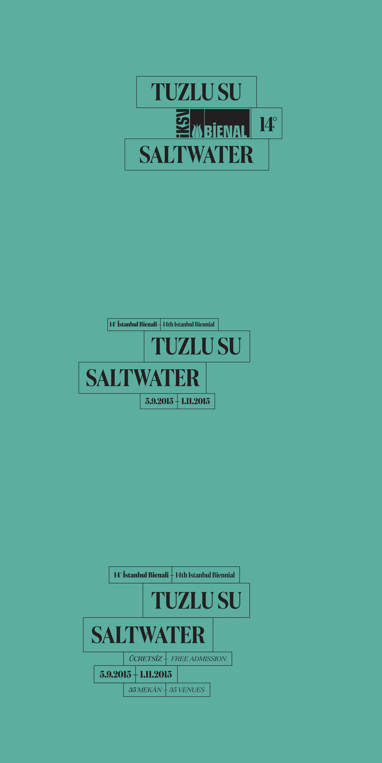
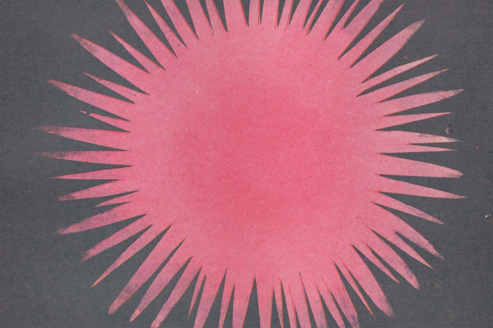
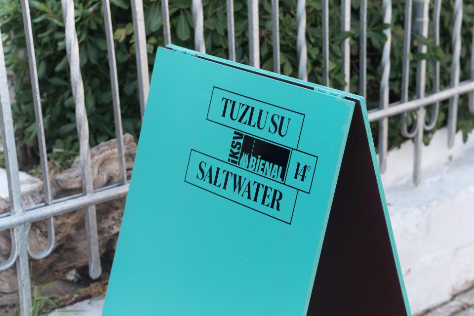
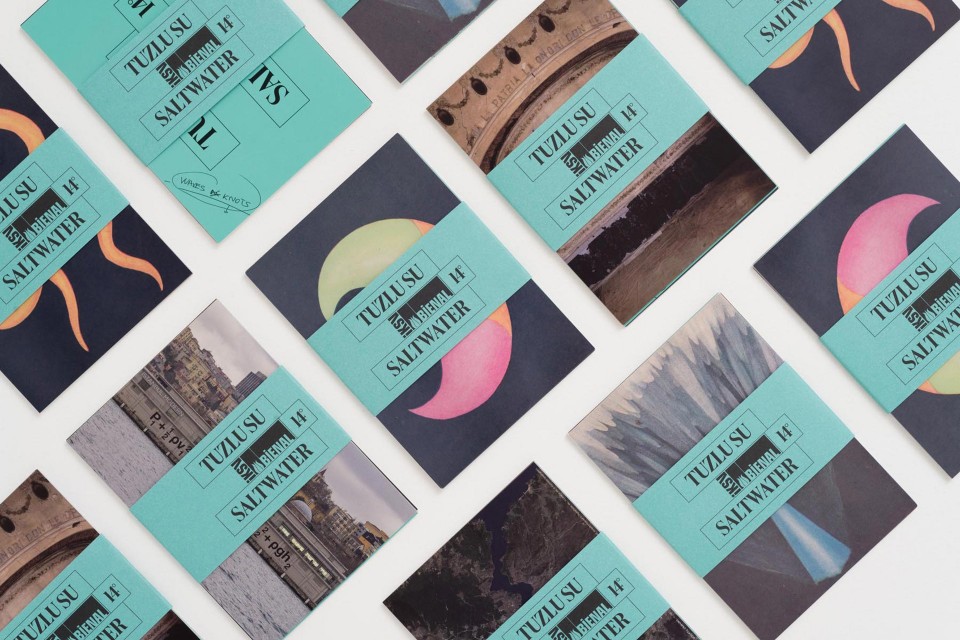
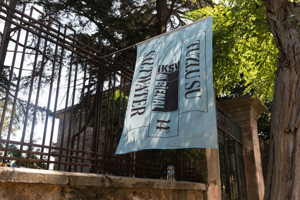
From logo to catalogue, from guidebook to merchandising, passing through signage and maps: when dealing with art, design needs to create a structure that ties together a wide range of different materials and moments, and still be able to stay cautious, almost transparent, in order to let each content shine by itself. The common visual thread we chose for our work was a color, a bright sea green that dresses most of the materials (not the catalogue though, which is a special creature, with its minimalistic internal asset and the slipcase illustrated with details from Annie Besant’s abstract drawings about “Theory of forms”). Speaking in terms of visual asset, we found true inspiration in the periodic table of elements, a geometric structure that places contents in an order without imposing its mark.
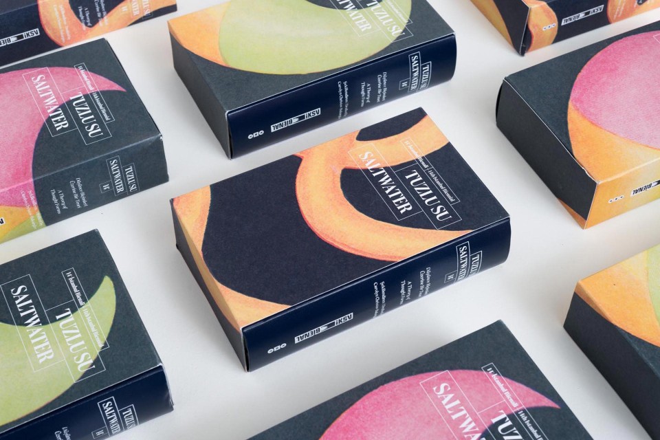
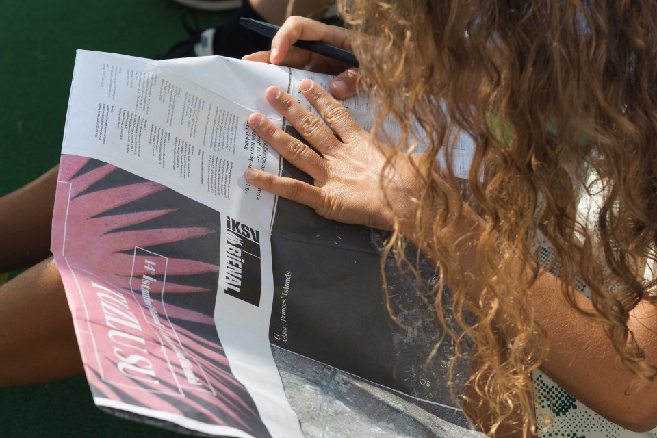
Art is not branding: we do not have to sell anything. Our responsibility in terms of design is to find the best way to invite and accompany people all along an experience and to be the bridge that lies between the artist and the people along three different phases: the invitation (logo and visual identity, invitations), the sharing (signage, guidebook, maps) and memory the experience (catalogue, merchandising).
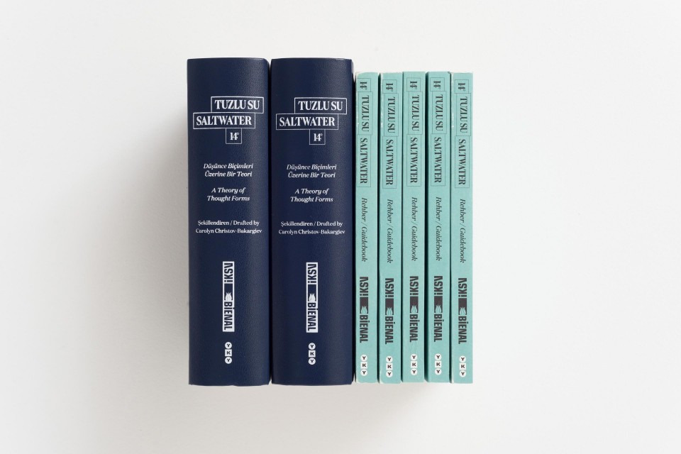
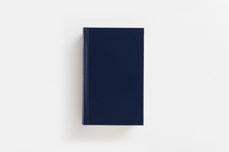
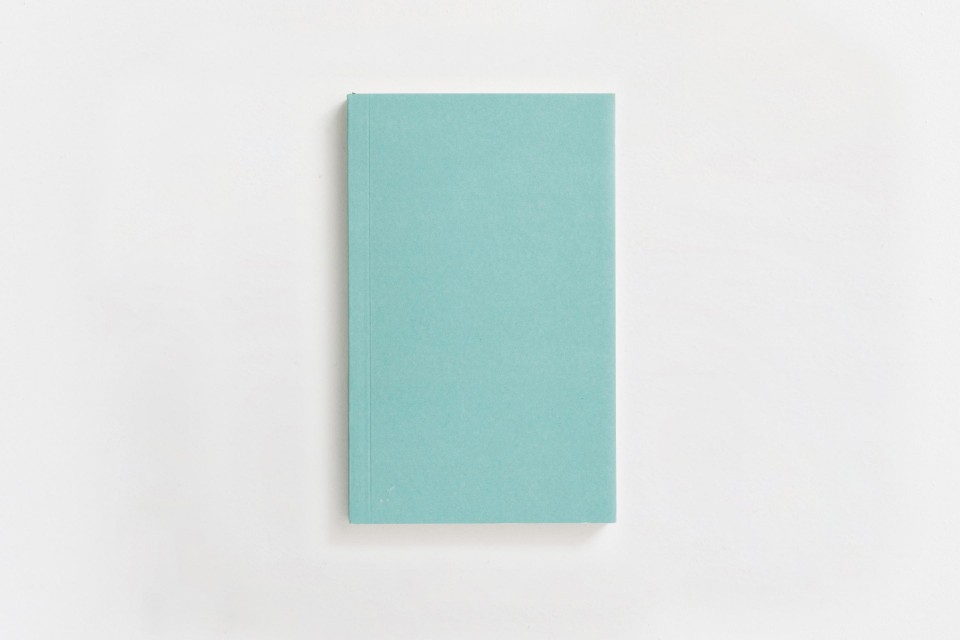
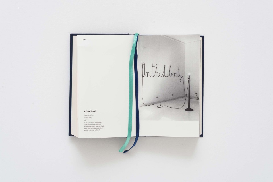
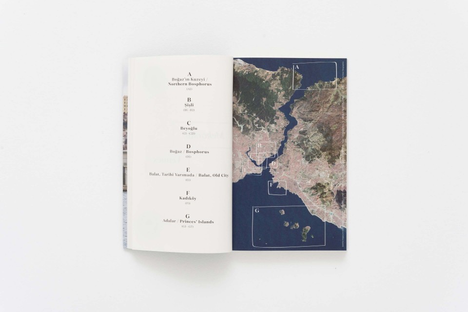

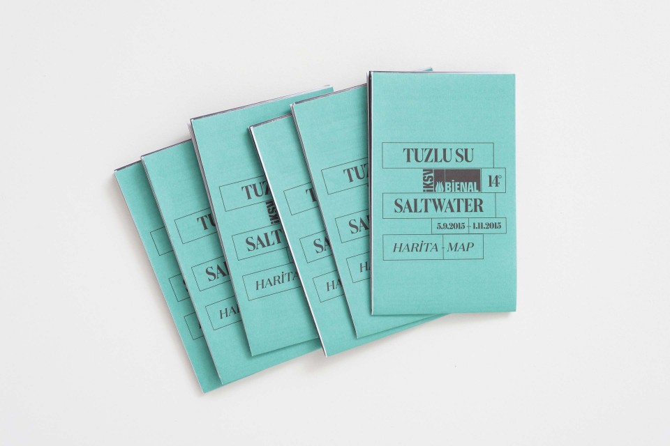
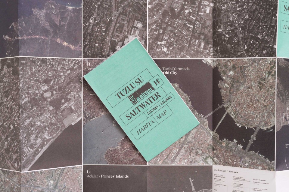
Secondly, the public of an art biennial is, by definition, very diverse. The visual language we develop will have to communicate to different audiences. Firstly, it will speak to the participants: artists, designers, editors and suppliers, people who work at and for the biennial. Then, it will speak to the global public, which might not have the chance to visit the exhibition “in situ”, but will experience the biennial through its catalogue, website and printed matters. Finally, it will speak to the institutions and sponsors involved in the project and, most of all, to the local public, which will physically be involved.
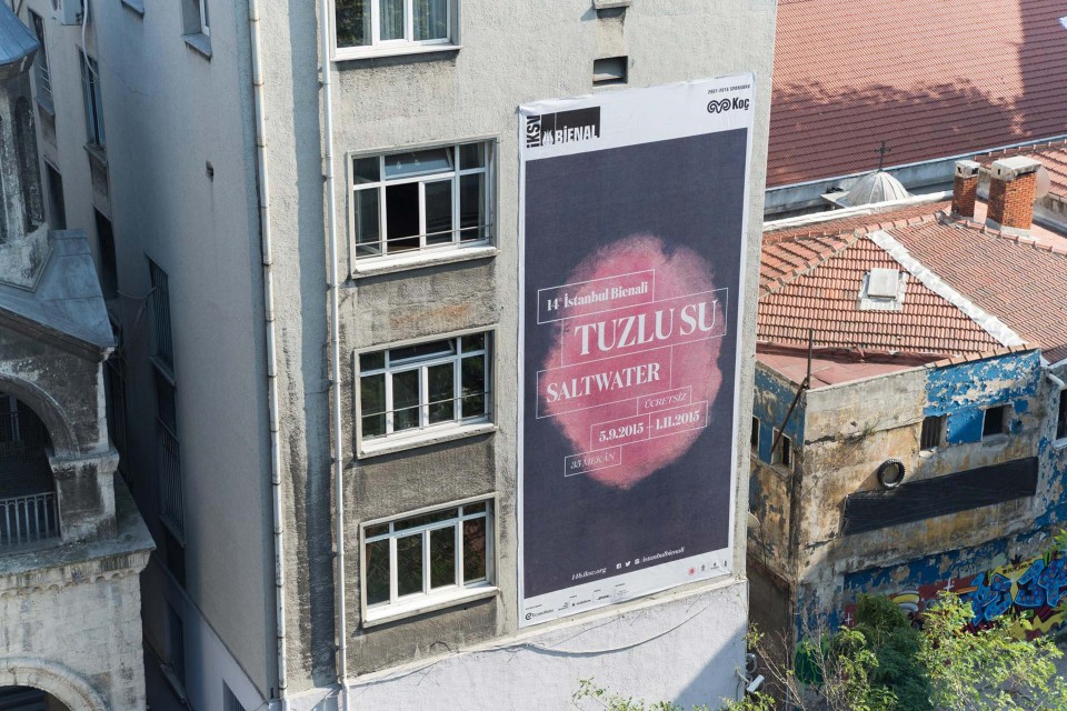
Being part of this enriching navigation also meant being able to connect individual skills and abilities into a collective force. We spent almost two months in Istanbul, working shoulder to shoulder with the IKSV team and coordinating the work of dozens of people: designers, publishers, web developer, editors and marketing managers. Of course we spent a lot of time designing on our laptops but, most of all, we spent time working on printed paper, dealing with sponsors and suppliers, speaking with the people we worked with, learning from the city itself.
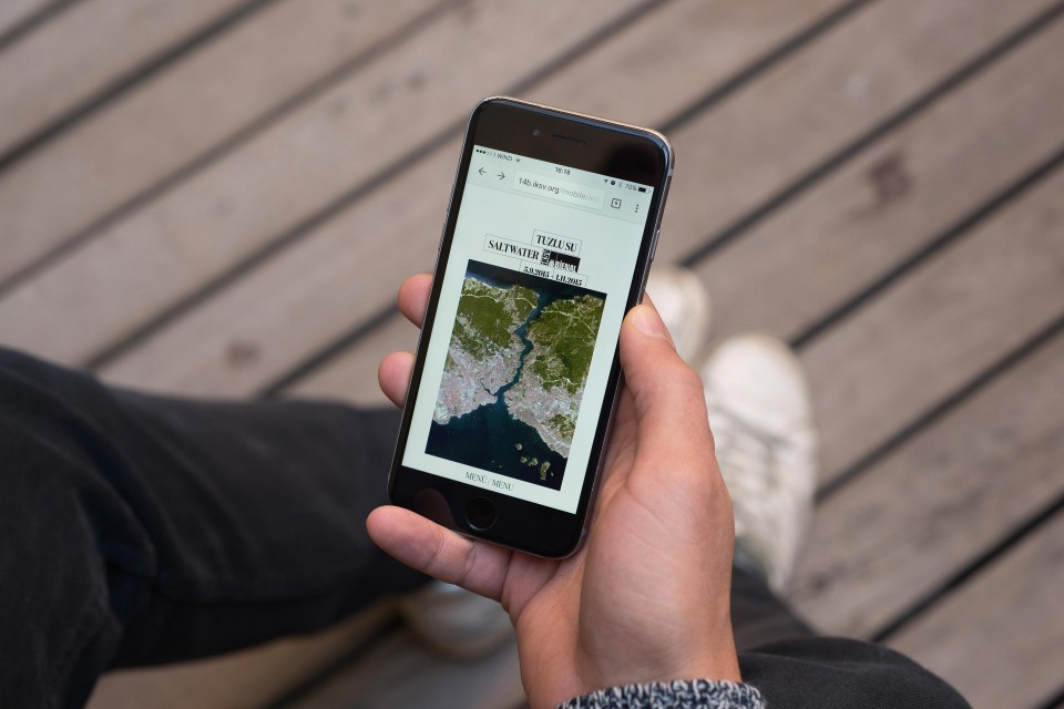
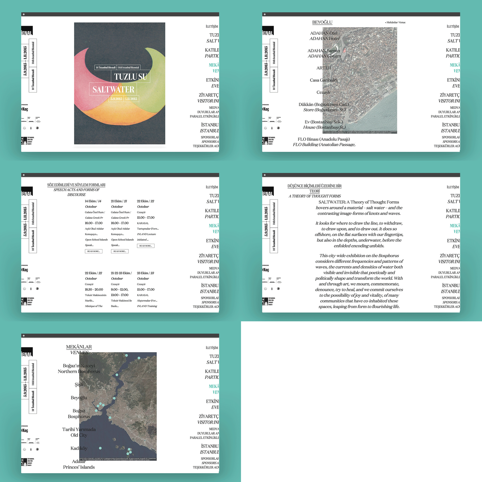
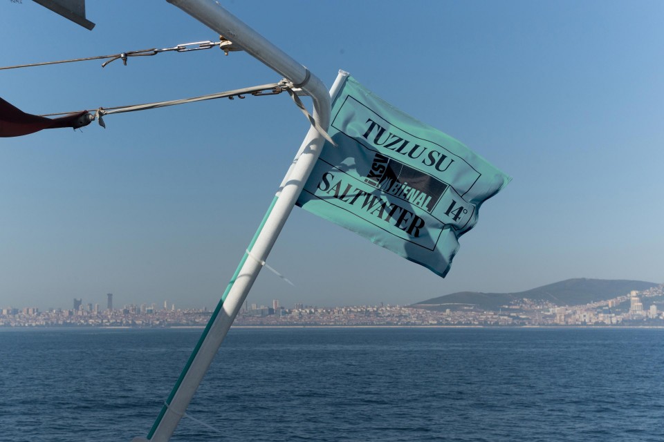
We believe in bold projects without being afraid of taking risks, projects that connect different talents, trust beauty and care for details. Saltwater is definitely an emblem of all of this.
Collections
An overview of our wide fields of action
-
Logos & Trademarks
What makes a brand memorable and unique.
-
Environments & Exhibits
Designing for spaces: from signage to cultural display, from retail to events
-
Art & Culture
We had the chance to work for museums, institutions and organization in Italy and worldwide
-
Educational
Designing for school publishing
-
Type Design
We love typography, we design typefaces, from lettering to complete custom type families.
Case Studies
selected projects
-
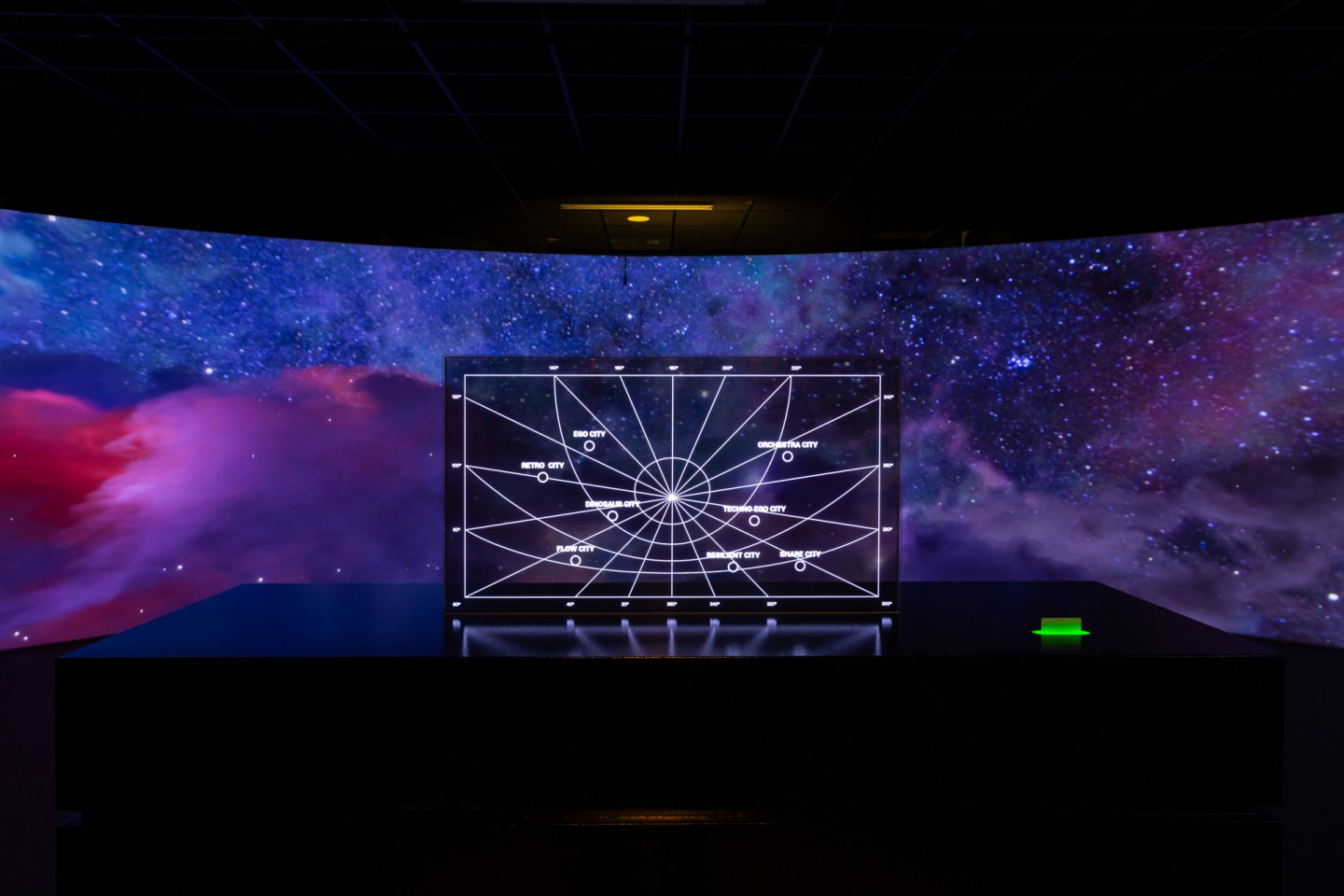
Layout, installations, and multimedia content
The Future Unfolds
An immersive and interactive journey to explore the future of mobility
-
visual identity
Artefiera Bologna 2025
A vibrant, pop-inspired restyling marks the 48th edition
-
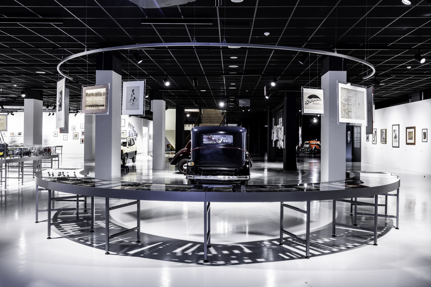
exhibition design
125 Volte Fiat
An exhibition celebrates FIAT’s 125th anniversary
-
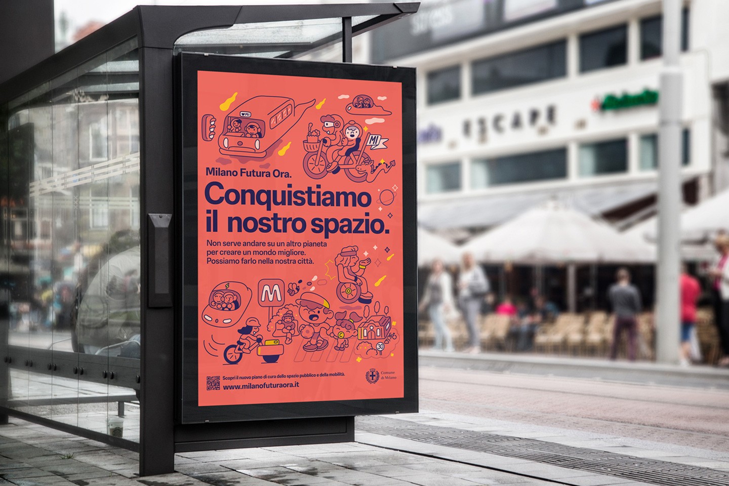
ADI Design Index 2025
Conquistiamo il nostro spazio
OOH campaign and website on shared public spaces and active mobility in Milan.