
A new brand identity for a historic handle company
From Valli & Valli to Valli
An elegant essential image makes leading Italian handles and door accessories manufacturer Valli more consistent with its values.
From the naming and logo to the tone of voice and the brand expression, on every communication touchpoint, offline and online.
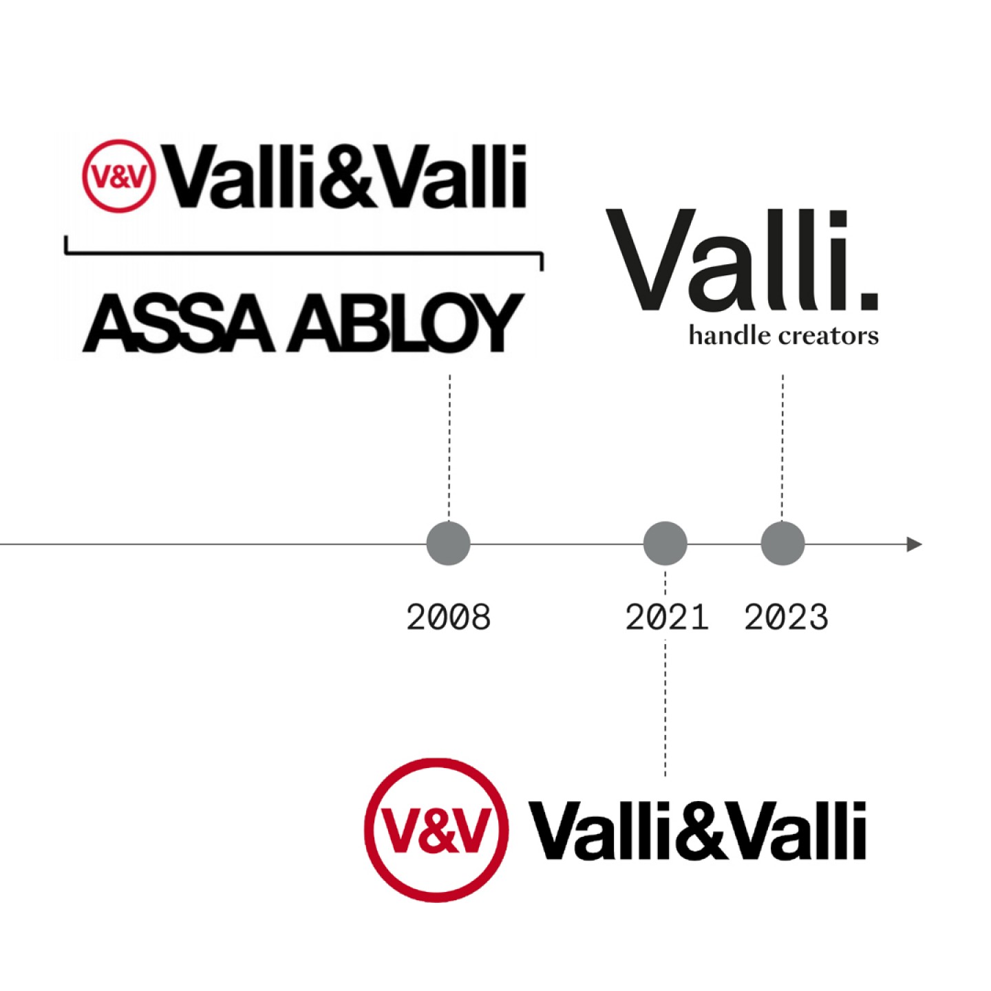
With a heritage of over 80 years of experience, Valli has produced handles and door accessories since 1934. Part of ASSA ABLOY Group since 2008, the manufacturer has always put at the core the idea that the handle is not only a mere tool but the synthesis of function and aesthetics, brought together in a single artefact, a work of art.
The rebranding aims to increase the brand's awareness among architects and designers and make its offer more consistent with the changing market.
A single word Valli. becomes the statement encompassing the company's heritage, values, and products, while the dot emphasizes this even more and marks the beginning of a new era.
The payoff "handle creators" focuses on the company's artisanal creative and design-driven perspective.
The new logo echoes the modernist style of its predecessor. The slight redesign of the L character resembles a handle and becomes a generative form of other possible graphic elements, such as pictograms and patterns. The colour palette consists of neutral grey tones revived by a touch of bright yellow that recalls the company's manufacturing history and the reality of its factory.
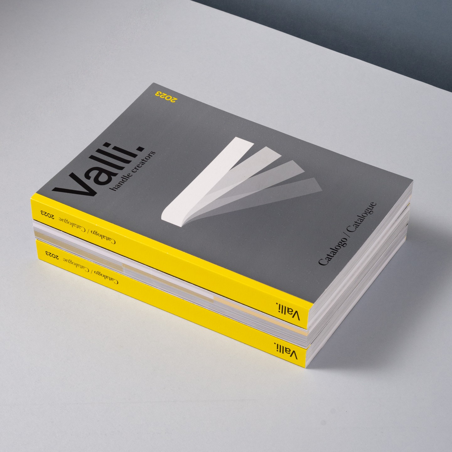
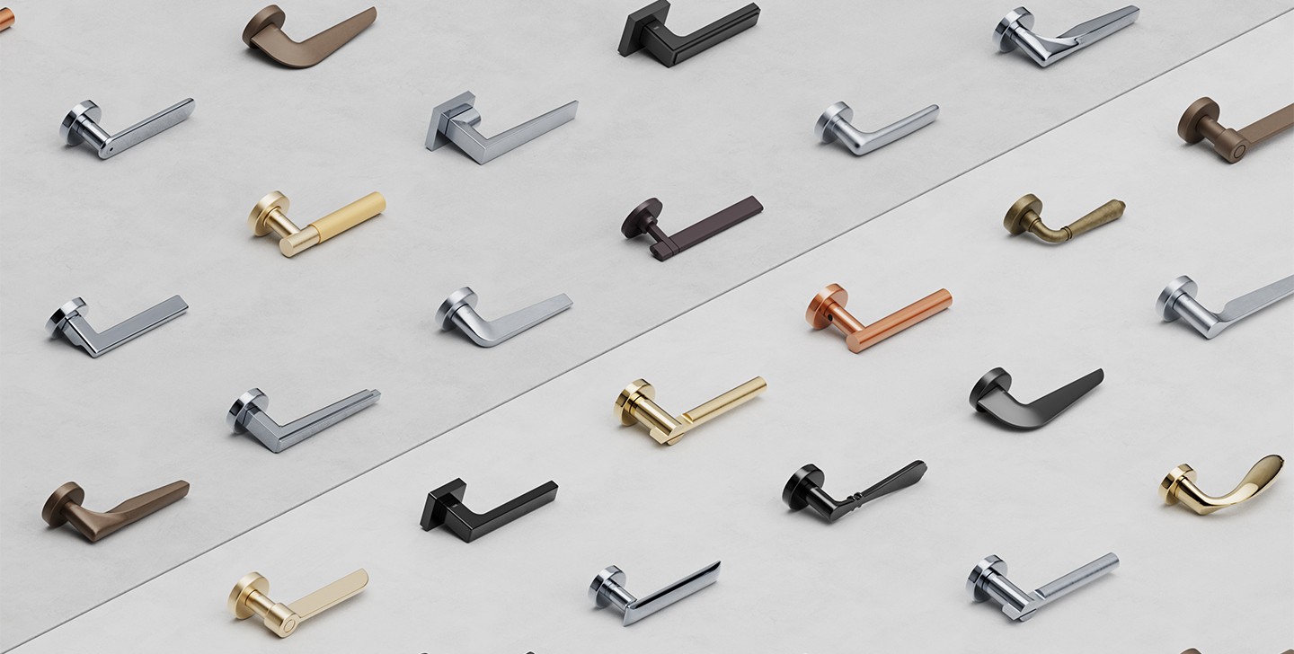
The visual language includes 3-D images portraying the handles within a three-dimensional geometric space. The aesthetic evokes the purest elements of architectural interiors with metaphysical and dreamlike undertones.
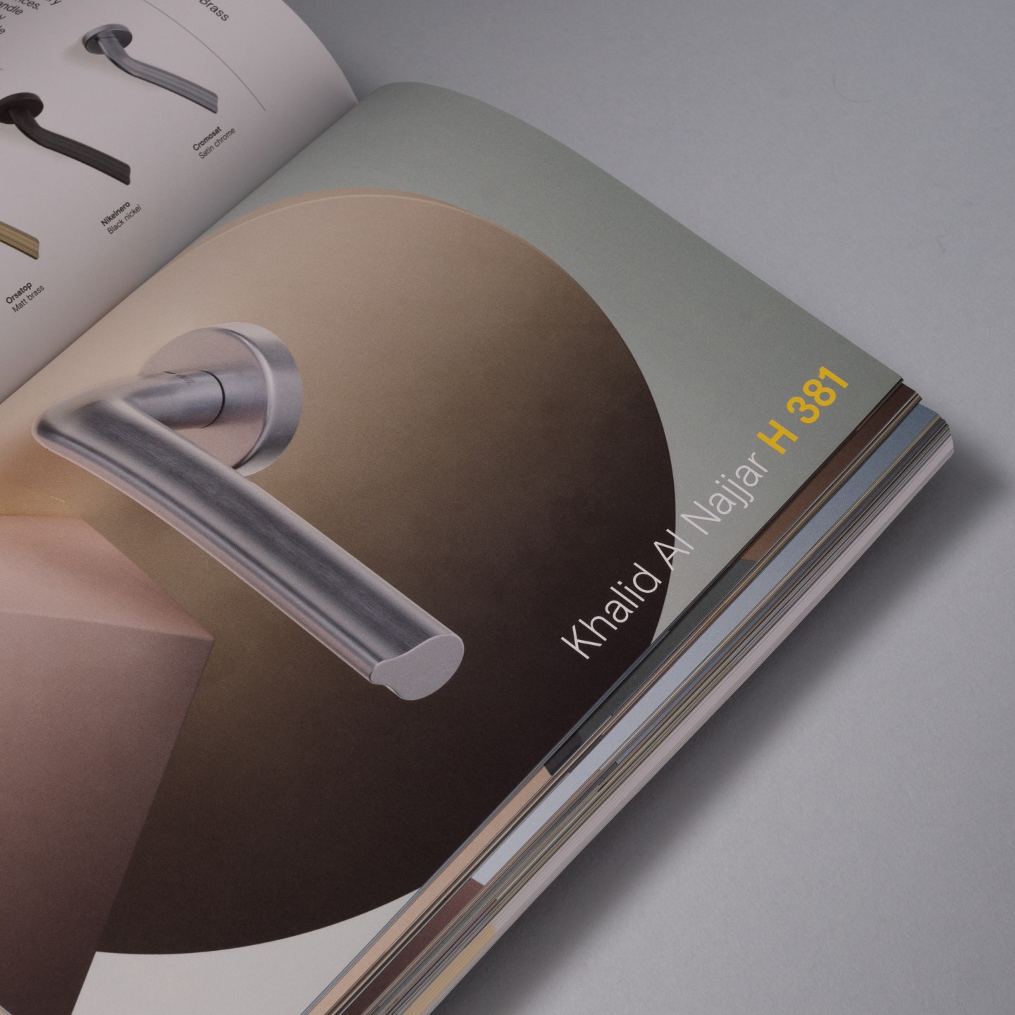
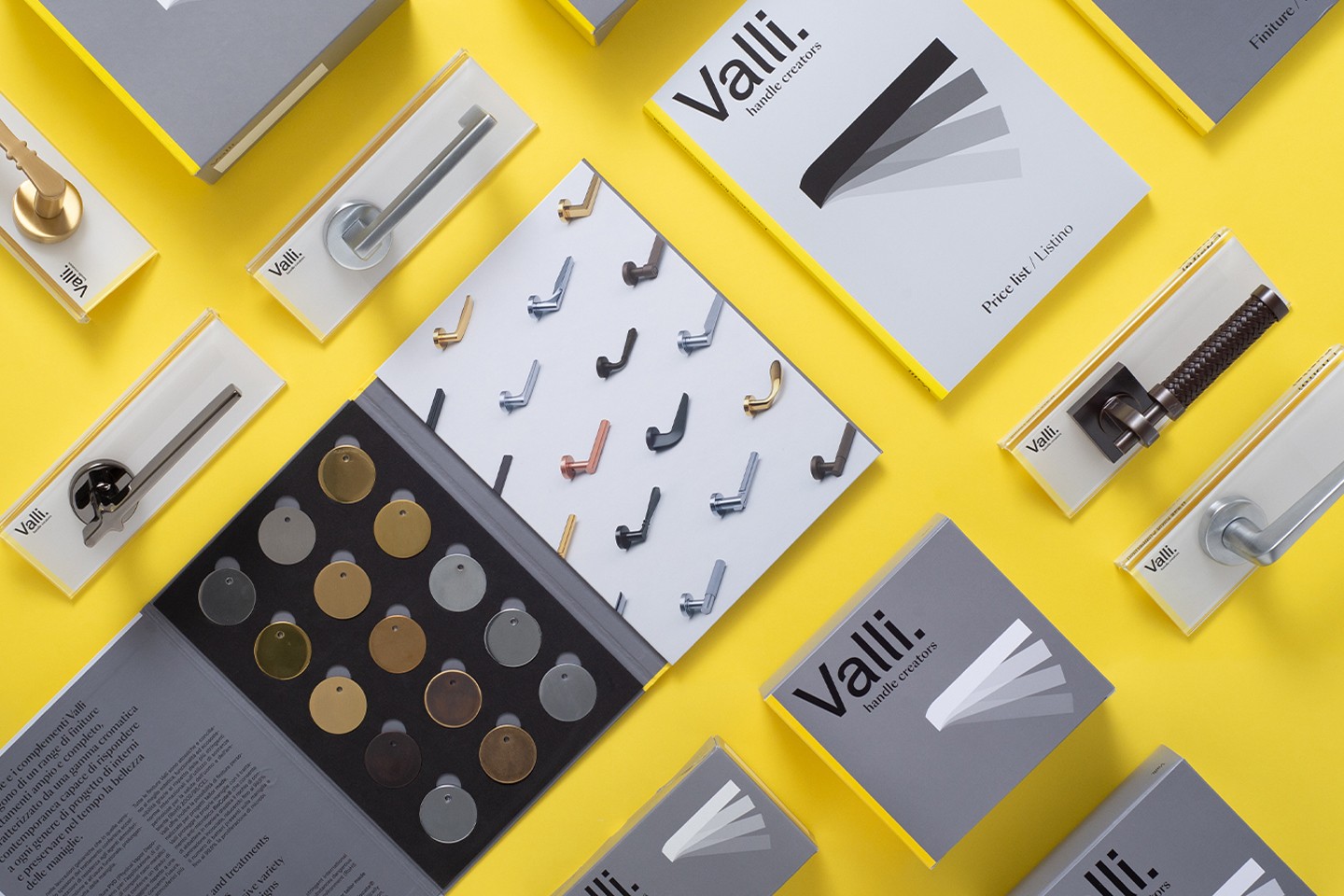
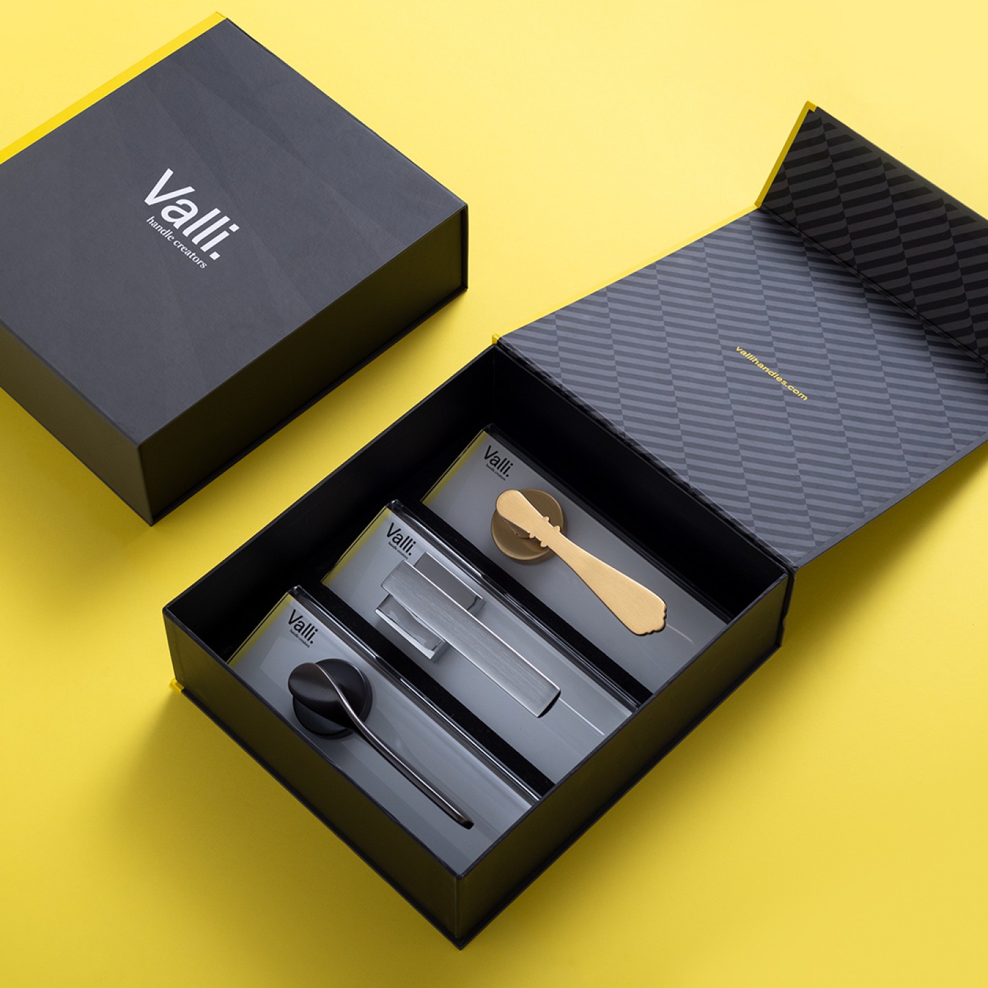
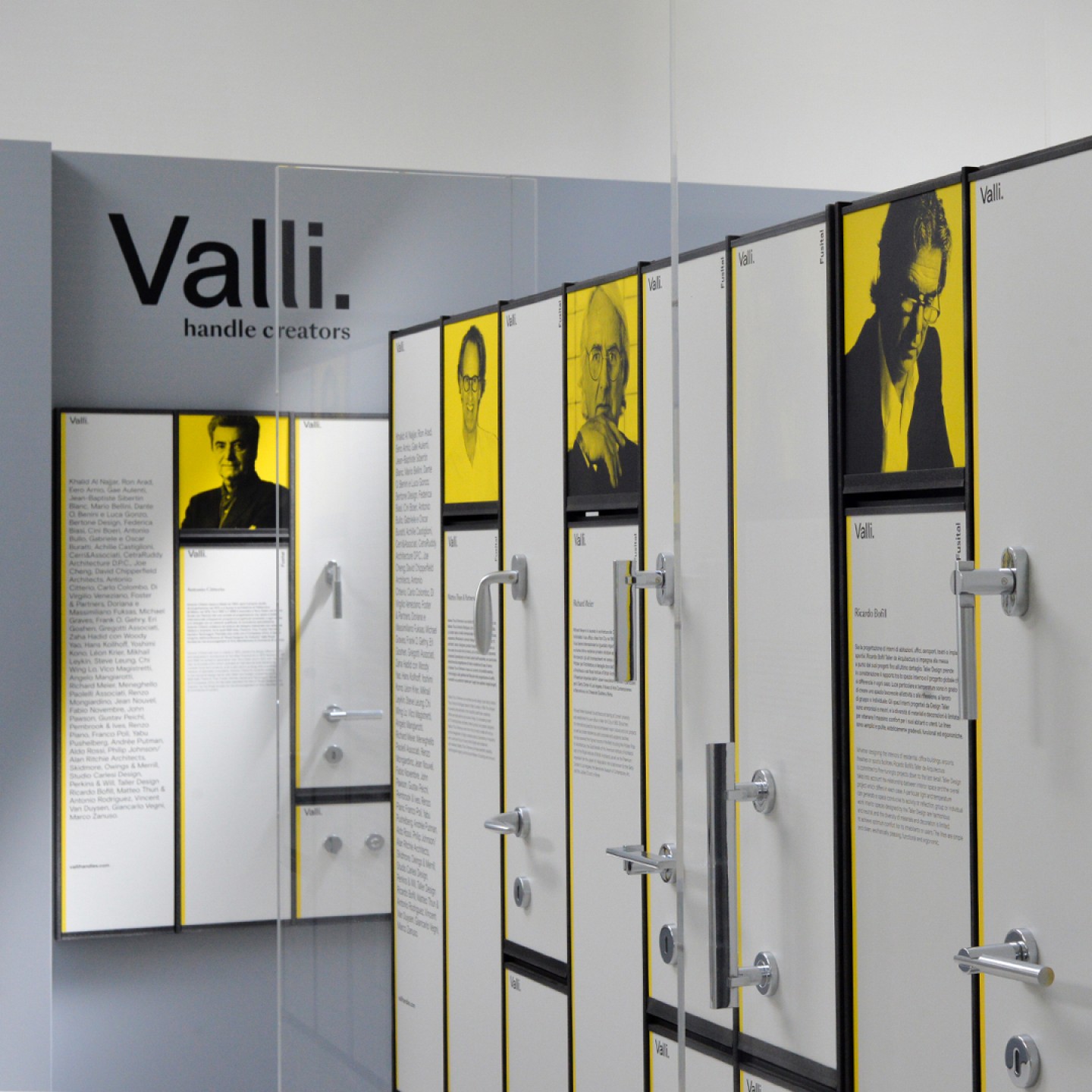
We have extended the entire visual language to all the marketing and communication materials, from the catalogues and packaging to the showroom and the website. The result is a consistent image that marks the evolution of the brand, its essence, and its offer across all touchpoints.
A comprehensive photo shoot and behind-the-scenes video capture the company's heritage and honour its tradition of craftsmanship.
In collaboration with
Photo, Video Studio Nicama
3D Visual by Subdivision Studio
Font in use
Basis Grotesque by Colophon Foundry
SangBleau by Swiss Typefaces
Collections
An overview of our wide fields of action
-
Logos & Trademarks
What makes a brand memorable and unique.
-
Environments & Exhibits
Designing for spaces: from signage to cultural display, from retail to events
-
Art & Culture
We had the chance to work for museums, institutions and organization in Italy and worldwide
-
Educational
Designing for school publishing
-
Type Design
We love typography, we design typefaces, from lettering to complete custom type families.
Case Studies
selected projects
-

Layout, installations, and multimedia content
The Future Unfolds
An immersive and interactive journey to explore the future of mobility
-
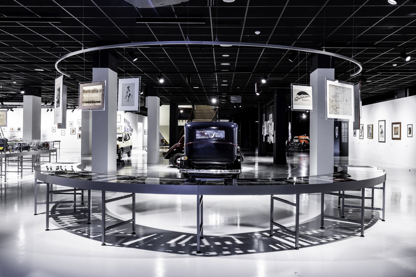
exhibition design
125 Volte Fiat
An exhibition celebrates FIAT’s 125th anniversary
-
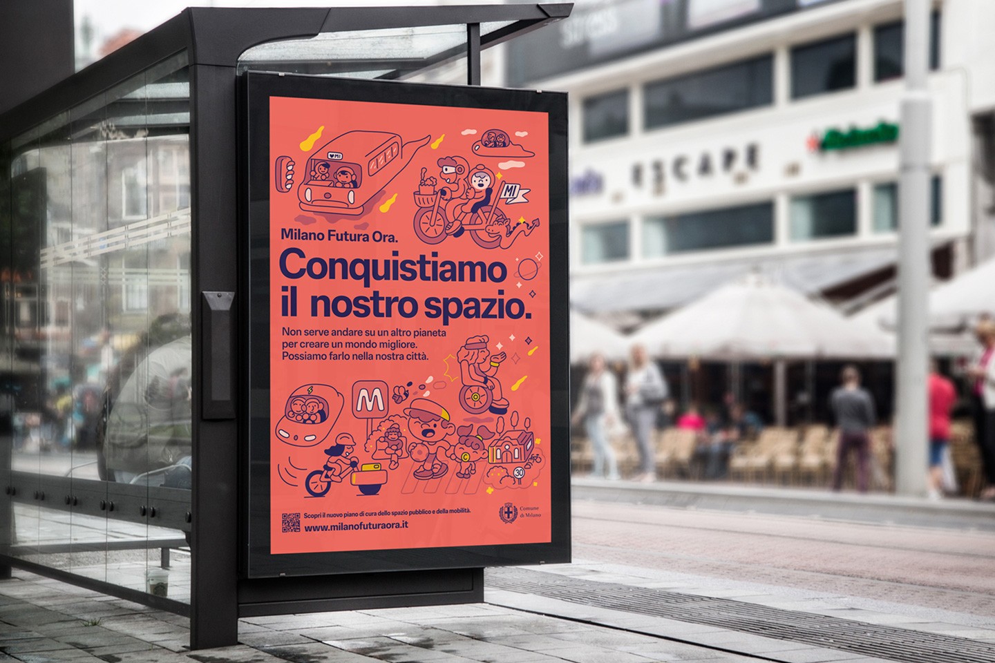
Campaign Design
Conquistiamo il nostro spazio
OOH campaign and website on shared public spaces and active mobility in Milan.
-
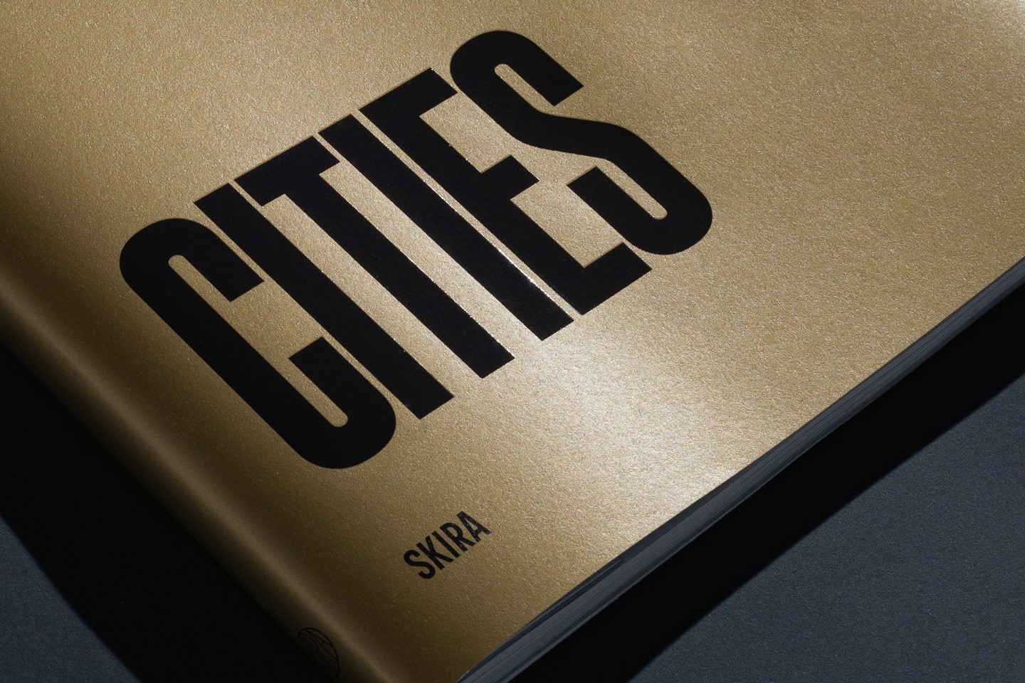
Event Design
Inspiring Cities
COIMA 50th Anniversary Event