A new Oscar for Mondadori
4500 titles, 28 different series, more than 1200 authors
A classic, Italo Calvino once wrote, “is a book that has never finished saying what it has to say”. The Oscar Mondadori series fits well this definition - the most important Italian catalogue (created in 1965 with the aim of bringing a generalist readership closer to great literature) includes the biggest international best-sellers (Calvino himself is one of Oscar’s leading authors), granting a long life to hundreds of titles, authors, and different genres, bestowing upon them a voice and presence that last over time. For over 50 years, the ‘Oscars’ have offered paperbacks in massive print runs. Over the years, genres and series have multiplied: at the moment the ‘Oscars’ include over 4,500 titles, 28 different series, and more than 1,200 authors, putting together ancient, modern, and contemporary classics, thrillers, romantic novels, philosophic and scientific essays, children’s books, and self-help handbooks. In short, the Oscars are an important cultural asset and an undisputed force in the market place, which nevertheless suffered an endemic lack of unity, and thus of identity.
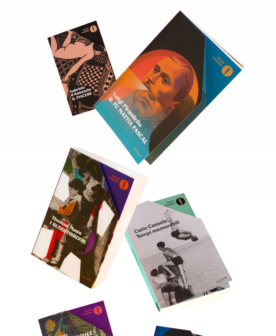
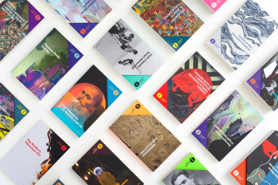
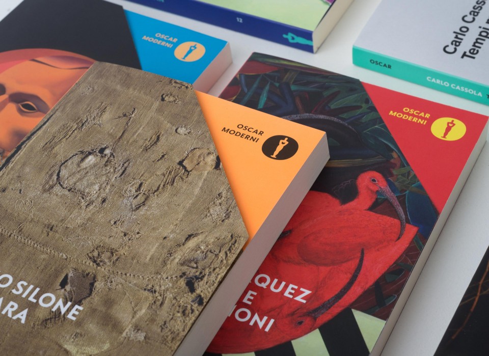
The rebranding and the restyling of the whole collection gave the Oscars a new identity, turning this vast territory into a big, yet harmonious, family. The Oscars’ logo plays a key role in this operation. The trademark statuette – in a simplified and more contemporary shape - is now inscribed inside a full “O”. Moreover, its graphic use has been ‘normalized’, taking on a dominant role in the visual balance of the covers – positioned at the top in the foreground, it is the seal that makes Oscars instantly recognizable from other books on the shelves.
An additional innovative element is the “papercut” of the cover, which affords readers the chance to peek beyond the first page and invites them to discover instantly the spirit of the book, immersing themselves in the atmosphere of the work upon their first glance while still in the bookshop.
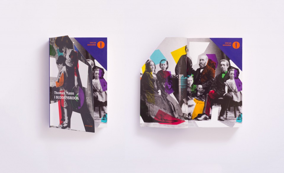
We designed the new Oscar imagining them as a big family made up of many small tribes. Each series is different from the others, but all are characterized by an expressive and refined pop iconography tailored to the requirements of each different book genre. Every leading author has a specific graphic universe all of his/her own, entrusted to “dedicated” artists or illustrators. The title fonts follow a temporal logic, a stylistic timeline we have developed specifically for the Oscars, evolving in accordance with the period in which the texts first appeared (ranging from classical antiquity to contemporary best-sellers).
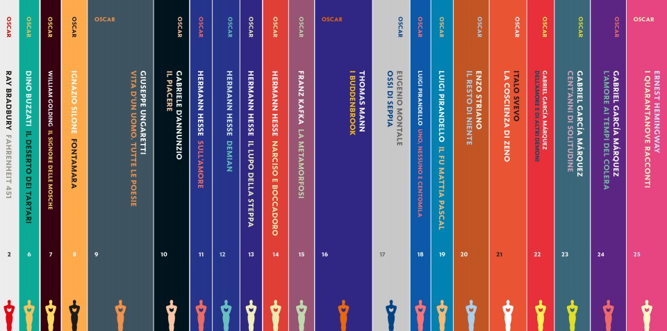
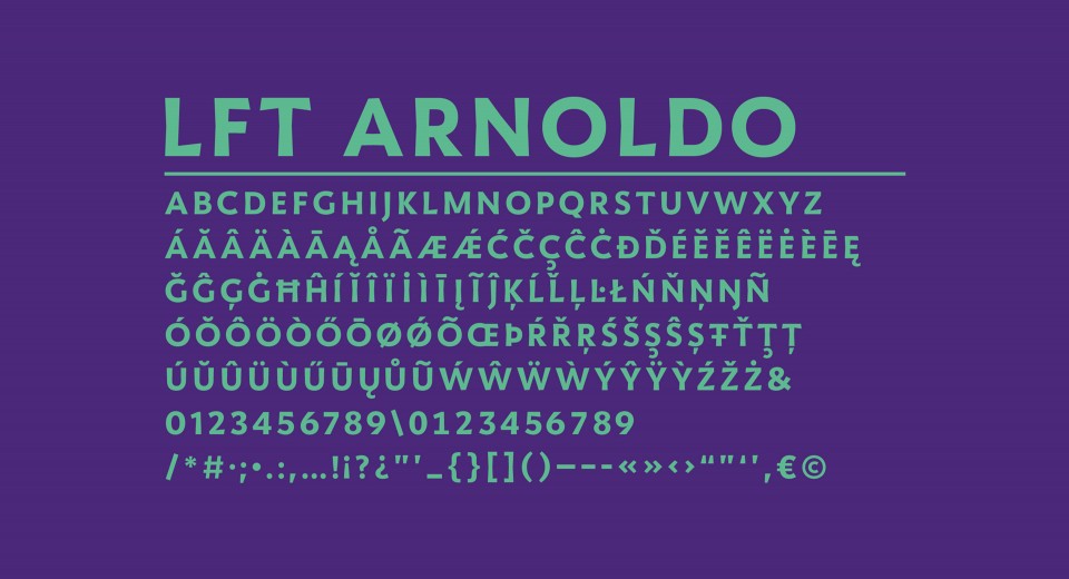
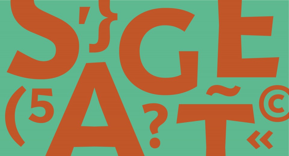
Lft Arnoldo, the family of fonts we designed specifically for Mondadori, is used for the logo, the spine texts, and the different series’ names. Working on the backbone of this element of continuity, we redesigned each different series’ book covers. For such a diverse catalogue, it was necessary to find a coherent, yet flexible paradigm, which held into account the genre and readership differences, while at the same time ensuring harmony among its parts.
Collections
An overview of our wide fields of action
-
Logos & Trademarks
What makes a brand memorable and unique.
-
Environments & Exhibits
Designing for spaces: from signage to cultural display, from retail to events
-
Art & Culture
We had the chance to work for museums, institutions and organization in Italy and worldwide
-
Educational
Designing for school publishing
-
Type Design
We love typography, we design typefaces, from lettering to complete custom type families.
Case Studies
selected projects
-

Layout, installations, and multimedia content
The Future Unfolds
An immersive and interactive journey to explore the future of mobility
-

visual identity
Artefiera Bologna 2025
A vibrant, pop-inspired restyling marks the 48th edition
-

exhibition design
125 Volte Fiat
An exhibition celebrates FIAT’s 125th anniversary
-

ADI Design Index 2025
Conquistiamo il nostro spazio
OOH campaign and website on shared public spaces and active mobility in Milan