Calligaris
The historic furniture brand takes on a new communication strategy and visual language
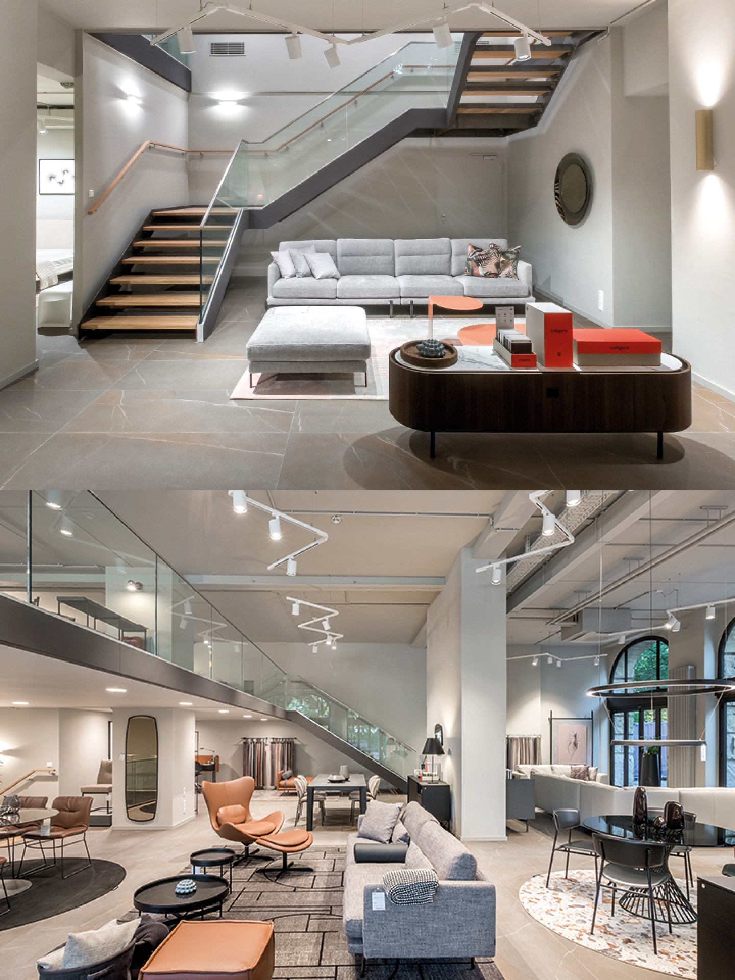
Historically a leading player in Italian design, Calligaris entrusted us with the art direction of its communications.
A fruitful collaboration with the company team and a group of professionals involved in this evolution process focused our strategy on the Calligaris brand’s 360° home lifestyle.
"Real" is the concept at the core of our communication strategy: as authentic as the brand and reliable as its range of products made for everyday life.
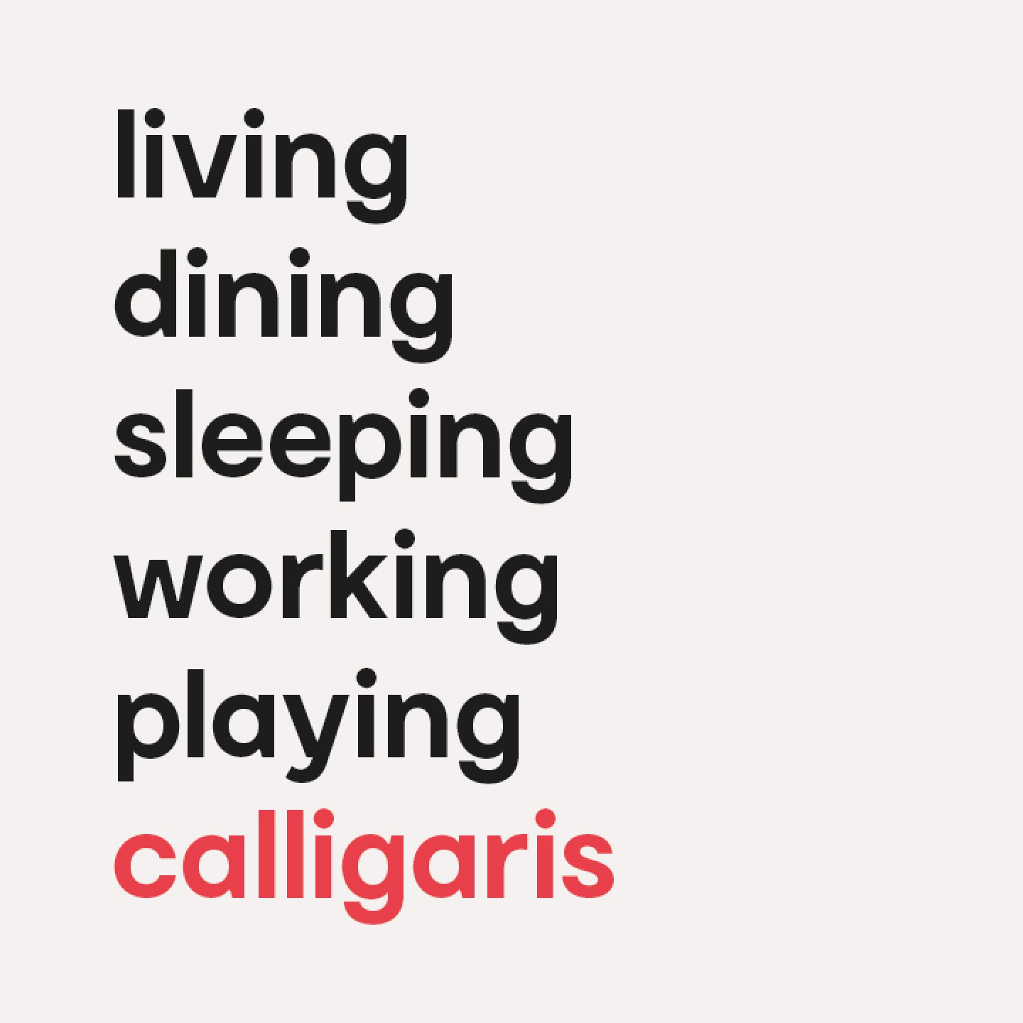
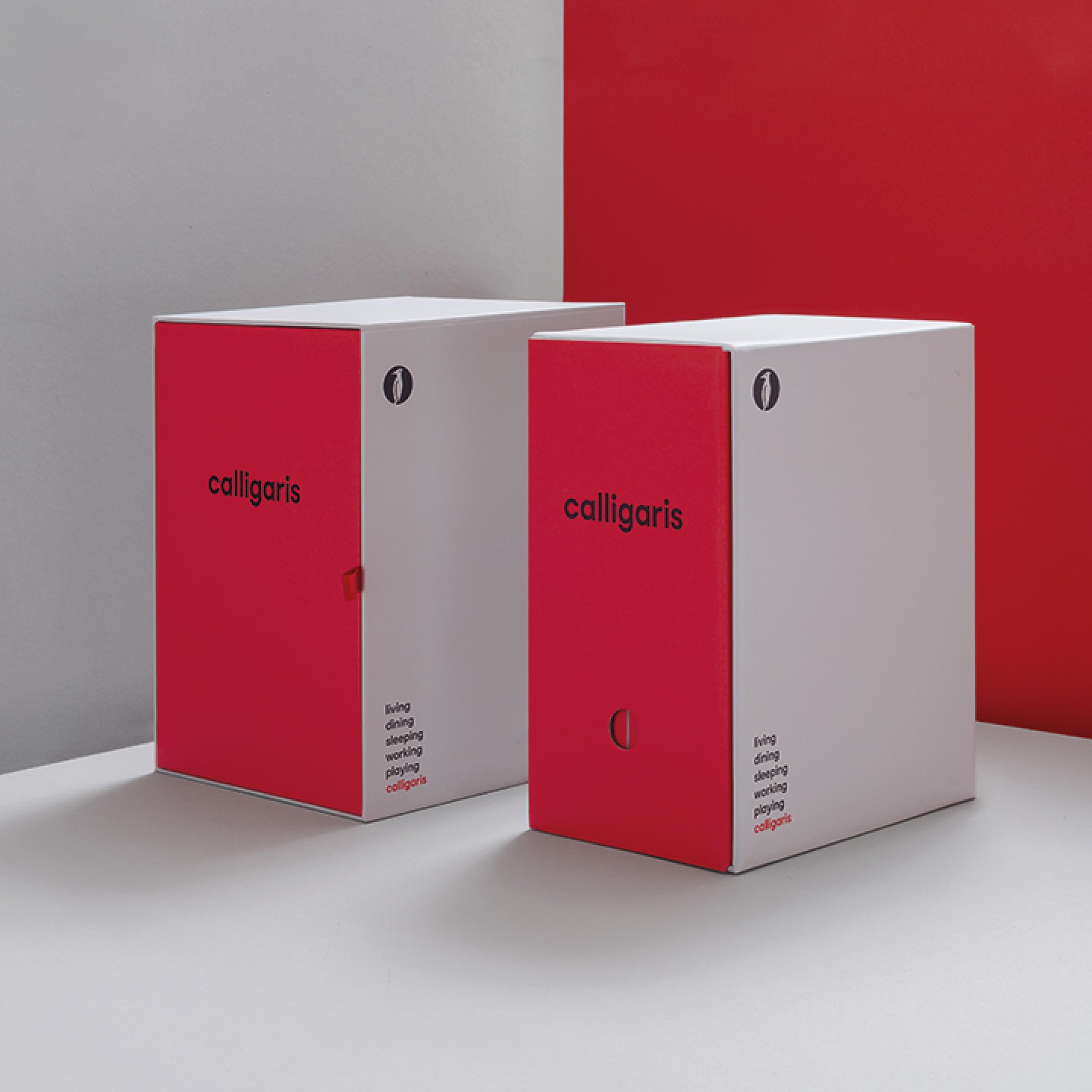
"Living, dining, sleeping, working, playing" is the mantra we devised to reflect the company's perspective and its wide range of products. A tool for each of the brand’s expressions that defines the lifestyle of those who choose Calligaris.

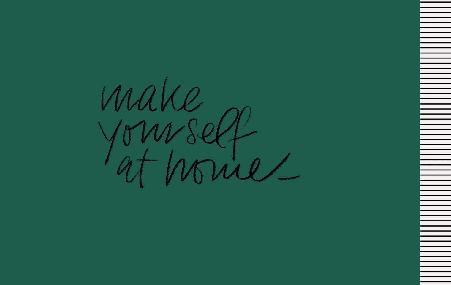
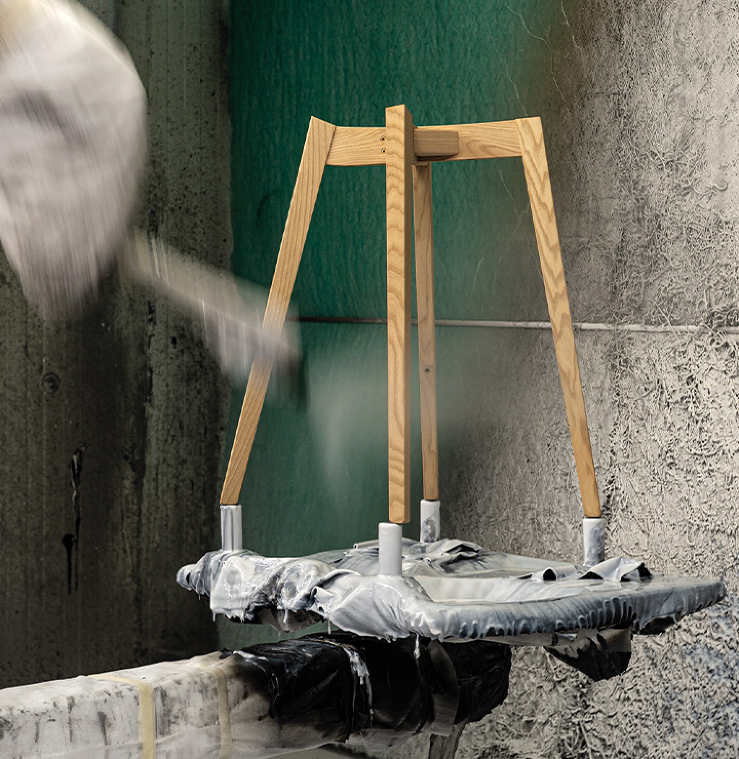
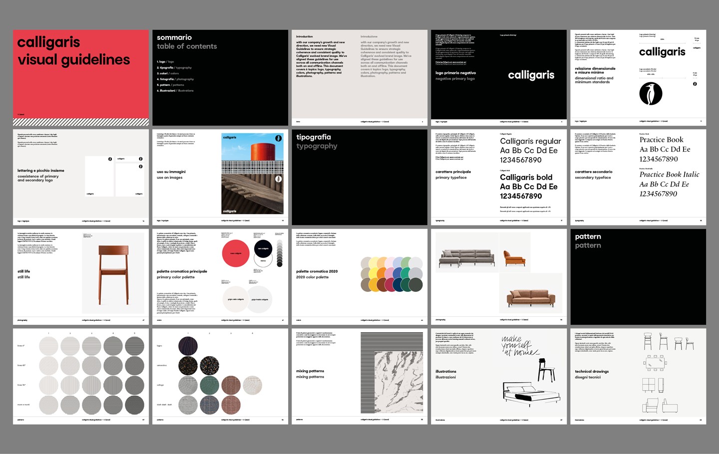
A set of visual guidelines guarantee consistency in the tone of voice, both from a photographic and a graphic perspective starting with the handwritten statement "Make yourself at home".
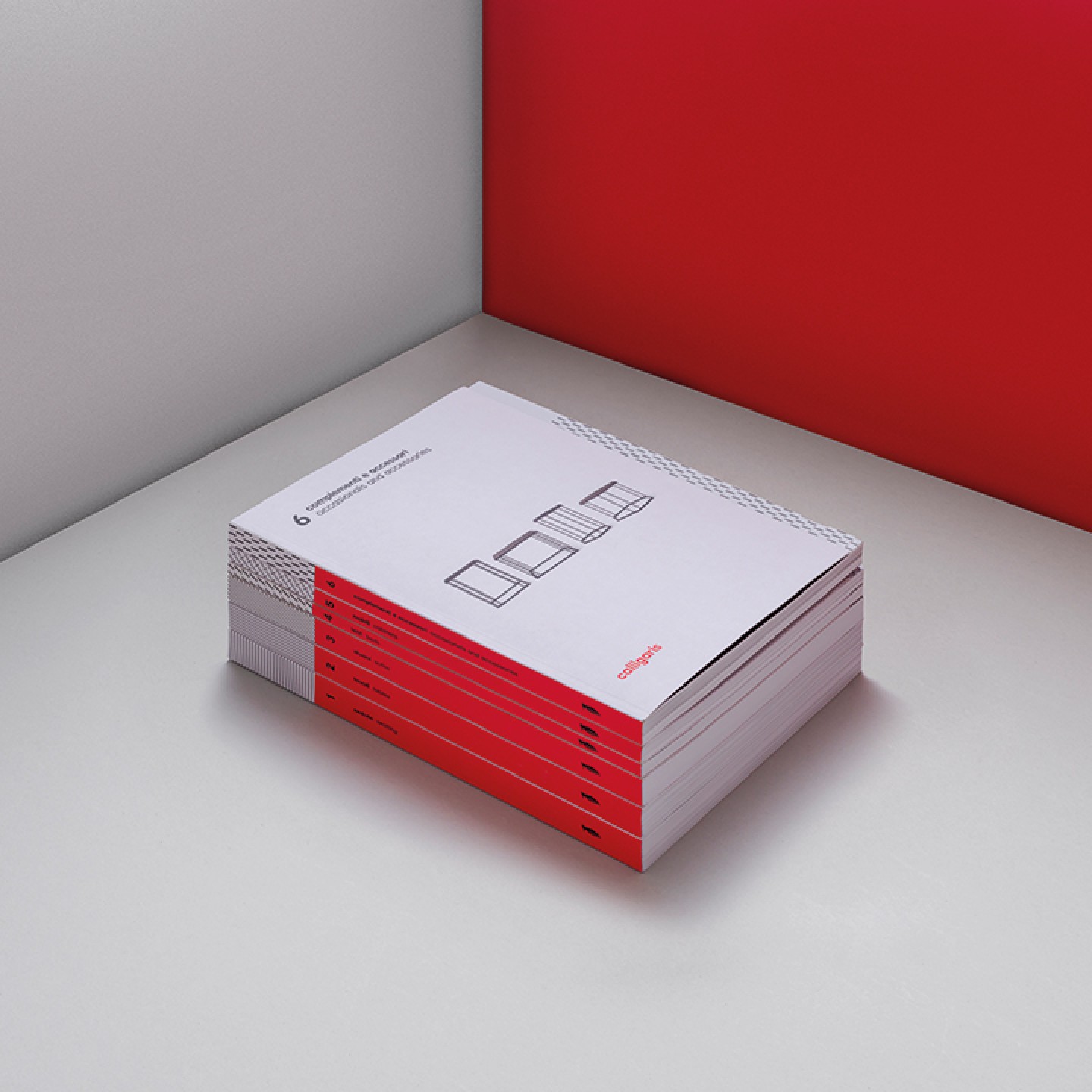
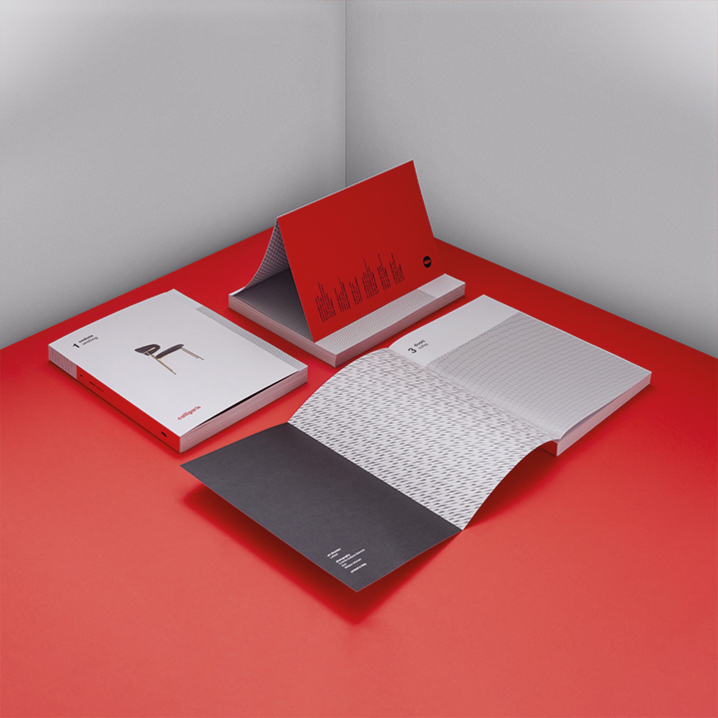
These graphic rules embody iconic features of new products and the brand's loyalty as a whole: a new colour and pattern system inspired by textures and materials; the use of the elegant "Practice" serif typeface by Optimo Type Foundry, combined with the corporate font; and last but not least, a slight logo-restyling that allows the "Calligaris" lettering logo and "woodpecker" symbol to stand alone, in different applications.
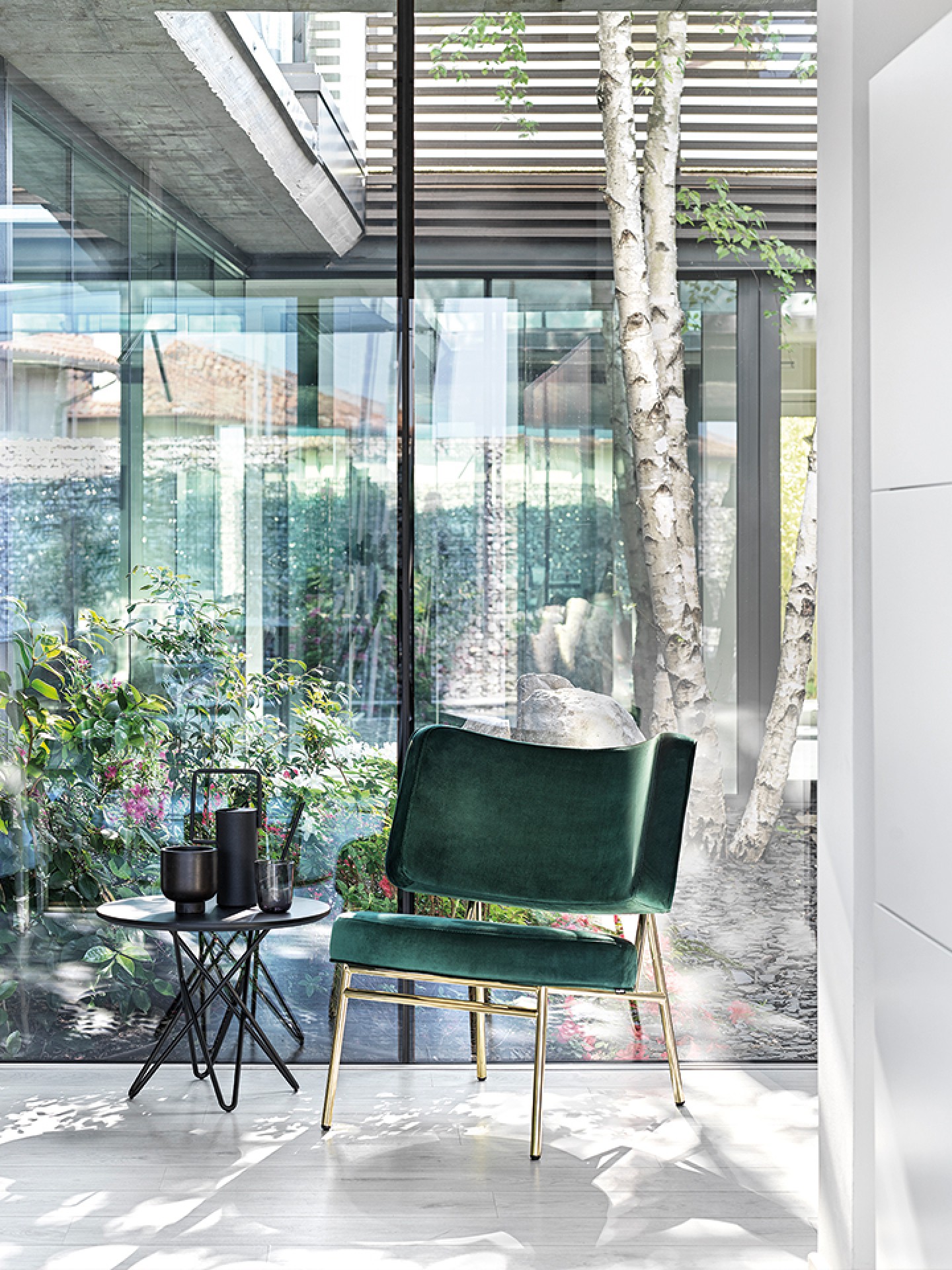
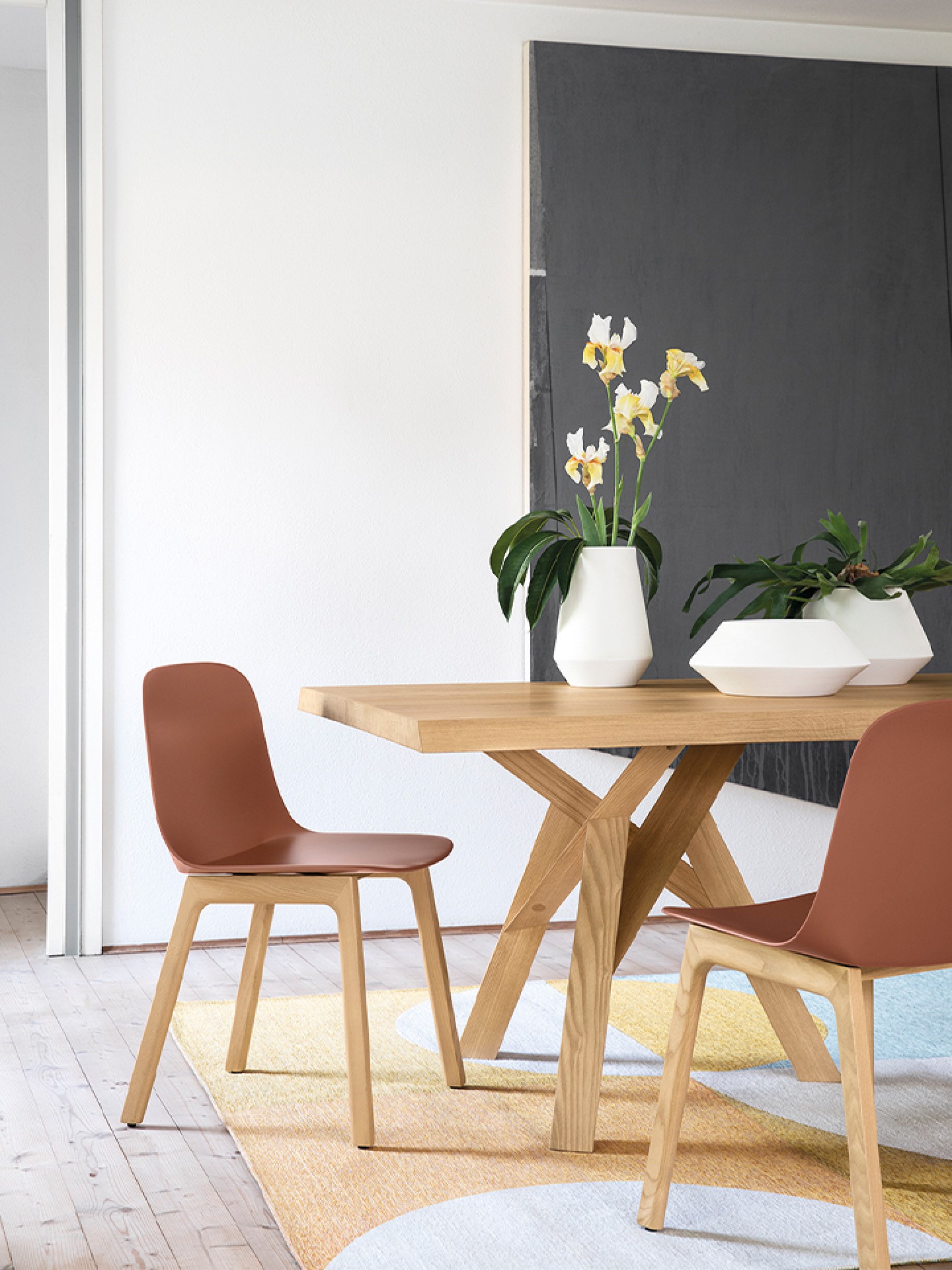
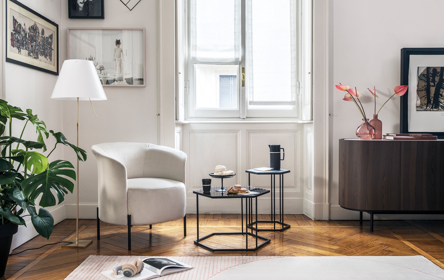
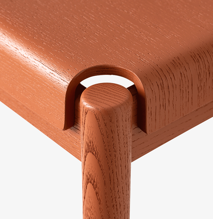
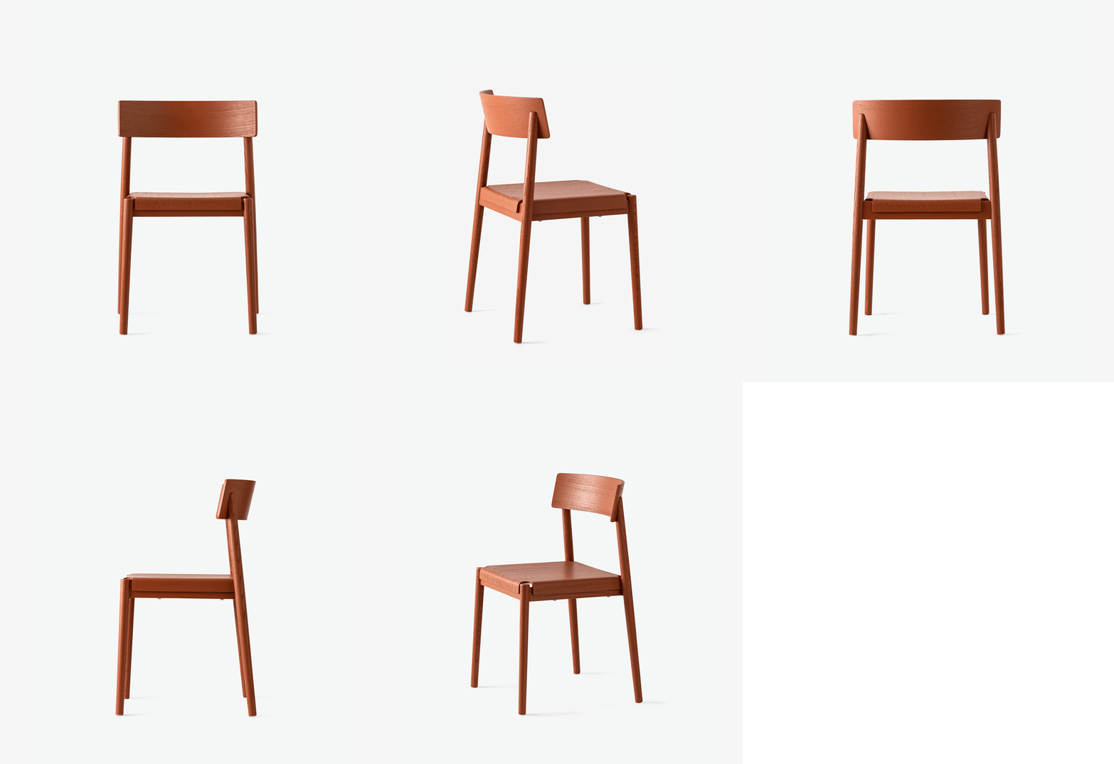
A few clear guidelines, collected in a graphic manual, to help anyone involved in communication activities align their tone and objectives.
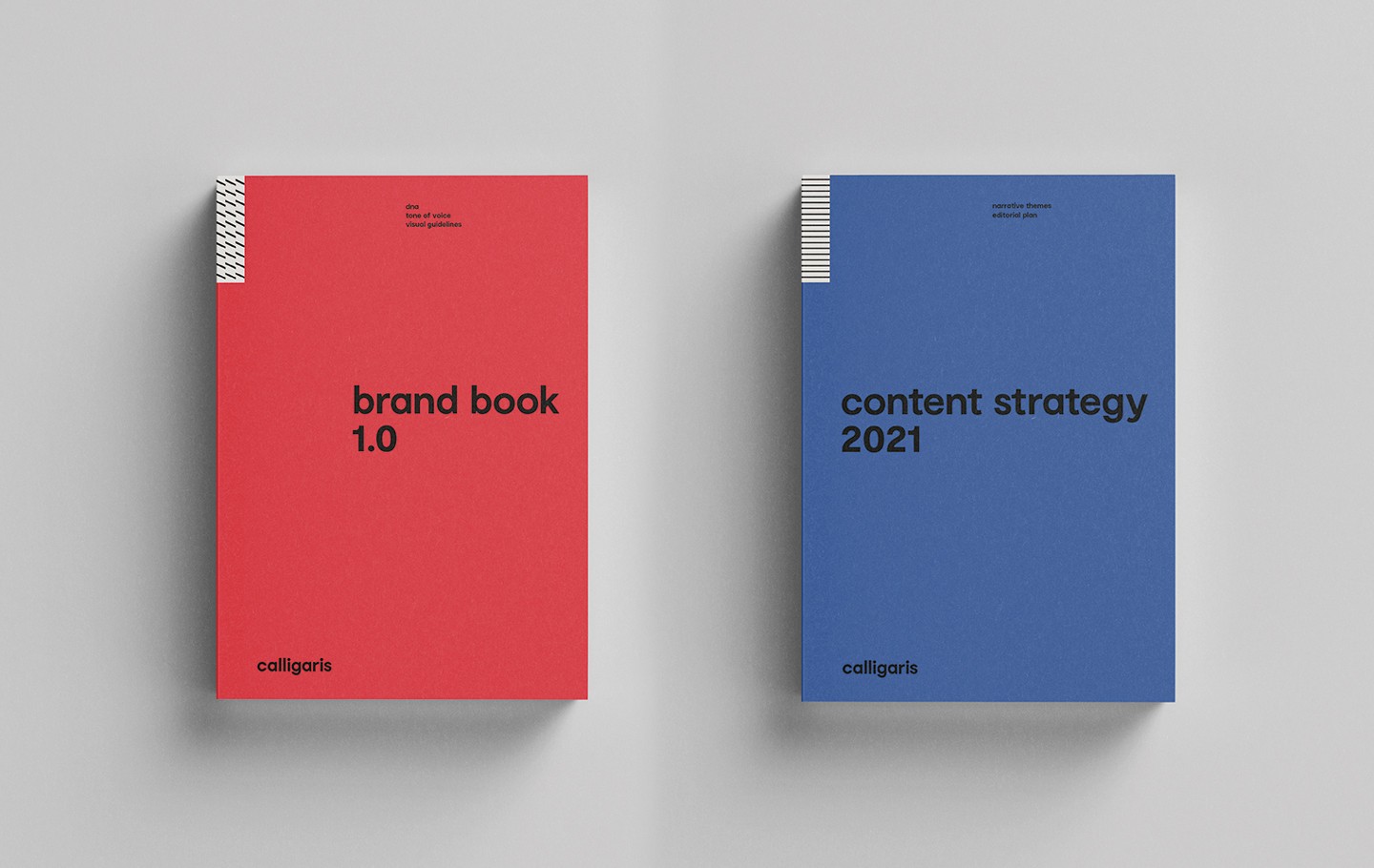
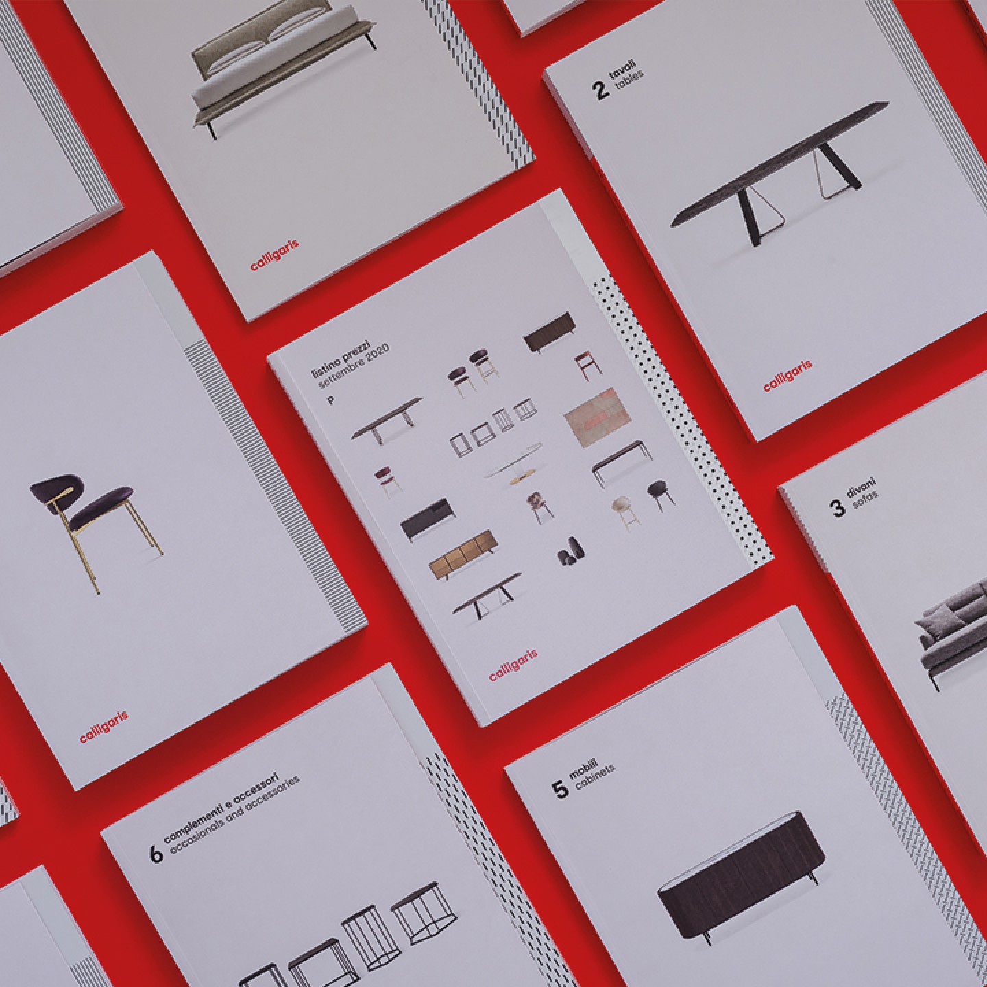
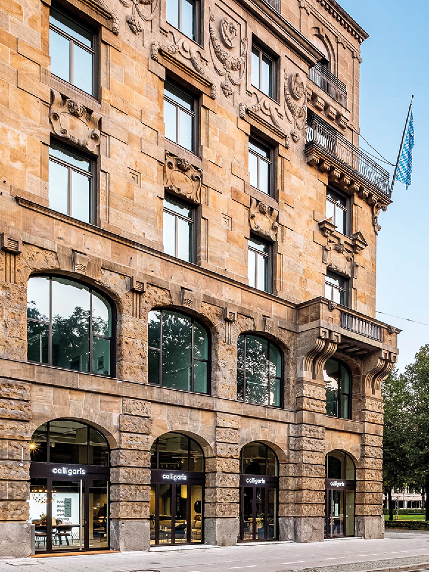
In these ways, the concept “real” takes shape in the new communication touchpoints for the public.
In collaboration with
Photo - Cristina Galliena Bohman and Matteo Imbriani
Styling - Vanessa Pisk Studio
Copywriting - Emma Hedley and Vicky Miller
Illustrations - Pol Montserrat
Font in use "Practice" by Optimo Type Foundry
Collections
An overview of our wide fields of action
-
Logos & Trademarks
What makes a brand memorable and unique.
-
Environments & Exhibits
Designing for spaces: from signage to cultural display, from retail to events
-
Art & Culture
We had the chance to work for museums, institutions and organization in Italy and worldwide
-
Educational
Designing for school publishing
-
Type Design
We love typography, we design typefaces, from lettering to complete custom type families.
Case Studies
selected projects
-
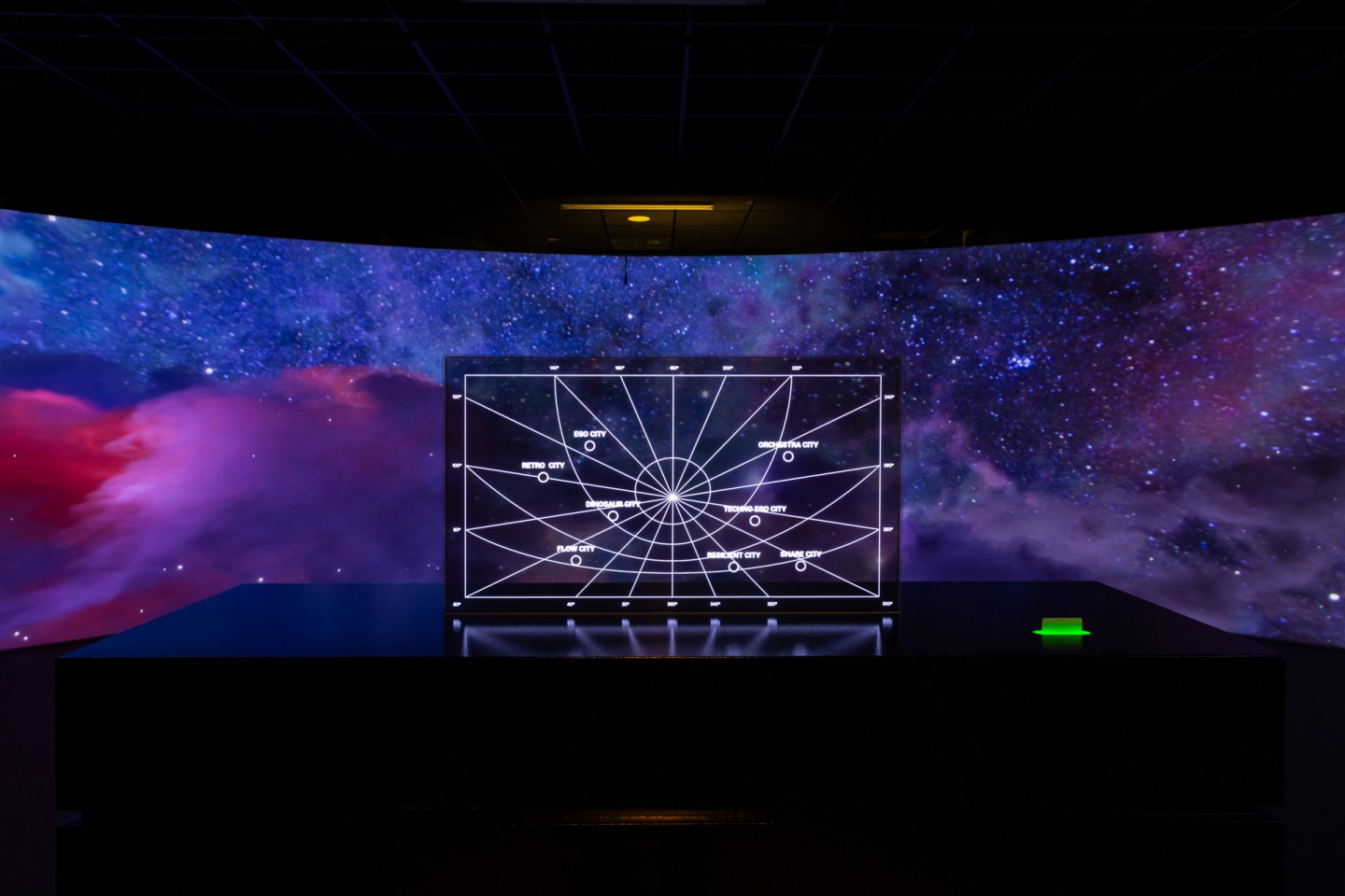
Layout, installations, and multimedia content
The Future Unfolds
An immersive and interactive journey to explore the future of mobility
-
visual identity
Artefiera Bologna 2025
A vibrant, pop-inspired restyling marks the 48th edition
-
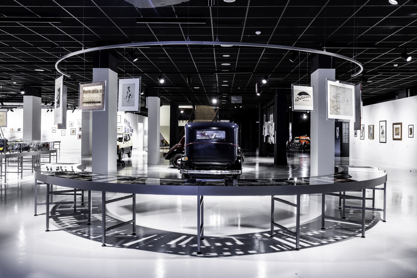
exhibition design
125 Volte Fiat
An exhibition celebrates FIAT’s 125th anniversary
-
ADI Design Index 2025
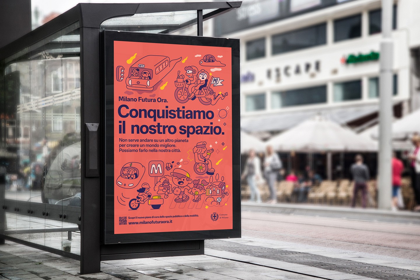
Conquistiamo il nostro spazio
OOH campaign and website on shared public spaces and active mobility in Milan.