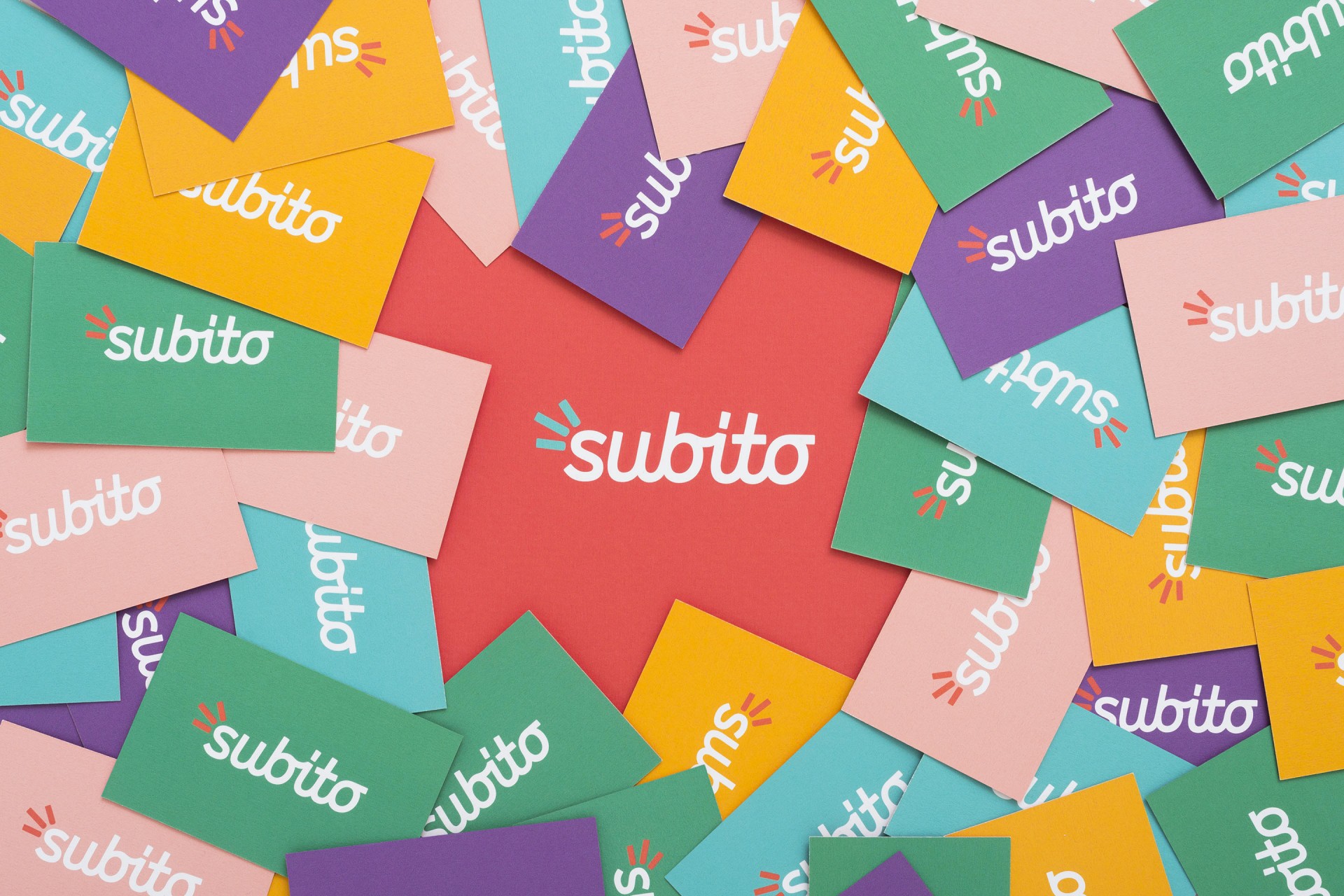
Designing a Love Brand
Our rebranding of the first buying and selling website in Italy
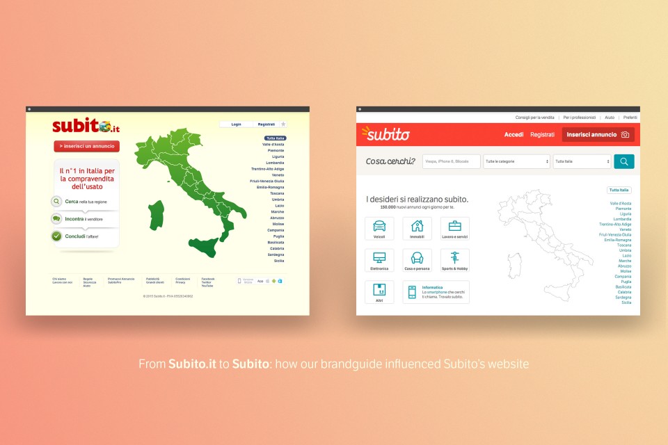
Born in 2007, in just a few years Subito.it has established itself as the “number 1 buying and selling” site in Italy. Last November we were chosen to head up its rebranding. From the beginning our goal was to draw the brand out of the dimension of the web. For the thousands of Italians who choose it every day, Subito.it was already much more than just a website, but it had to learn to express itself as such, to build an empathic connection with its users. The rebranding was used to accompany subito.it in this big step, to help it become a unique, familiar presence, brand non only to choose, but to love.
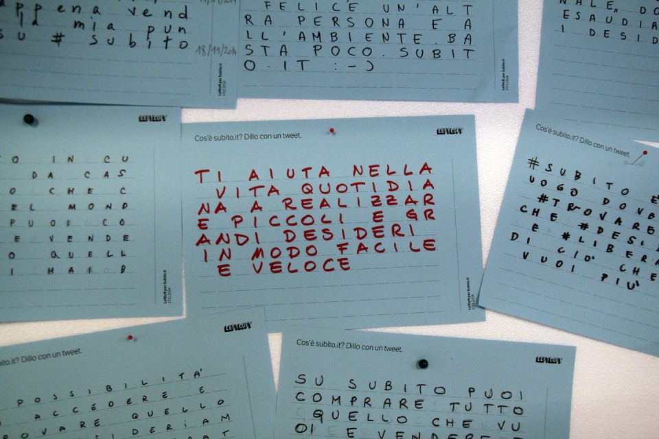
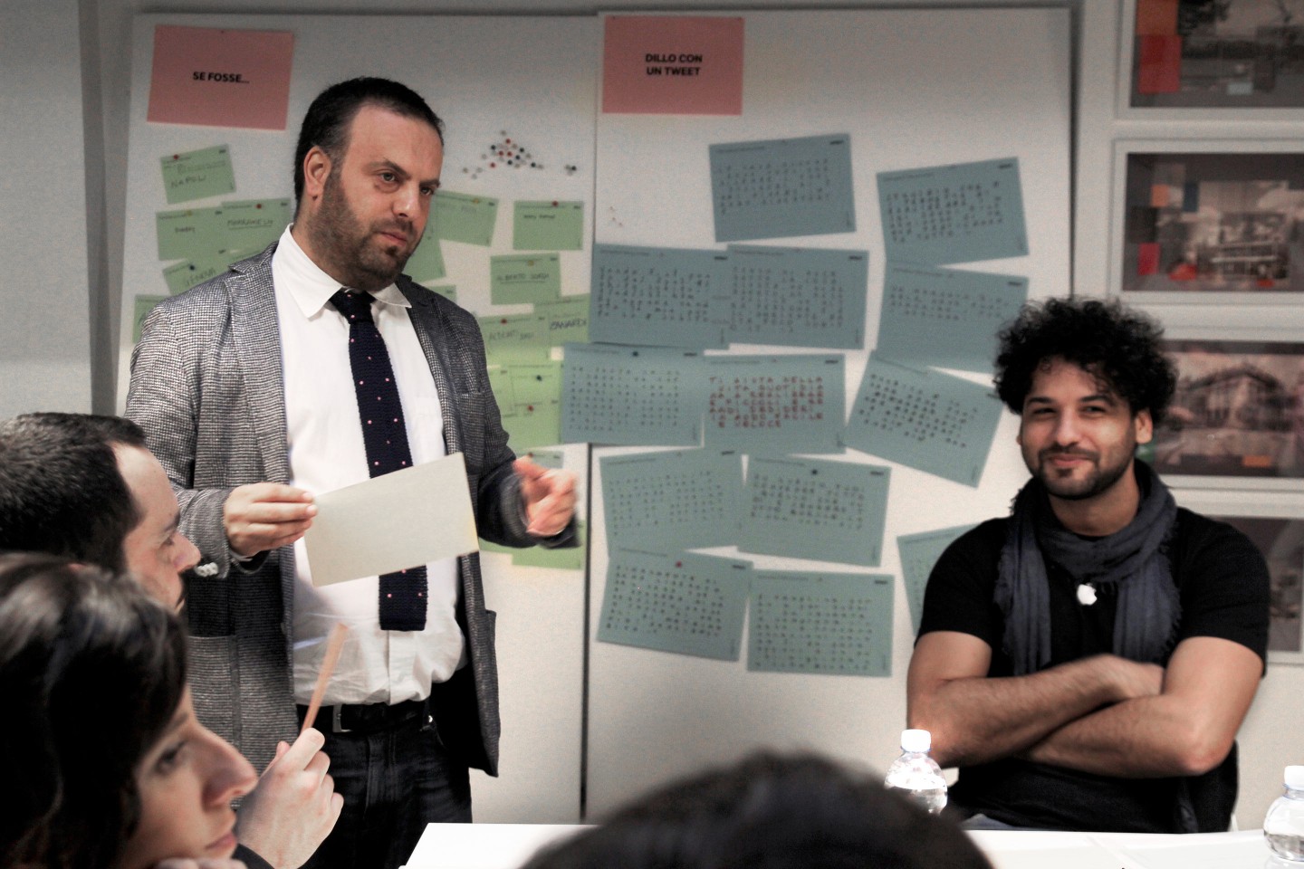
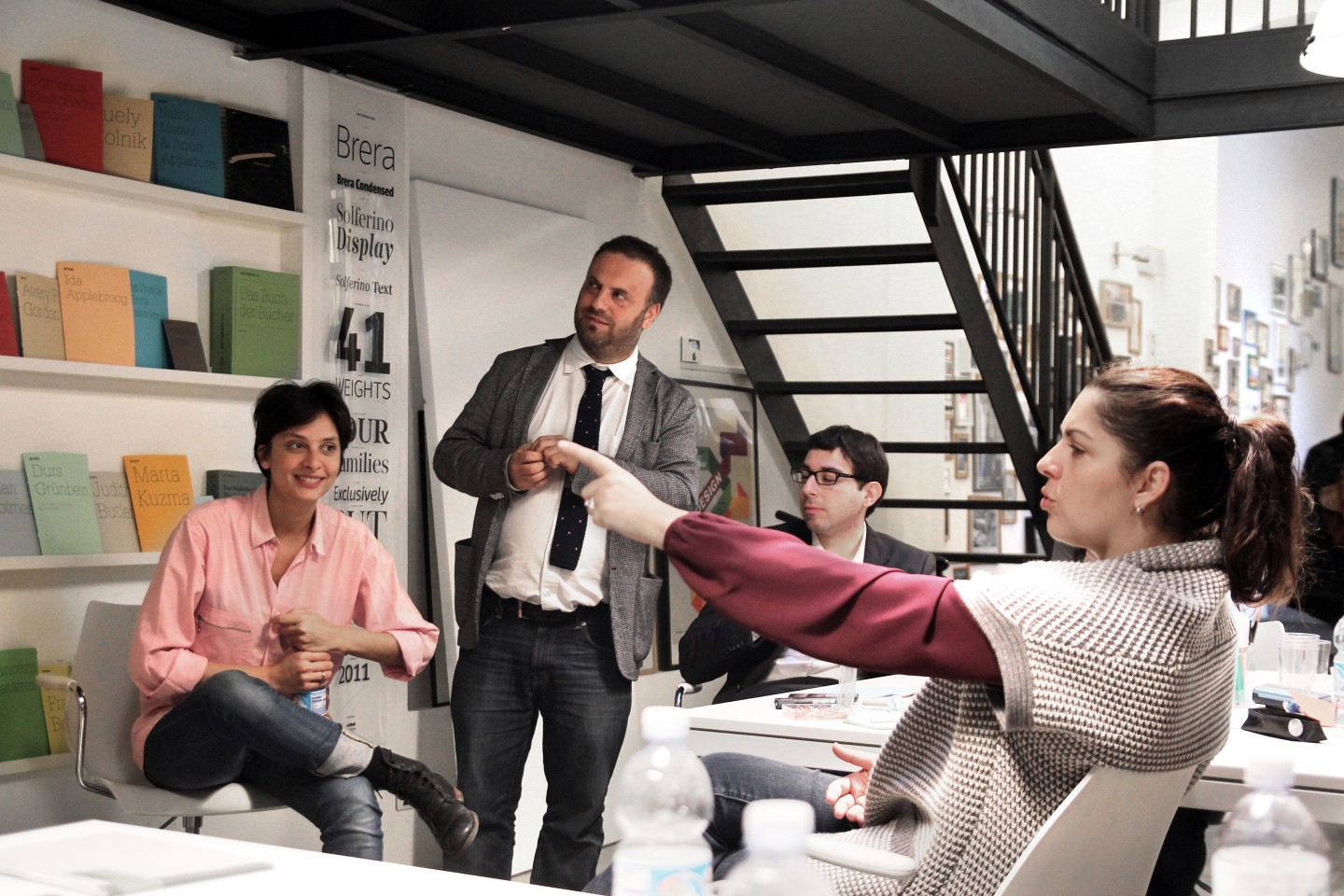
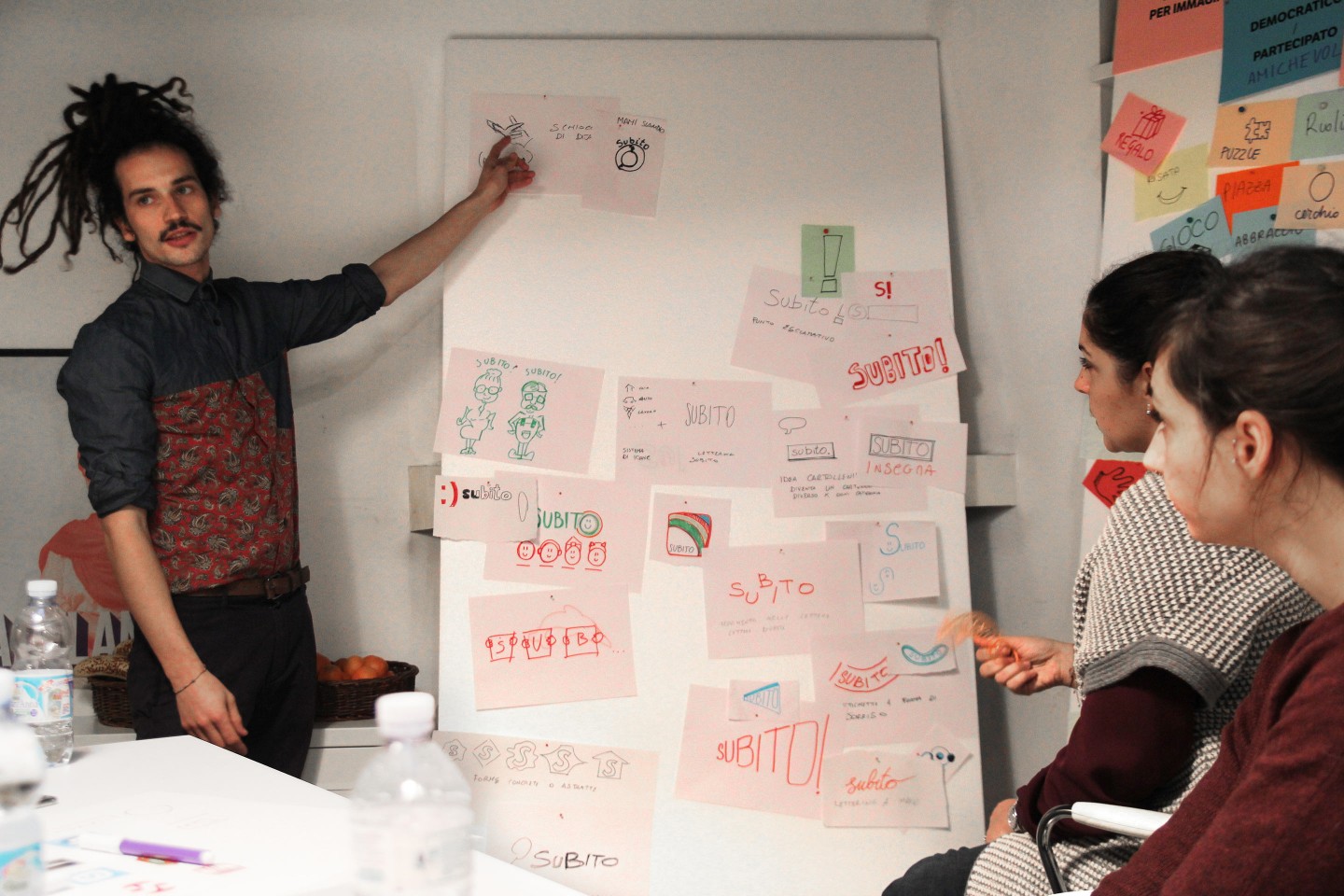
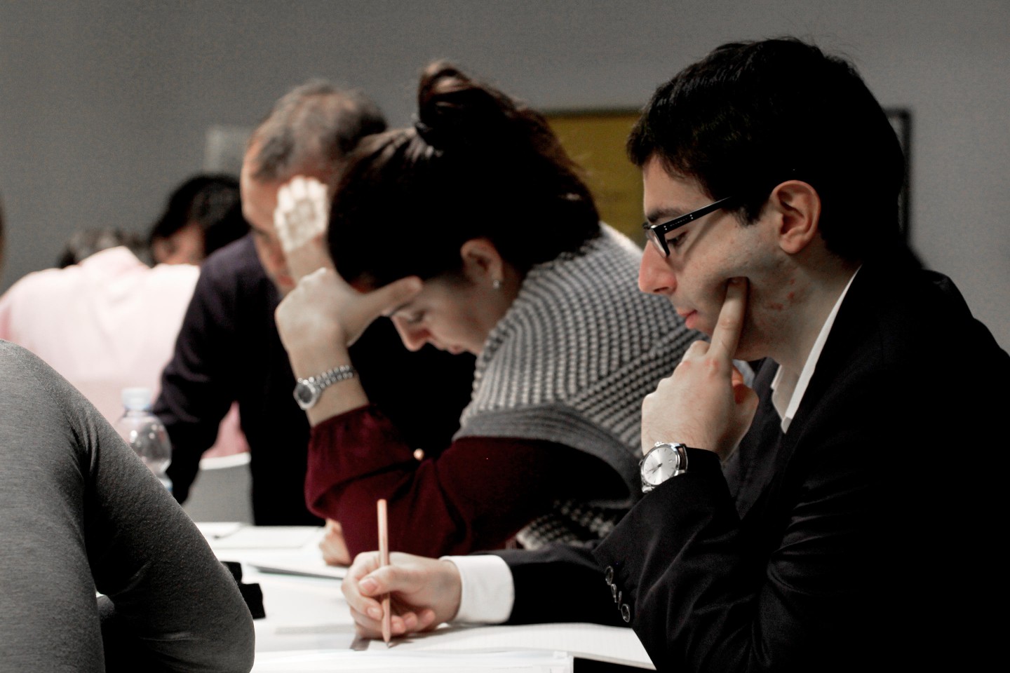
A radical change for the company, not only in terms of image but also of thinking, which we have led forward by working closely with those who have made Subito.it grow every day. The collaboration began with a co-design workshop, which directly involved key figures in the team within the company, and our team of designers and storytellers. Designers, narrators, communication managers, general managers and web designers, creative directors and marketing specialists: we all gathered around a table to figure out together - beyond our different roles within the project – what Subito.it really was, how it was perceived by those who use every day, and what horizons it could explore through its new identity. The process of exploration of the brand - together with the analysis and narrative of the values that make its personality unique- has led us to define its DNA. Through individual and group games, a selection of common ideas, symbols and keywords, we have built the new image, its tone of voice and the whole manifesto of rules and principles on which its new narrative rests.
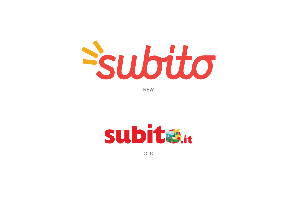
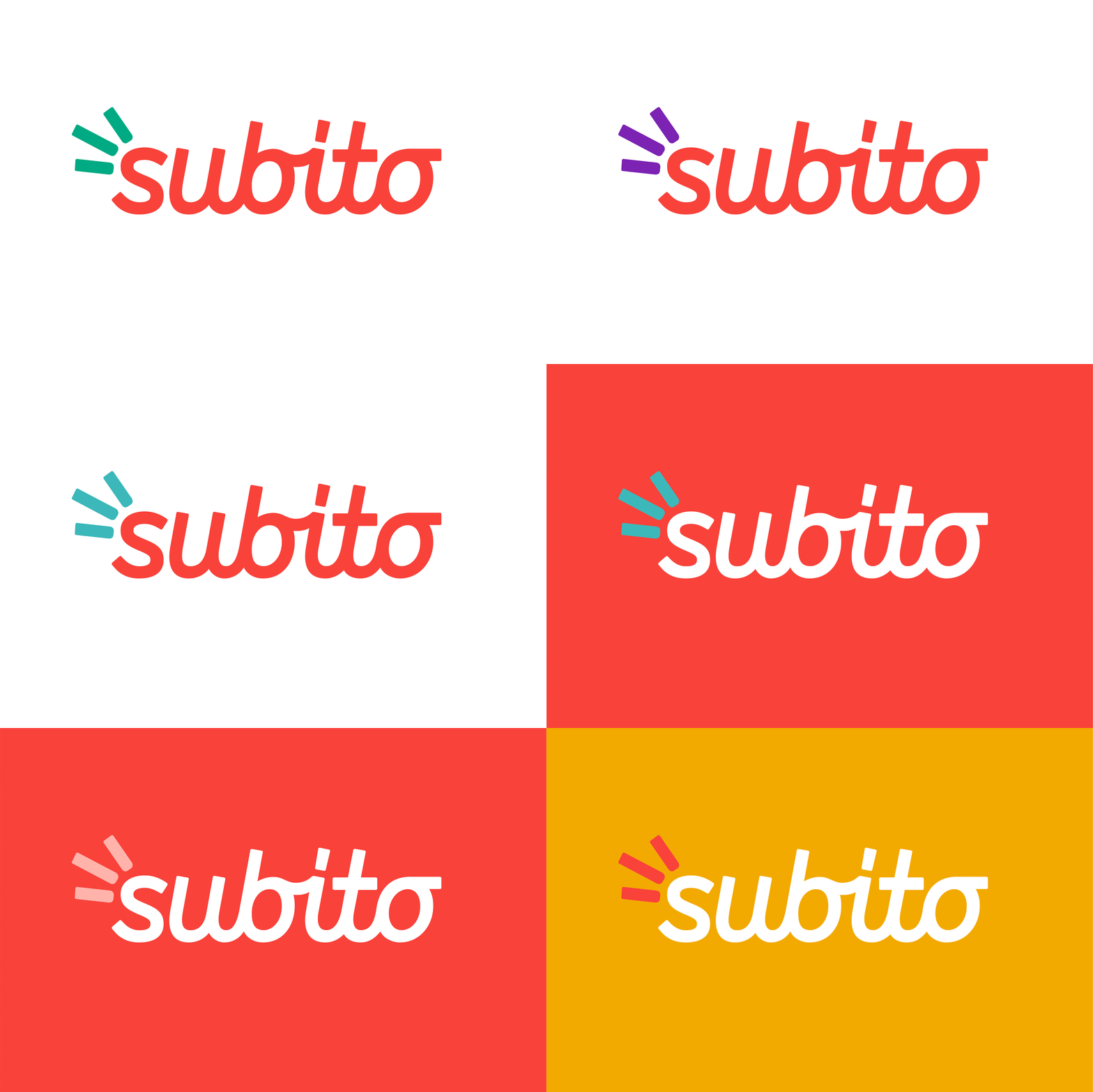
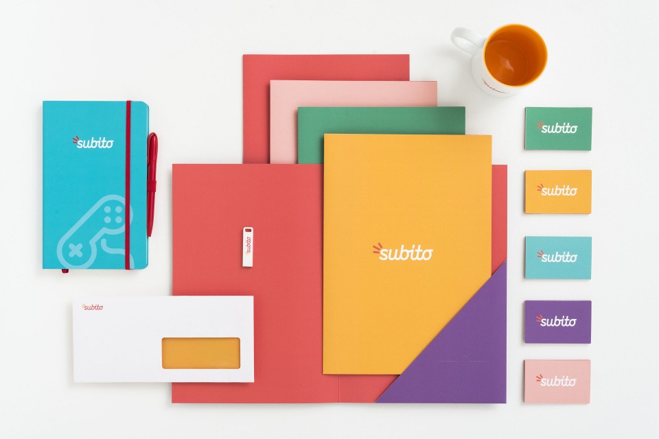
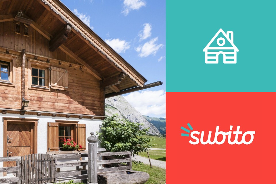
From "Subito.it" we arrived at "Subito", a large second hand market, easy to use and open to everyone. The graphics of this step are contained in its new logo, consisting of the name of the brand in the new custom italics "Flea", and a symbol, "Snap", the snapping of the fingers of the wishes coming true. Practical, genuine, pop, eco: this is the new Subito, and its values are reflected in its language of signs, words and colors.
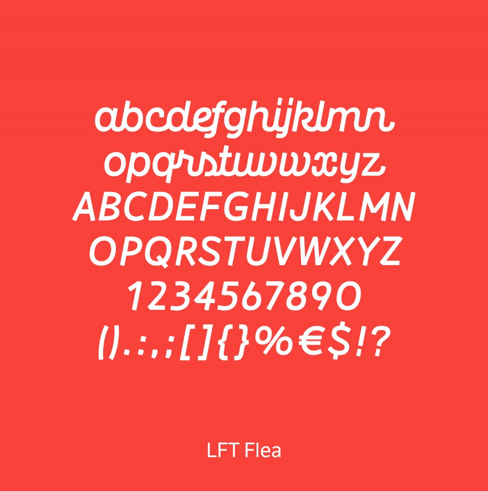
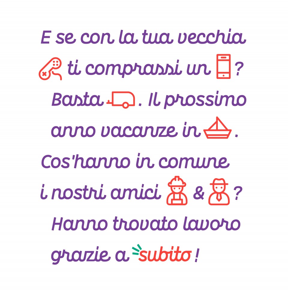
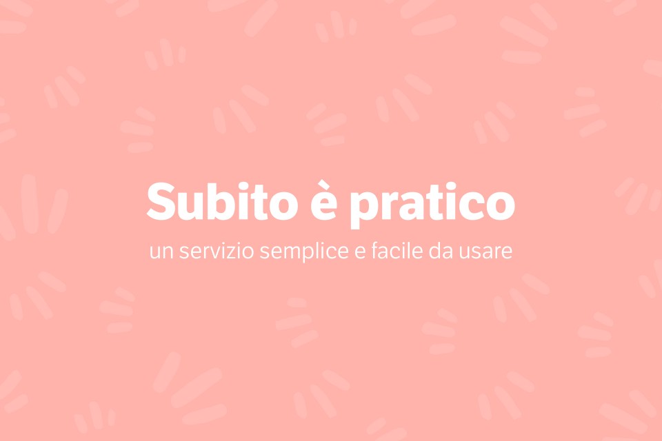
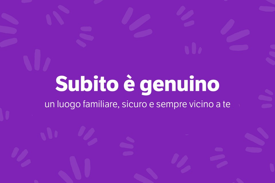
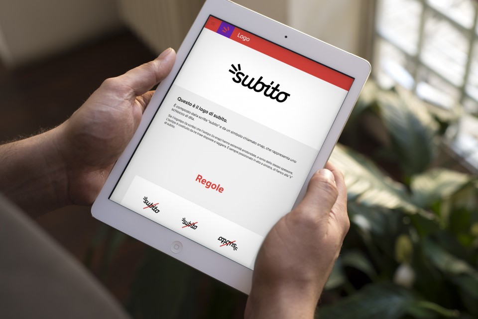
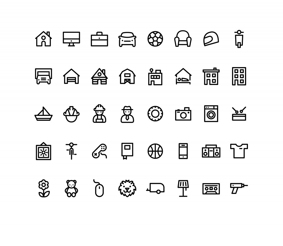
The DNA discovered together has been placed in the brand’s online guides: a tool that tells the new identity in all its aspects, and presents the new Subito to all those who, as of today, will come to interact with the service and want to make use of its image in the right way. From the logo to the tone of voice, from the typography to the rules of color combination: the online brand manual is an essential tool, constantly updated and updatable, an exhaustive but agile guide, rigorous and ironic, a passport that every "loved brand" should have in order to present itself to the world and continue to grow in the best way.


Collections
An overview of our wide fields of action
-
Logos & Trademarks
What makes a brand memorable and unique.
-
Environments & Exhibits
Designing for spaces: from signage to cultural display, from retail to events
-
Art & Culture
We had the chance to work for museums, institutions and organization in Italy and worldwide
-
Educational
Designing for school publishing
-
Type Design
We love typography, we design typefaces, from lettering to complete custom type families.
Case Studies
selected projects
-

Layout, installations, and multimedia content
The Future Unfolds
An immersive and interactive journey to explore the future of mobility
-
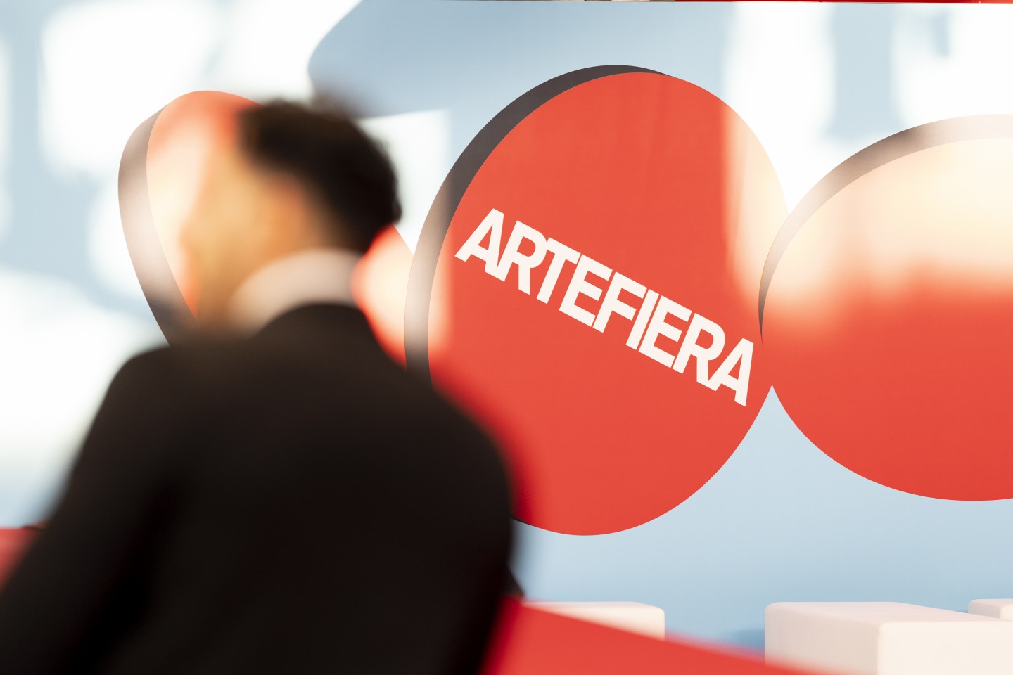
visual identity
Artefiera Bologna 2025
A vibrant, pop-inspired restyling marks the 48th edition
-
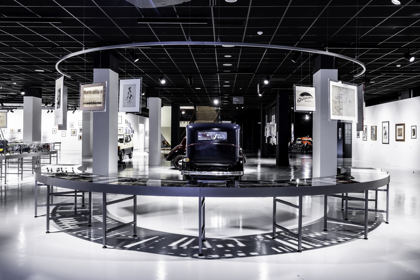
exhibition design
125 Volte Fiat
An exhibition celebrates FIAT’s 125th anniversary
-
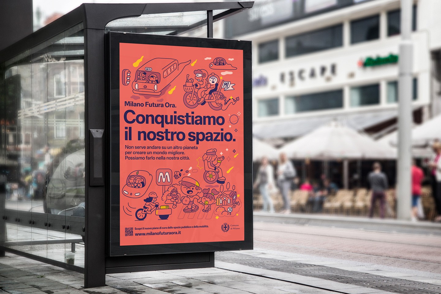
ADI Design Index 2025
Conquistiamo il nostro spazio
OOH campaign and website on shared public spaces and active mobility in Milan.
