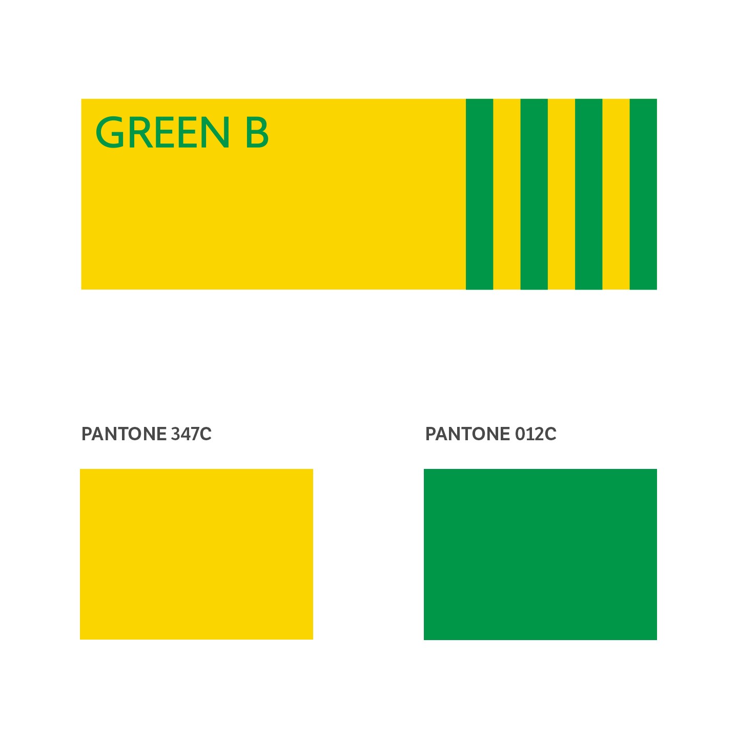
Green B - B sustainable today
Naming and Visual Identity for the Benetton Group's CSR ecosystem
Naming and visual identity for Green B, a project that brings together all the sustainability initiatives of Benetton Group including United Colors of Benetton, Undercolors and Sisley.
The project focused on the concept of the CSR ecosystem, of which the Benetton Group has always been a keen promoter. Given the growing importance of this global theme in recent years, the need arose to give this ecosystem a well-defined, value-based visual identity.
We found a name, designed a logo and created a key visual to tell the project’s unique story while remaining true to the brand’s highly recognizable visual narrative, so rooted in the collective imagination of the public.
The concept of Green B encompasses multiple actions and meanings linked to the brand’s Corporate Social Responsibility ecosystem, creating an intuitive reference system for the many subjects connected to it: "From the conception and realization of the product to the supply chain, from energy efficiency to caring for the community, [it represents] a 360 ° vision that systematizes our commitment to both the environment and people".
For Benetton, being green is more than the fashion of the moment, it is an innate way of being. As ambassador for this green soul, Green B is the symbol of everything that is sustainable for Benetton: a call for collective action in the name of a more ethical and earth conscious fashion world.

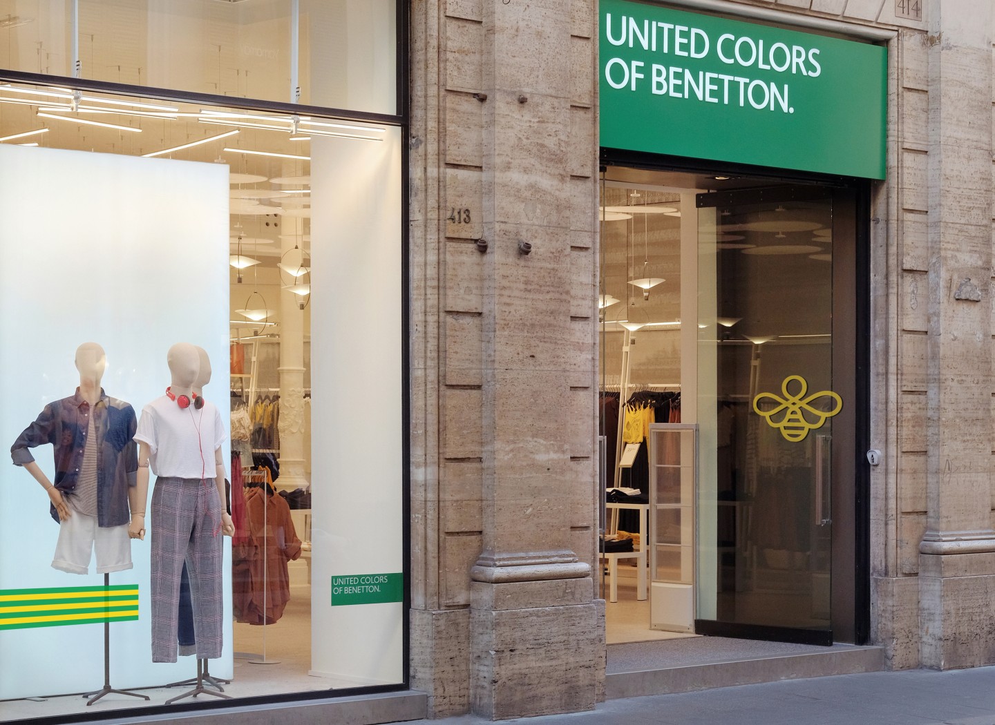
The Green B logo visually recalls the features of Benetton's famous “green brick” but has its own visual autonomy, in line with the project concept.
As a natural variation of the original logo, it uses the corporate font already in use, but has its own palette and identifying graphic elements. Despite its independence, the Green B logo can be harmoniously combined with those of the Group's brands to convey the sense of integration inherent in the CSR project’s broader context.
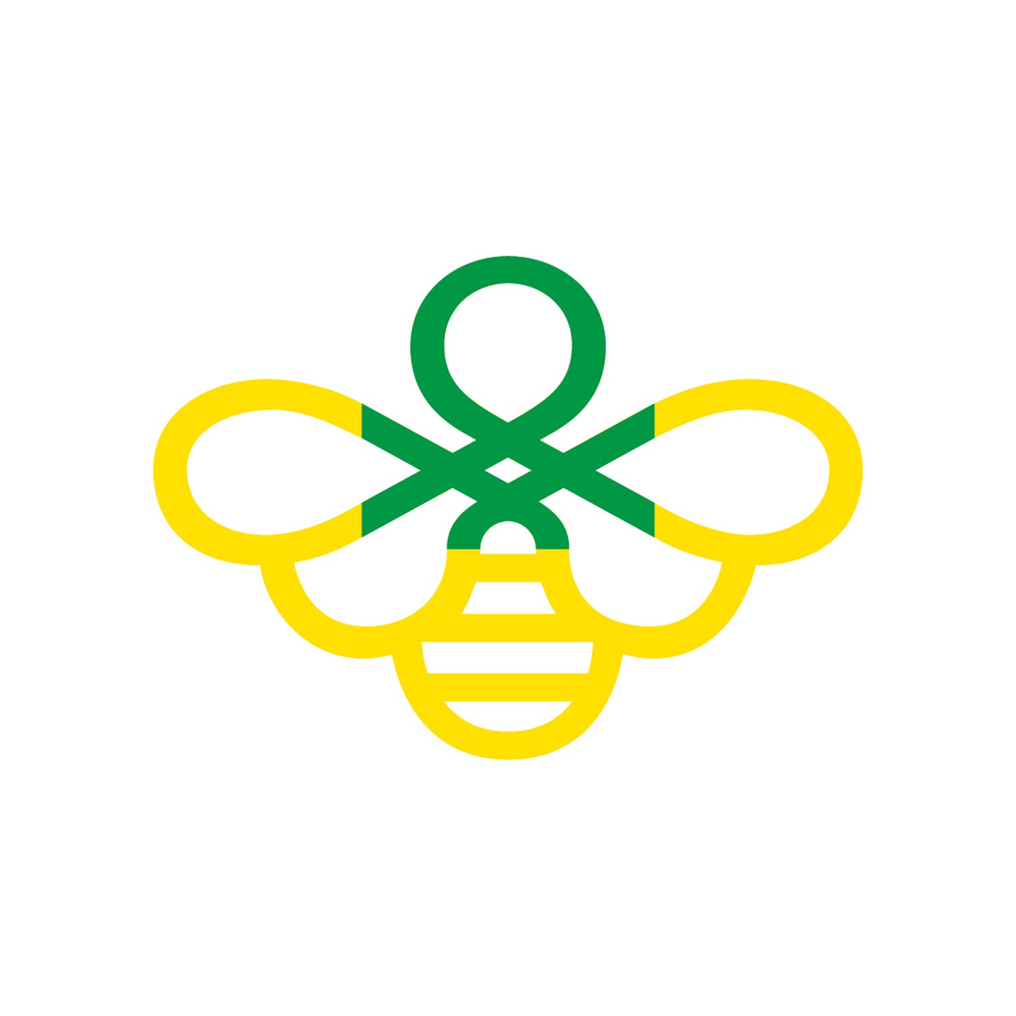
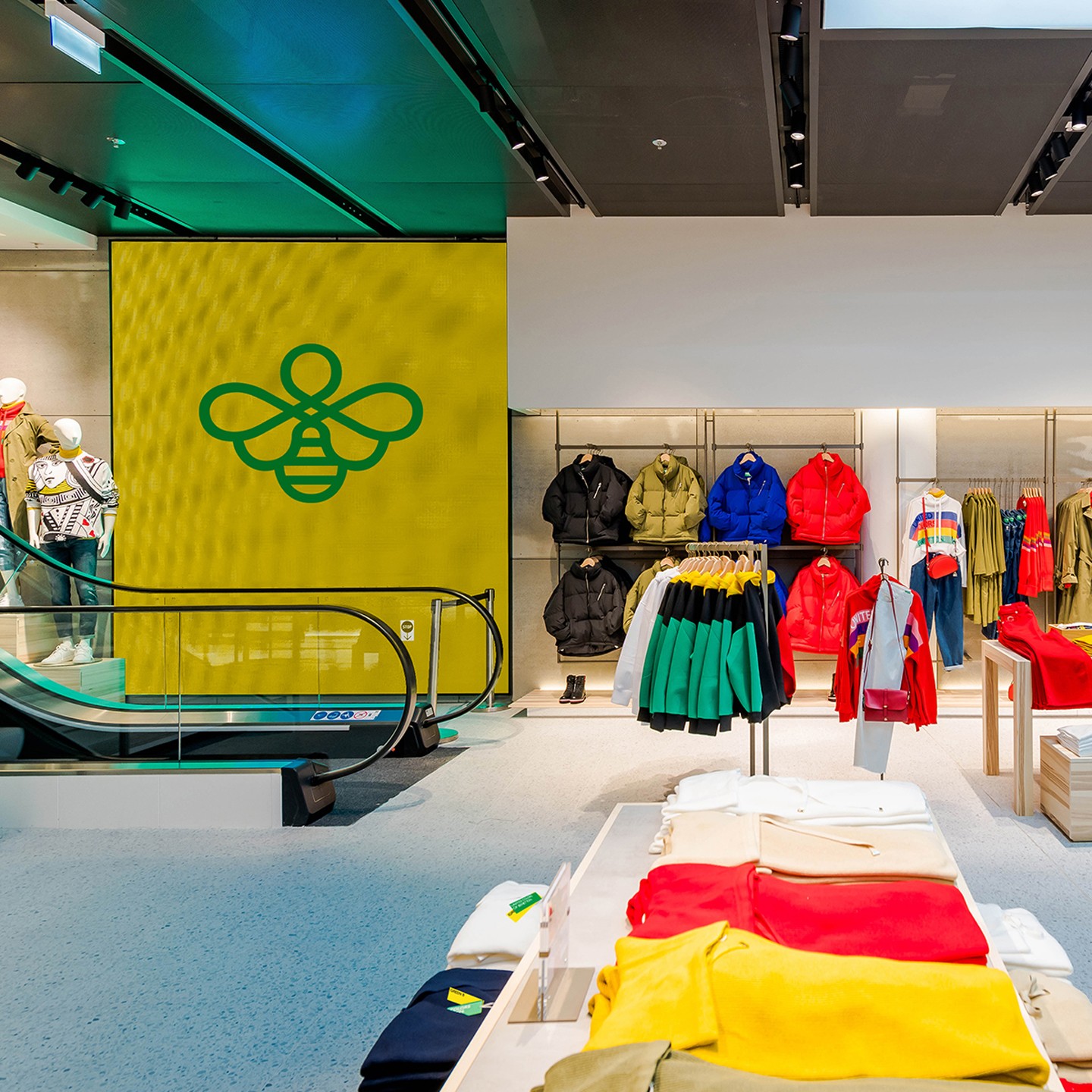
Next to Green B is a mascot that carries and amplifies the narrative of the project across various media channels and classic communication touchpoints. A distinctive decorative sign, which originates in the brand's famous knit stitch and transforms into a bee!
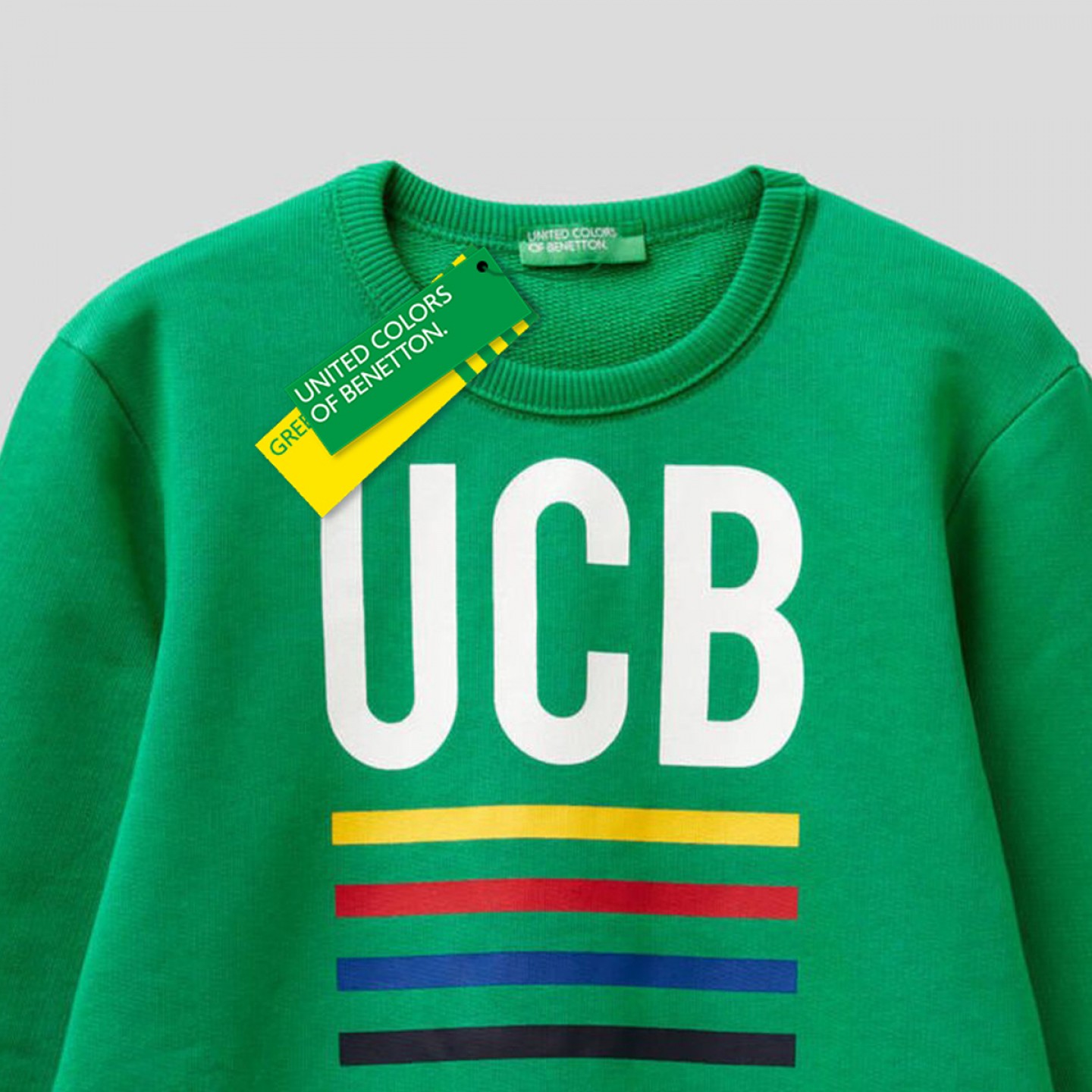
Benetton's sustainable identity will be communicated step by step through the Group's main offline / online communication touchpoints, in points of sale and through the Group's numerous green initiatives from product tags to store windows and different material applications in the retail world.
Green B. B sustainable, today.
Collections
An overview of our wide fields of action
-
Logos & Trademarks
What makes a brand memorable and unique.
-
Environments & Exhibits
Designing for spaces: from signage to cultural display, from retail to events
-
Art & Culture
We had the chance to work for museums, institutions and organization in Italy and worldwide
-
Educational
Designing for school publishing
-
Type Design
We love typography, we design typefaces, from lettering to complete custom type families.
Case Studies
selected projects
-

Layout, installations, and multimedia content
The Future Unfolds
An immersive and interactive journey to explore the future of mobility
-

visual identity
Artefiera Bologna 2025
A vibrant, pop-inspired restyling marks the 48th edition
-

exhibition design
125 Volte Fiat
An exhibition celebrates FIAT’s 125th anniversary
-

ADI Design Index 2025
Conquistiamo il nostro spazio
OOH campaign and website on shared public spaces and active mobility in Milan.