Inter: 365 Days of Football
A full rebranding of one of the best club in the world.
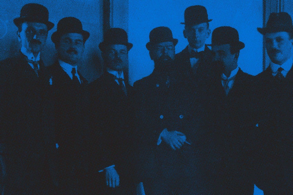
“This wonderful night will establish the colors of our badge: black and blue on a background of golden stars. It will be called Internazionale because we are brothers of the world”
Milano, 9 Marzo 1908
Our collaboration with F.C. Internazionale started three years ago, driven by a single goal: to bring the people back to the stadium. The tickets and membership campaigns we launched in 2011 did not target football fans, but people from Milano.

To bring this new identity to life, our goal was to create a highly contemporary image for a historical team, by celebrating both football values and traditions. As a centenary international club, over the years, Inter had developed a vast array of activities and divisions which needed to be renewed in a visually coherent and harmonious way.
In order to open a visual dialogue with 106 years of history, we first had to identify how to unite the expansive group of products and identities that are FC Internazionale.
To develop a coherent strategy we focused on the five values that define the Inter culture: Milanese, international, legendary, surprising, loyal.
The entire rebranding process was conceived with the purpose of creating a versatile but unique identity; combining a strong modern personality, with a careful review of iconic and traditional elements.
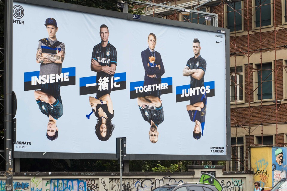
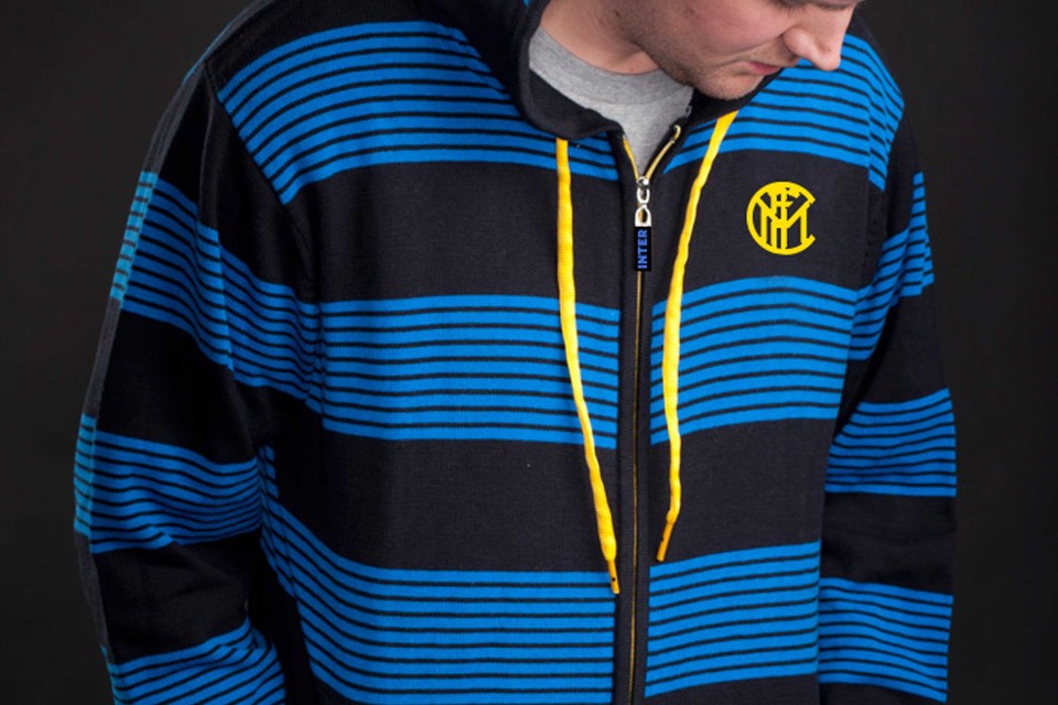
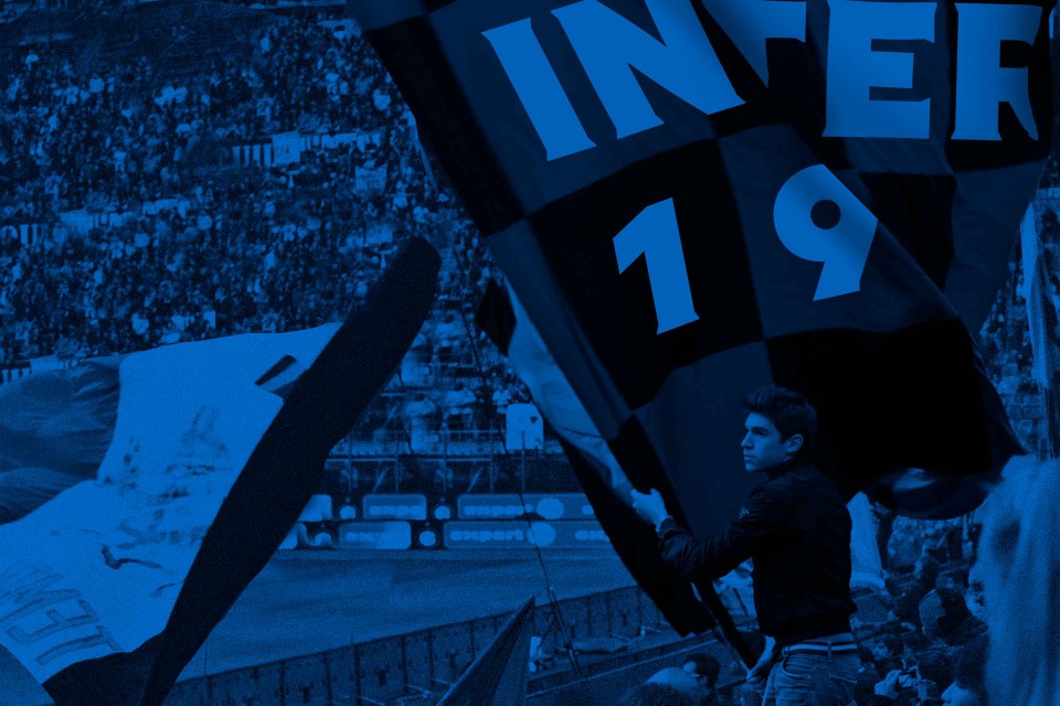
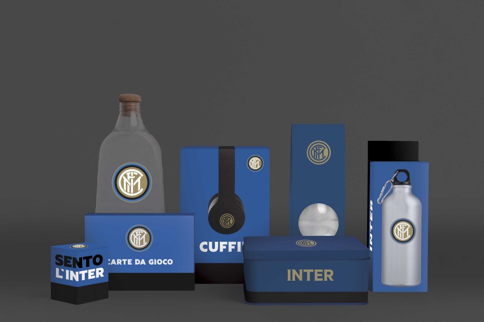
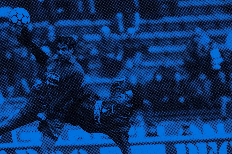
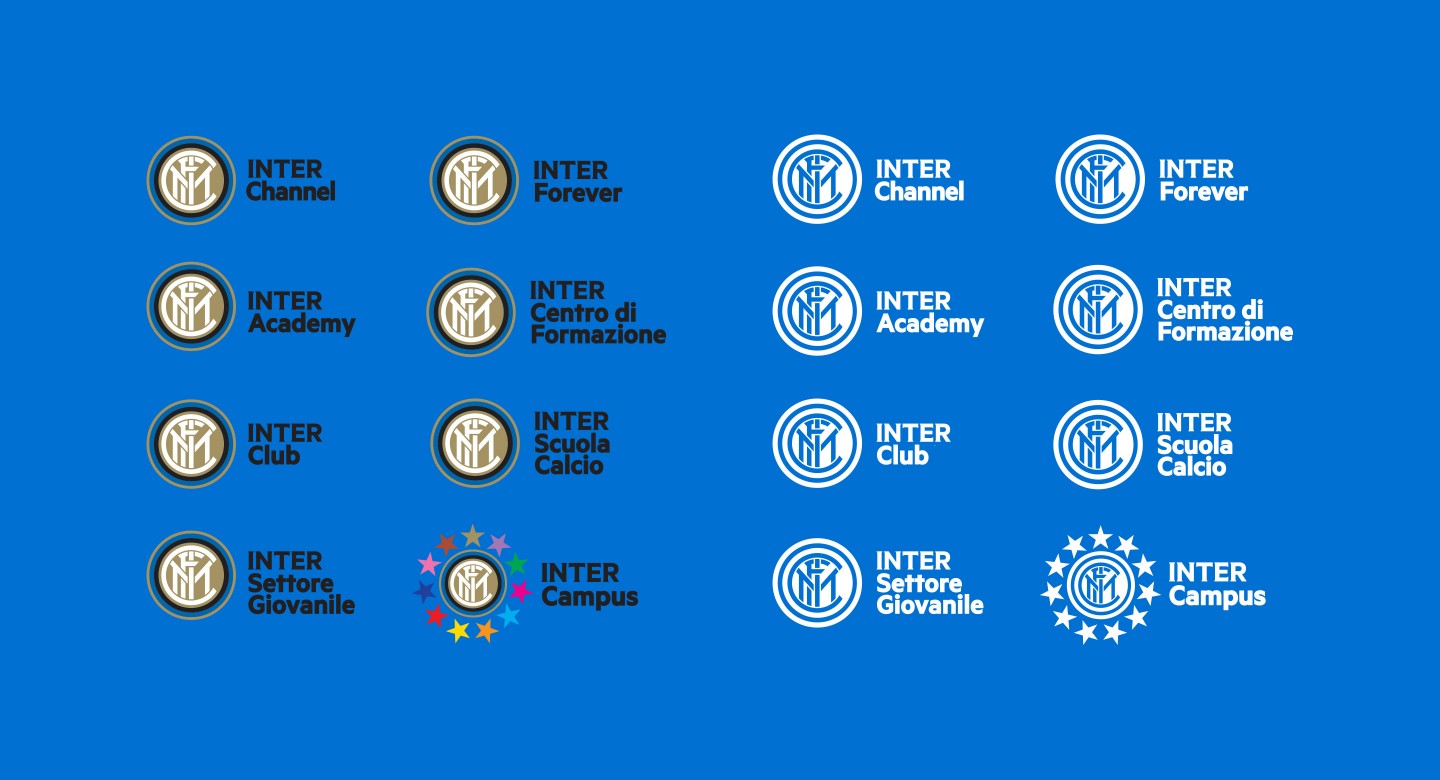
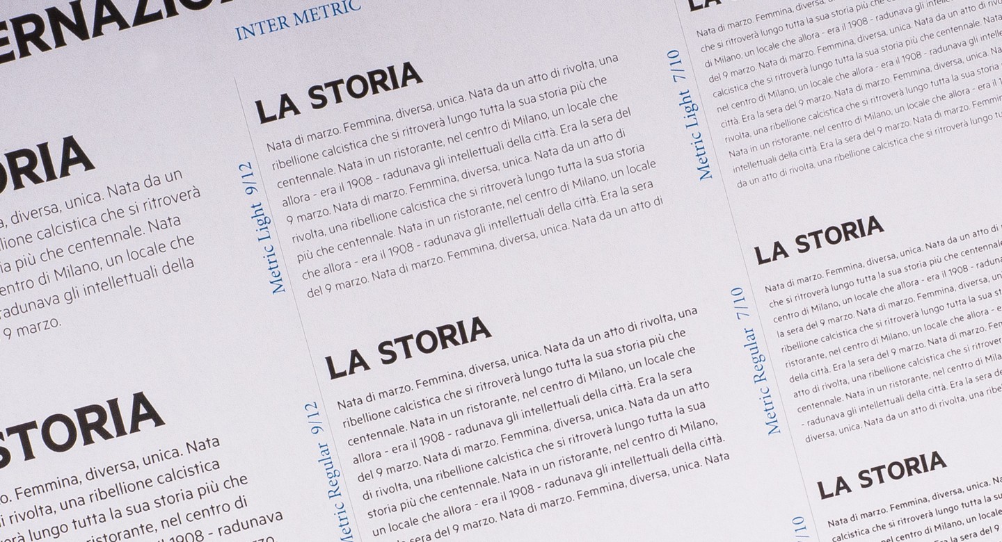
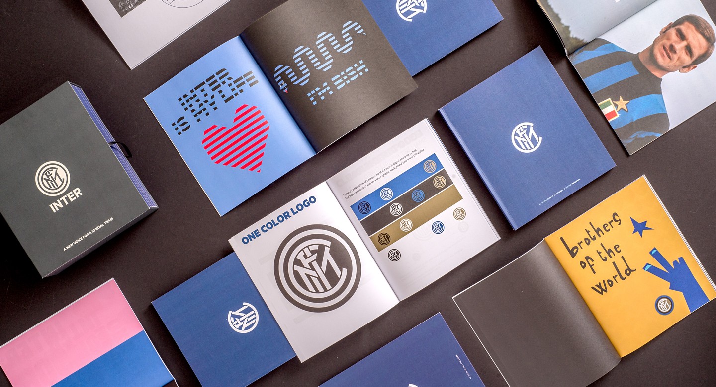
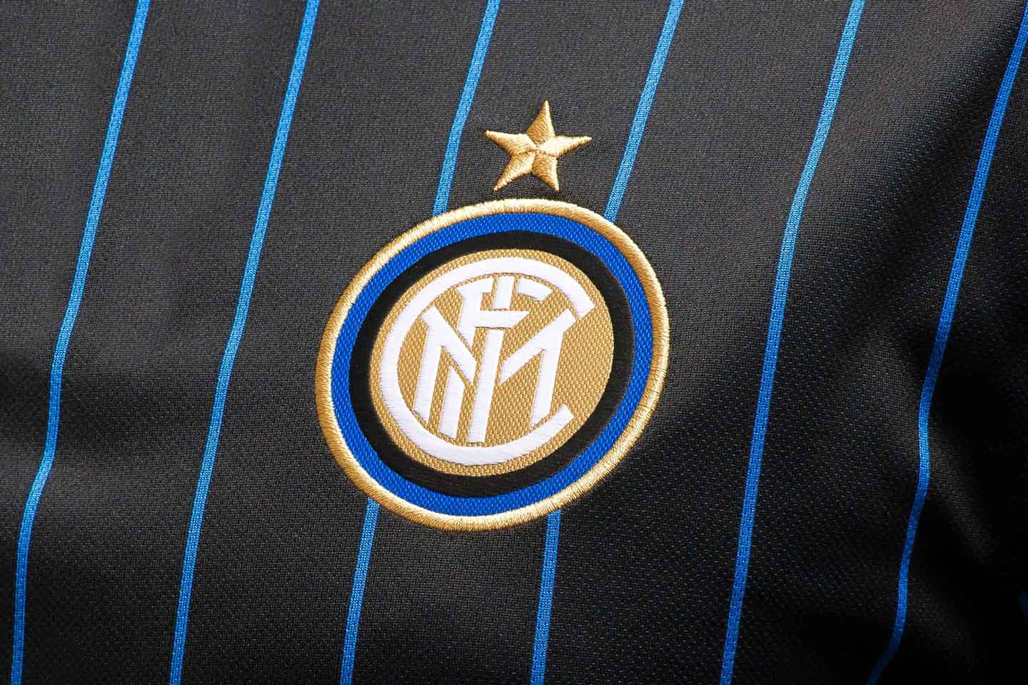
Inspired by the vintage 1908 pictogram, the logo was redesigned. The usage of the Inter star was redefined so that it represents the number of league titles won and is only mandatory on the team jersey. To complement Inter's contemporary new look, we introduced an exclusive custom font, the Inter Metric typeface, designed by Kris Sowersby.
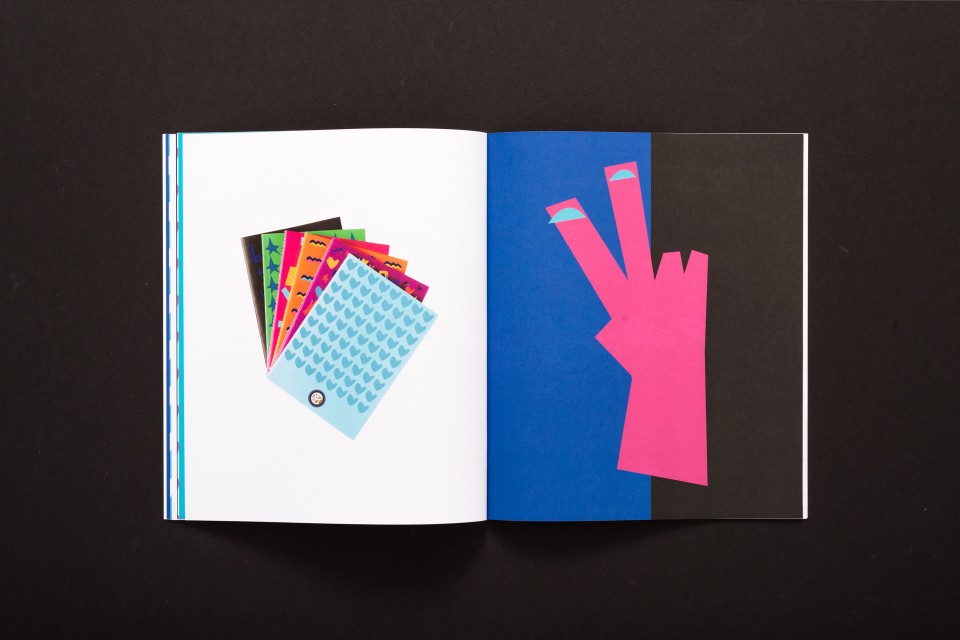
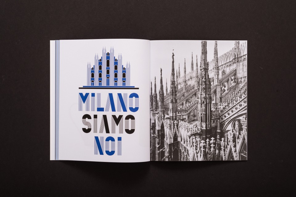
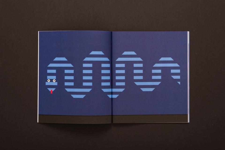
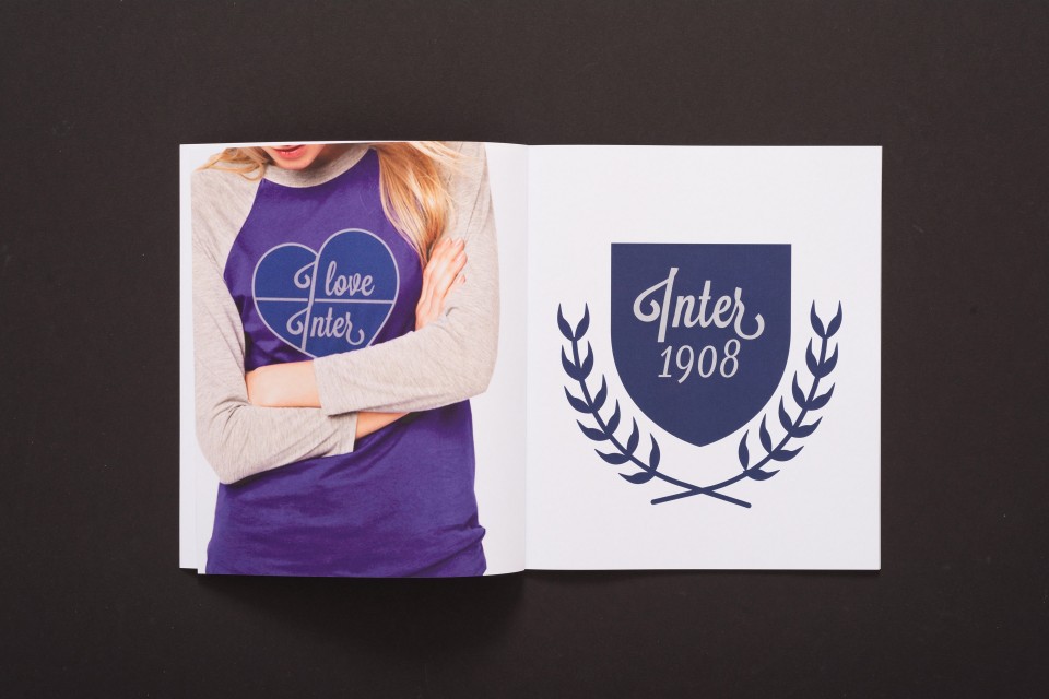
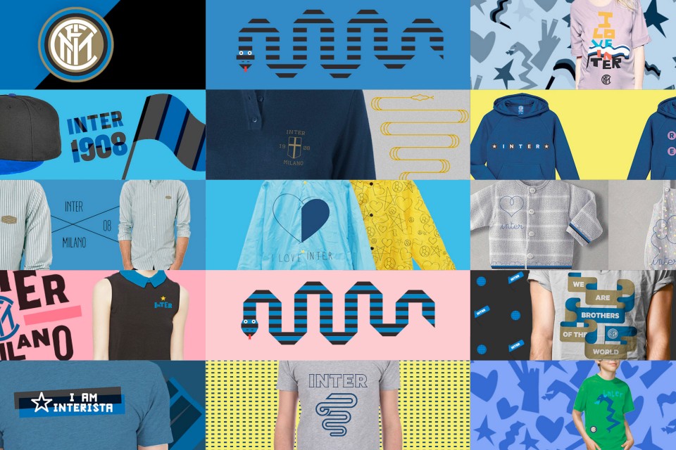

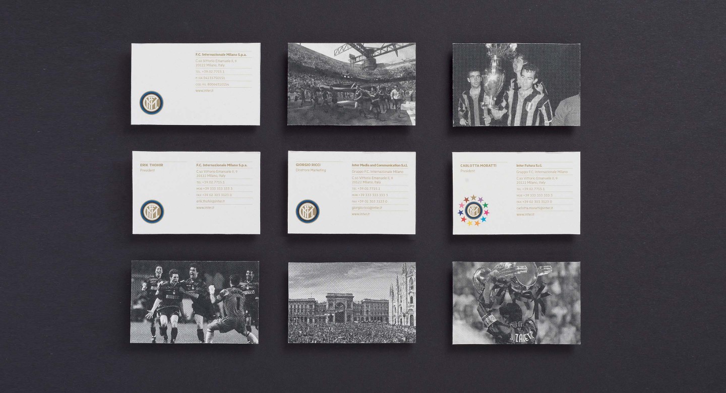
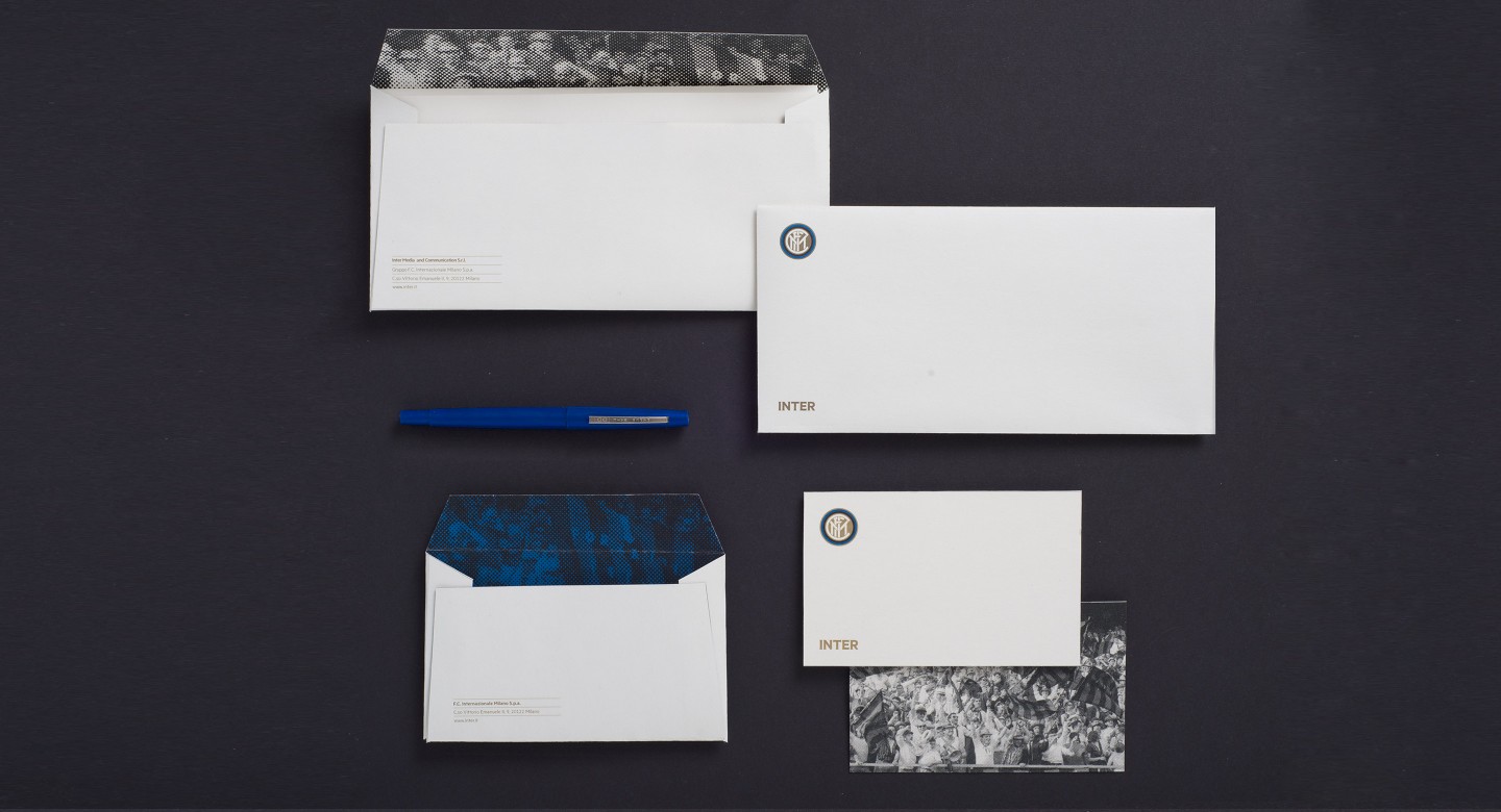
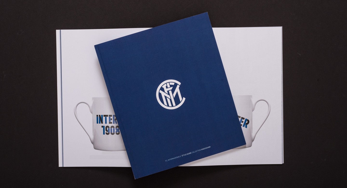
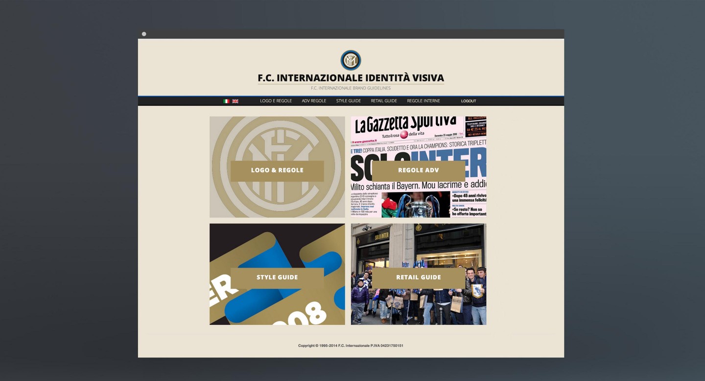
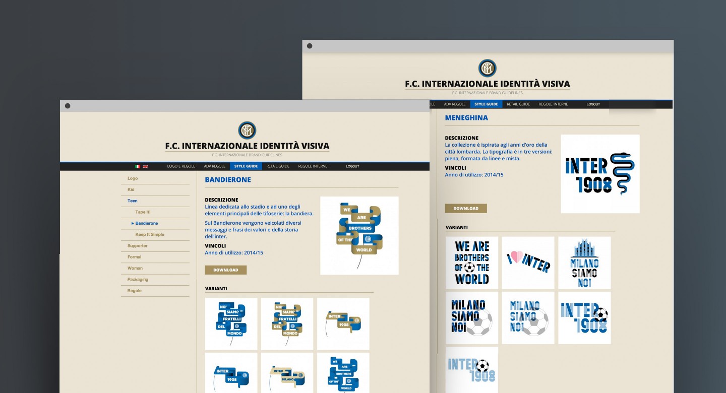
We developed a global, detailed style guide containing usage rules for the logo, fonts, packaging, and a collection of 16 custom colour and background patterns. The documentation of these brand visuals are a unique companion containing precise and inspiring guidelines for designers, licensors, and suppliers.
Collections
An overview of our wide fields of action
-
Logos & Trademarks
What makes a brand memorable and unique.
-
Environments & Exhibits
Designing for spaces: from signage to cultural display, from retail to events
-
Art & Culture
We had the chance to work for museums, institutions and organization in Italy and worldwide
-
Educational
Designing for school publishing
-
Type Design
We love typography, we design typefaces, from lettering to complete custom type families.
Case Studies
selected projects
-
Layout, installations, and multimedia content
The Future Unfolds
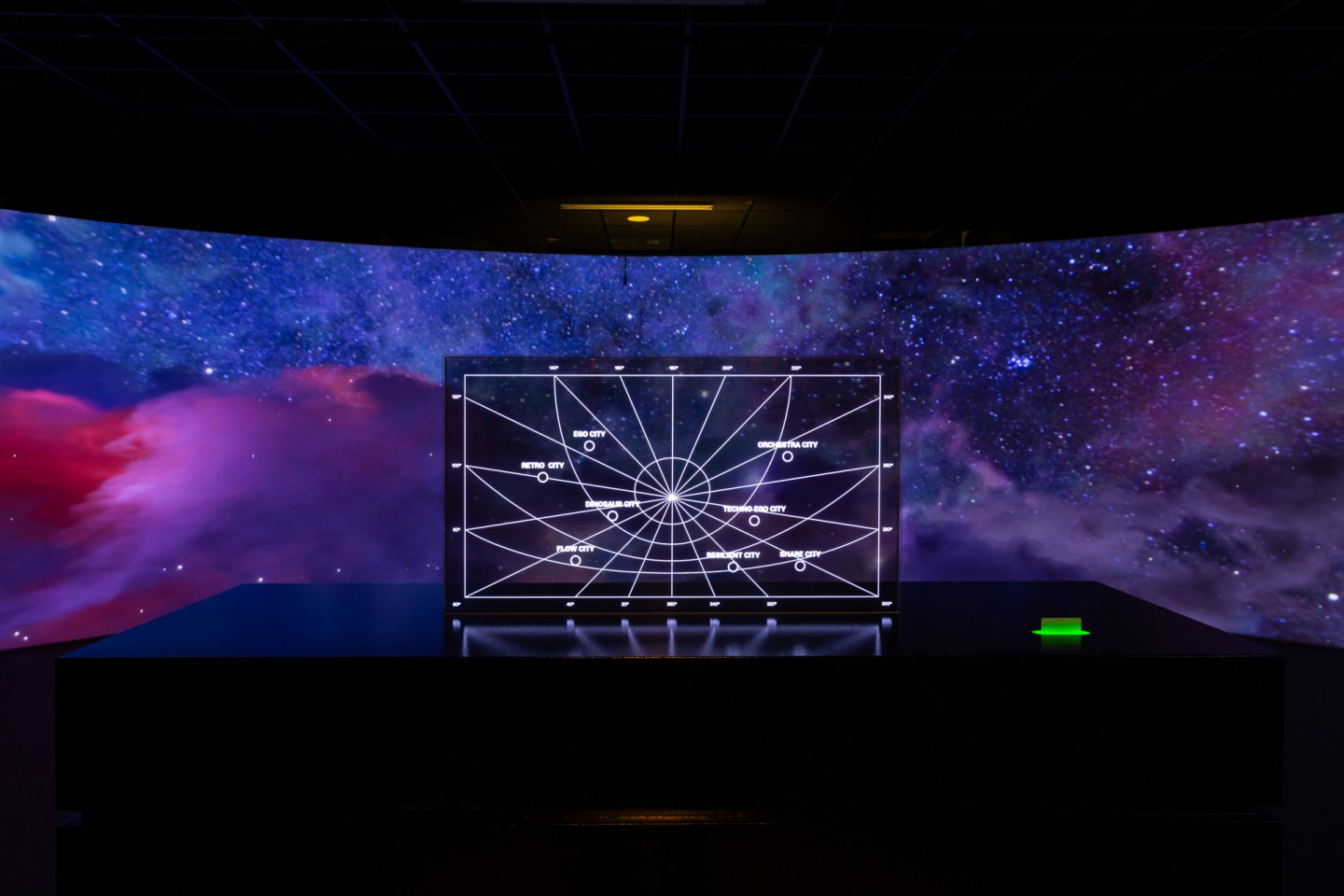
An immersive and interactive journey to explore the future of mobility
-
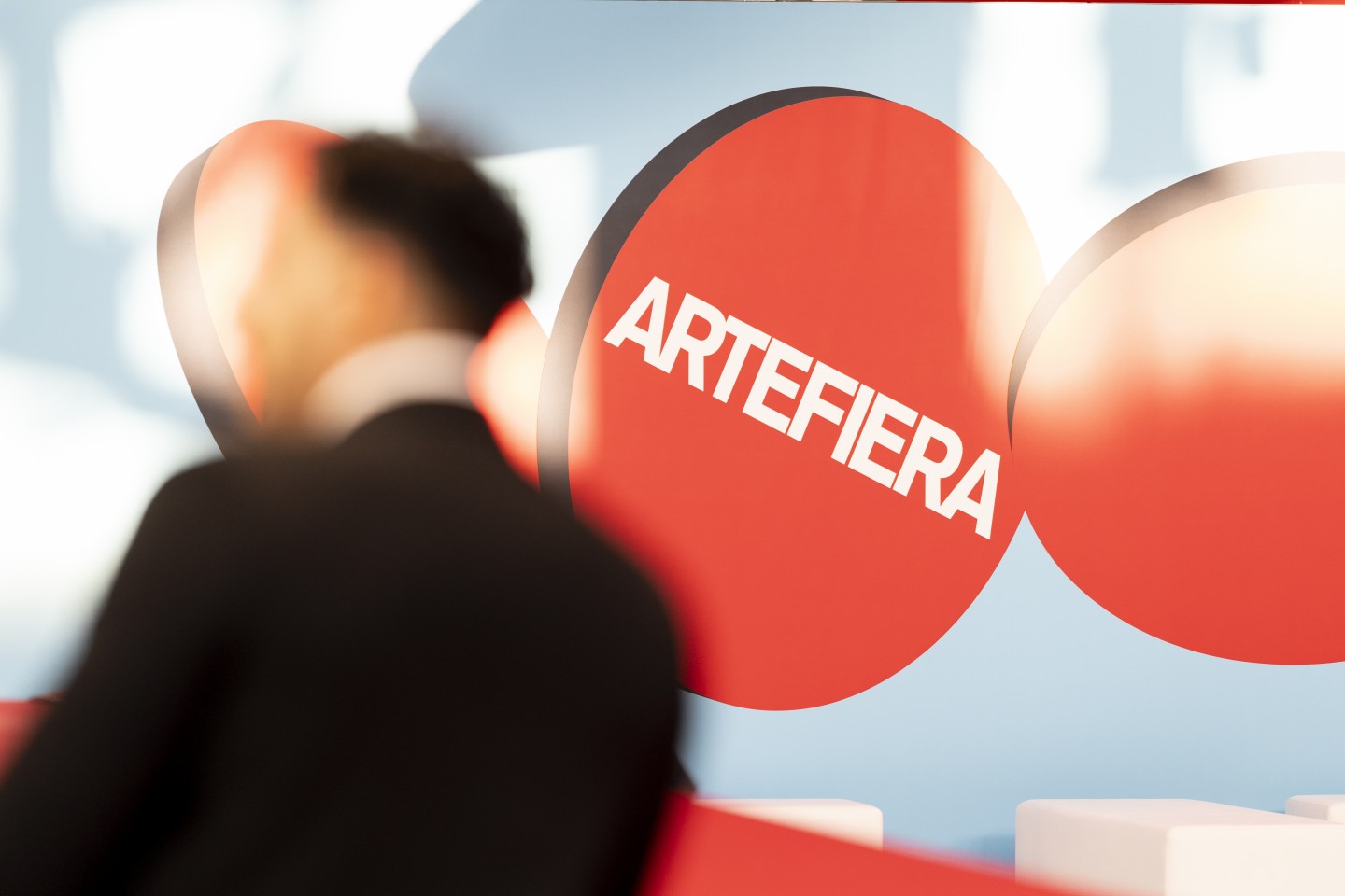
visual identity
Artefiera Bologna 2025
A vibrant, pop-inspired restyling marks the 48th edition
-
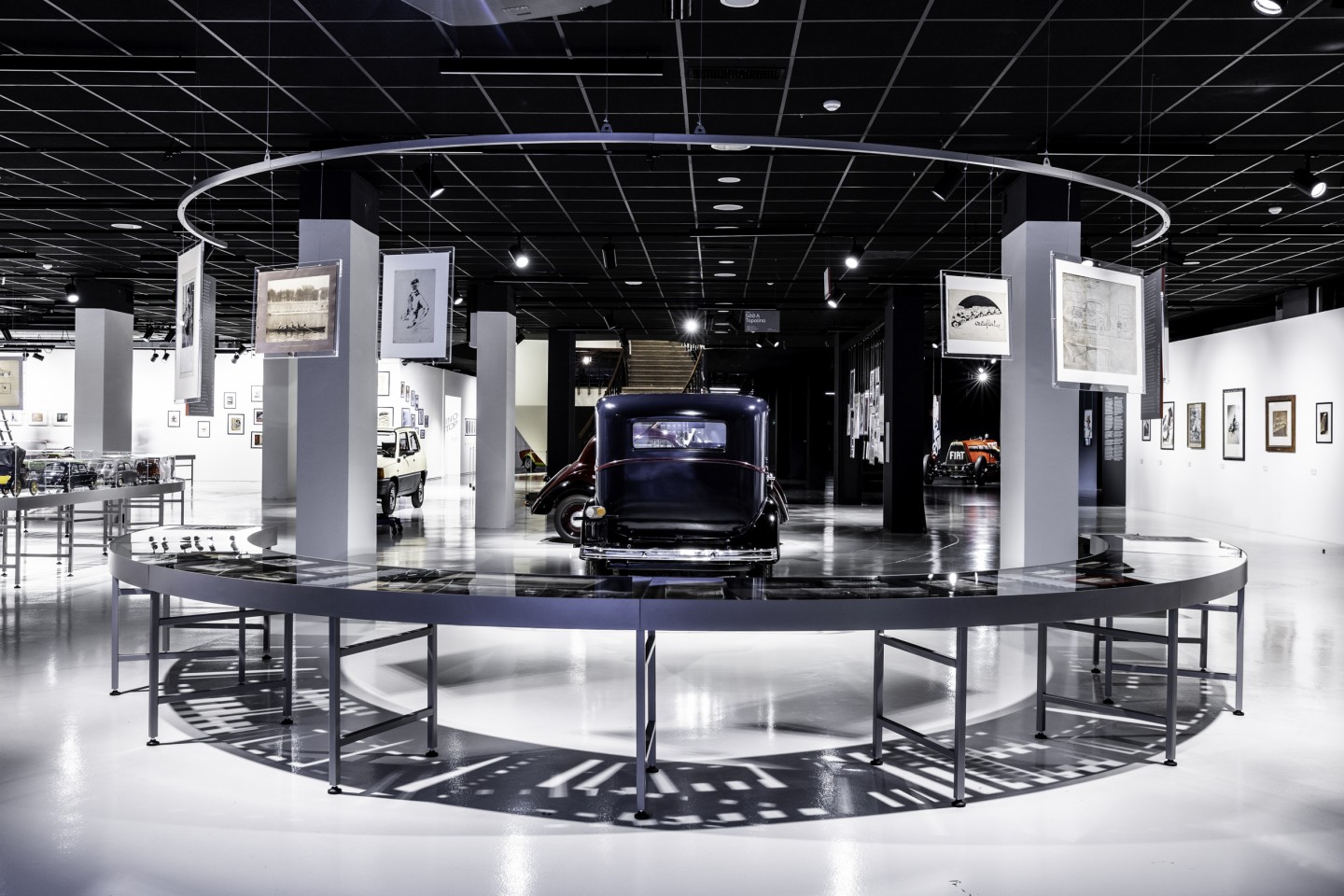
exhibition design
125 Volte Fiat
An exhibition celebrates FIAT’s 125th anniversary
-
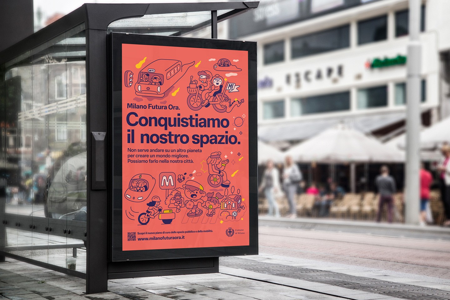
ADI Design Index 2025
Conquistiamo il nostro spazio
OOH campaign and website on shared public spaces and active mobility in Milan.
