Loescher product and identity
How to reinvent the whole identity of a glorious italian publisher?
“It’s nice to live again after death”, says the quote which Loescher—the historic educational publisher from Turin—adopted as its motto. In order to advance you need to remember the past and nourish from it, just like the unlikely character present in the logo does. A tradition is a story that someone chooses to tell, and our work for Loescher had this purpose in mind: to build an identity capable of narrating value trough a renovated look for a publisher who has always been a symbol of prestige and great knowledge.
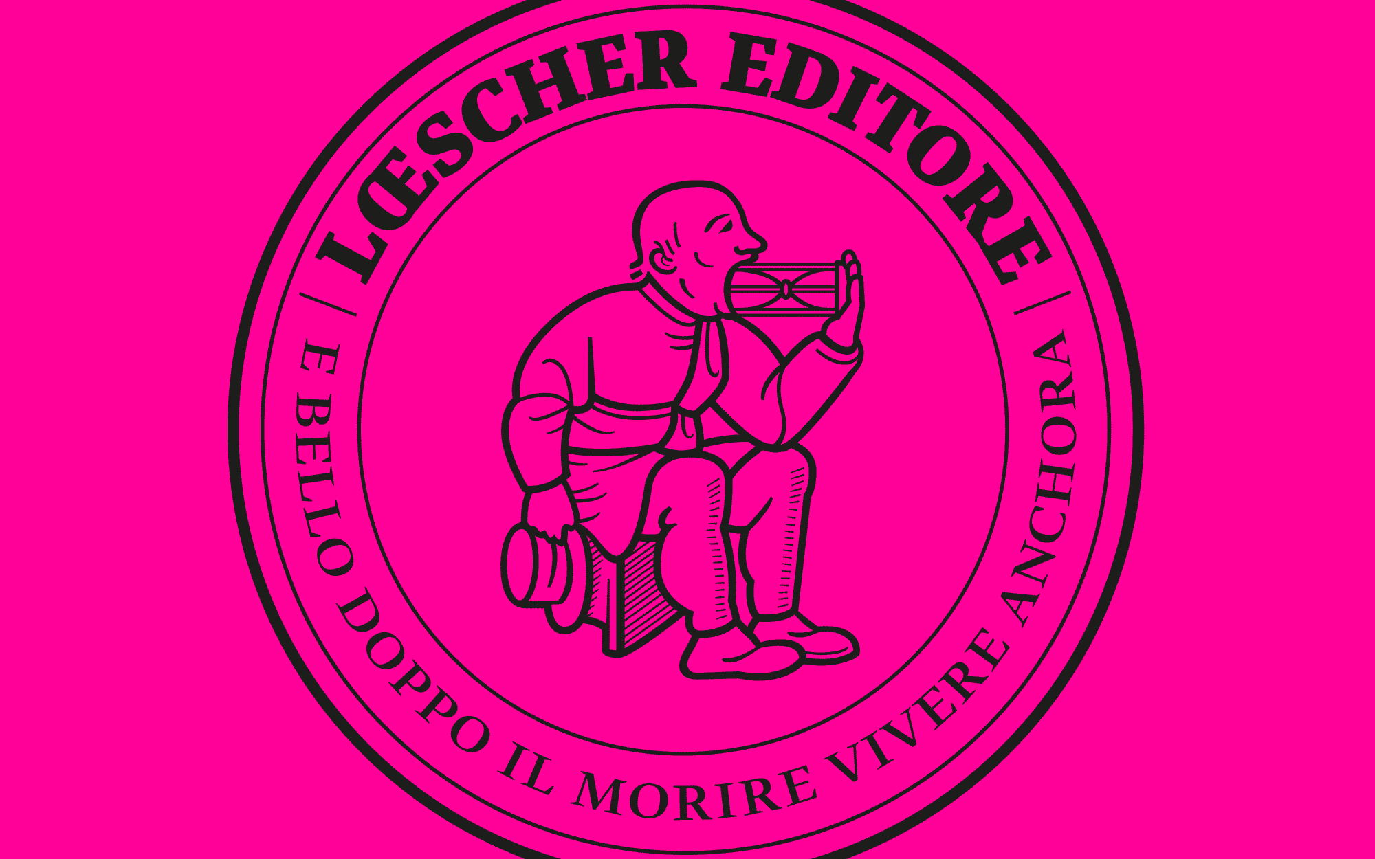
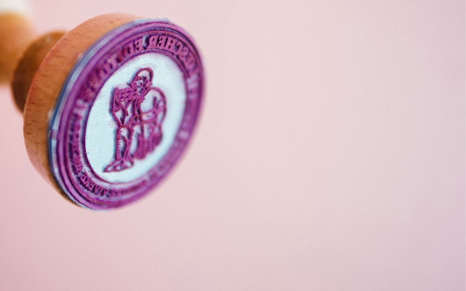
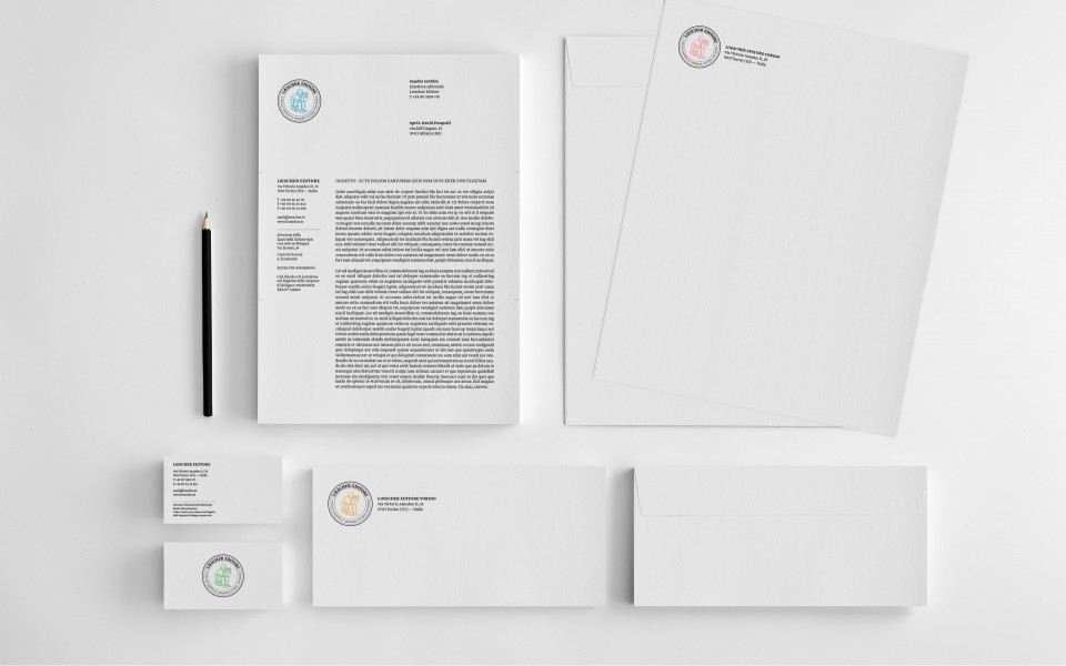
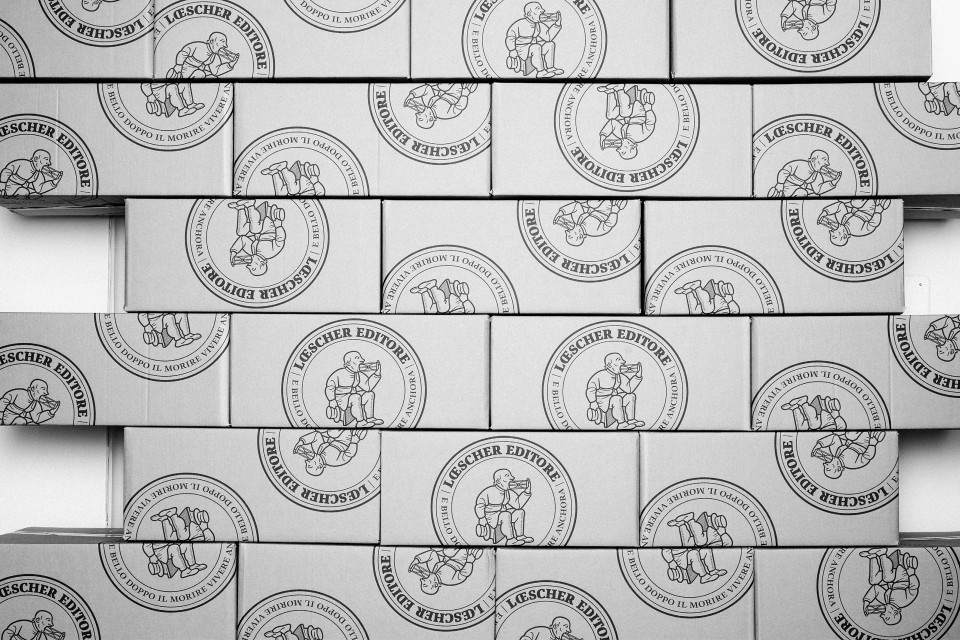
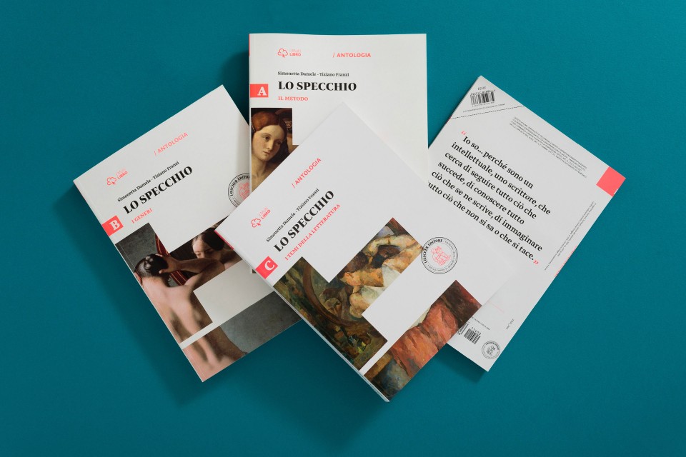
We started from the logo, which was redesigned and transformed into a seal expressing both quality and expertise. The fluorescent colors we chose give a pop-like and contemporary feel to the historic brand, and the free positioning of the seal on the products helps deliver a dynamic and modern sense of craftsmanship.
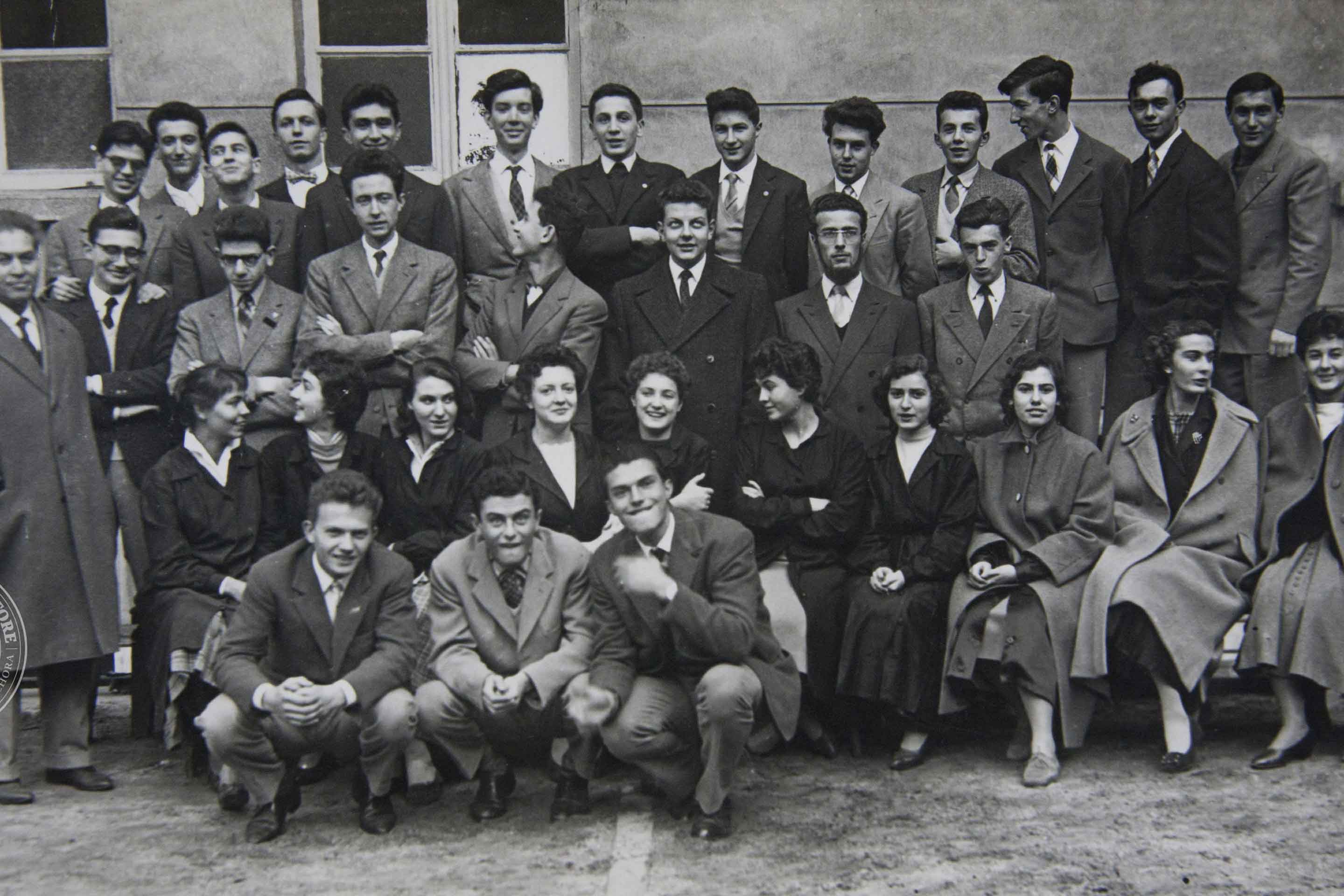
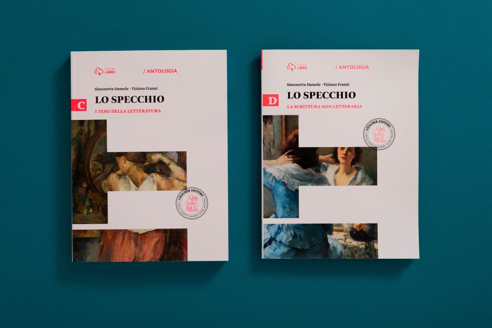
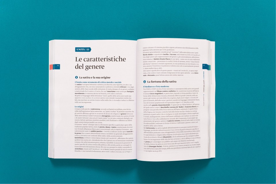
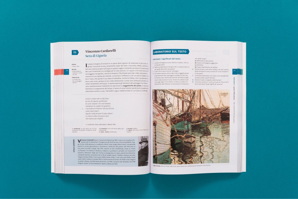
In order to rethink and redesign the whole editorial system—with more than 150 new covers and 60 collections of books—our work was inspired by the most iconic of Loescher products, IL: the famous Italian-Latin-language dictionary. It is a tool used by three generations of students, and an indispensable part of Italy’s culture for the last 50 years. Essential lines, strong lettering, and sobriety: these visual values guided the construction of the new Loescher visual identity. It is a tribute to the letter as the distinctive element of civilization and Western culture.
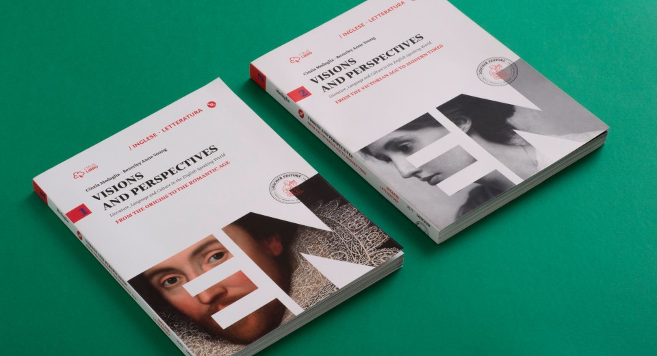
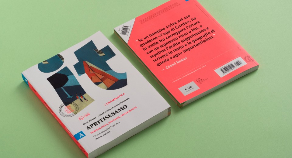
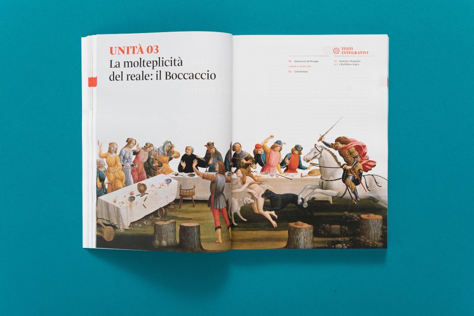
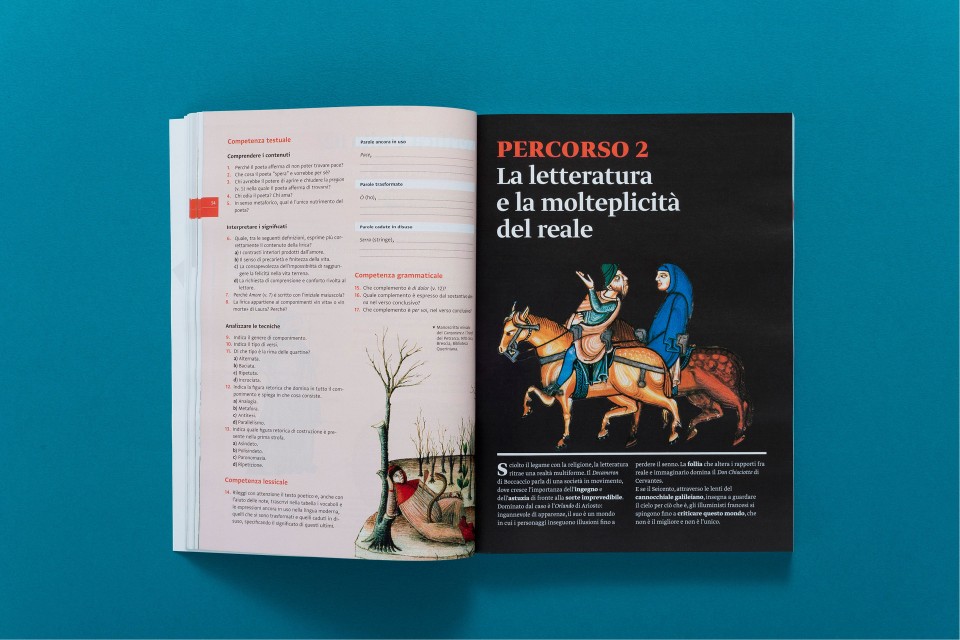
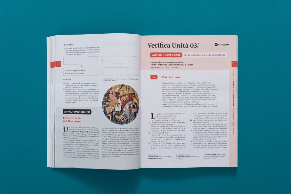
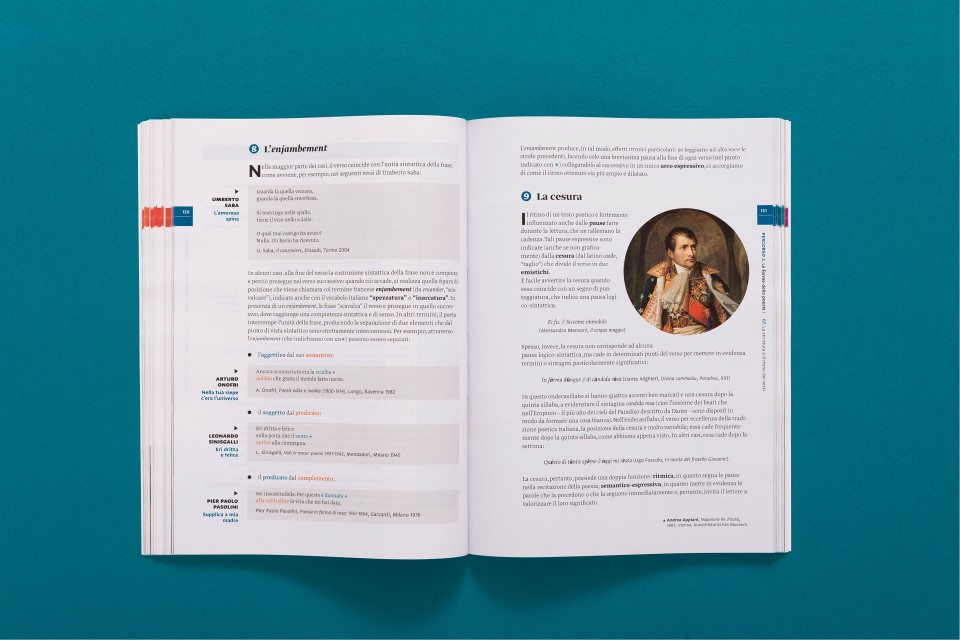
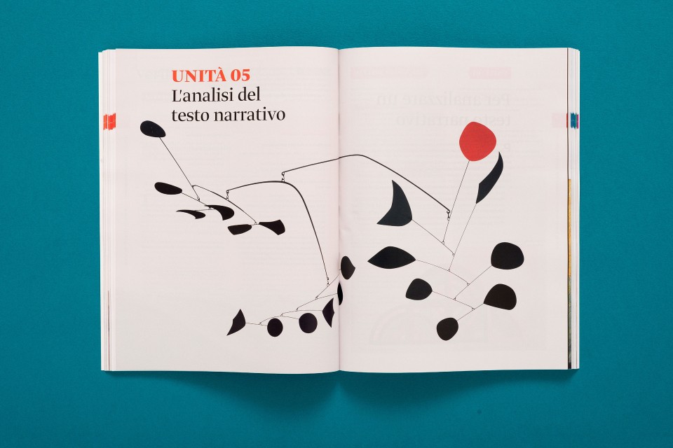
Essential acronyms allow the user to immediately recognize not only the Loescher brand, but also the subject matter of each publication. Furthermore, colors and images are used as the lining that enrichen all areas of knowledge. In managing this ambitious operation, we collaborated with some of the best italian contemporary illustrators, who designed exclusive images for the new covers and collections. Our selection includes artists such as Riccardo Guasco, Irene Laschi and Stefano Marra.
The new graphic-theorical system is formally explained trough a style guide we created, which contains all the necessary information in order to design future publications. It is our Loescher guide for tomorrow’s tradition.
Collections
An overview of our wide fields of action
-
Logos & Trademarks
What makes a brand memorable and unique.
-
Environments & Exhibits
Designing for spaces: from signage to cultural display, from retail to events
-
Art & Culture
We had the chance to work for museums, institutions and organization in Italy and worldwide
-
Educational
Designing for school publishing
-
Type Design
We love typography, we design typefaces, from lettering to complete custom type families.
Case Studies
selected projects
-

Layout, installations, and multimedia content
The Future Unfolds
An immersive and interactive journey to explore the future of mobility
-

exhibition design
125 Volte Fiat
An exhibition celebrates FIAT’s 125th anniversary
-

Campaign Design
Conquistiamo il nostro spazio
OOH campaign and website on shared public spaces and active mobility in Milan.
-

Event Design
Inspiring Cities
COIMA 50th Anniversary Event