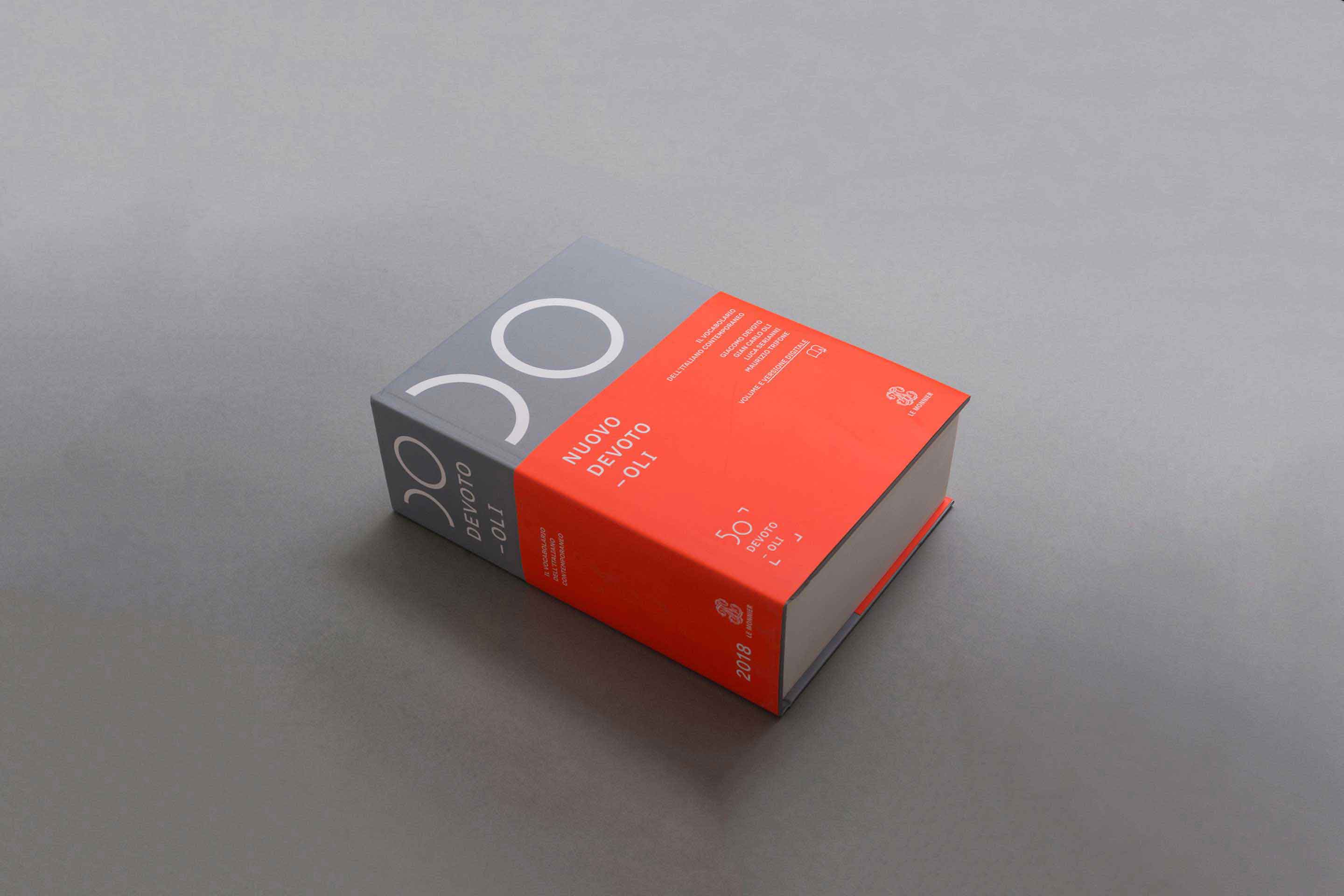
Nuovo Devoto-Oli
A new idea and a new image for one of the most important Italian dictionary
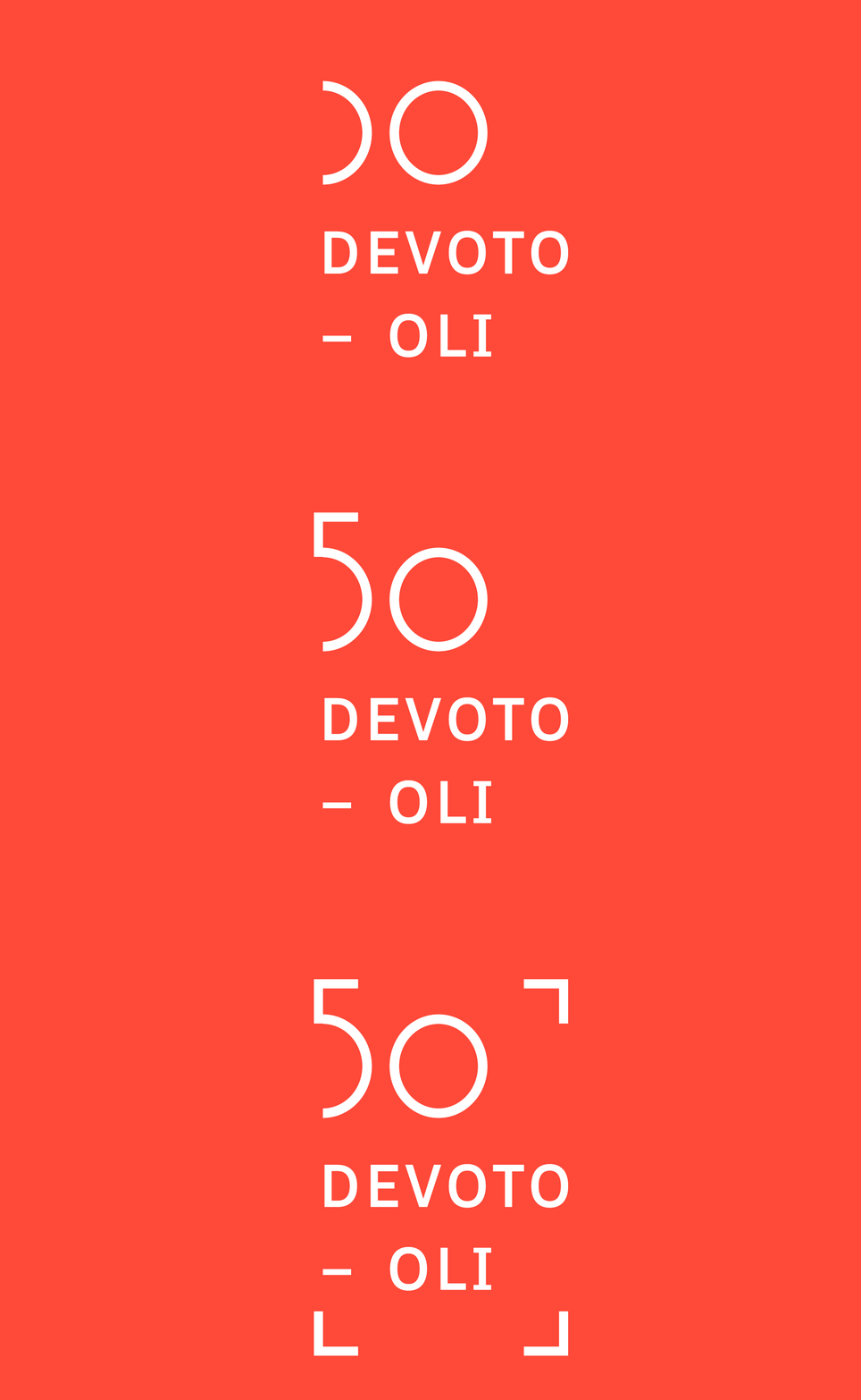
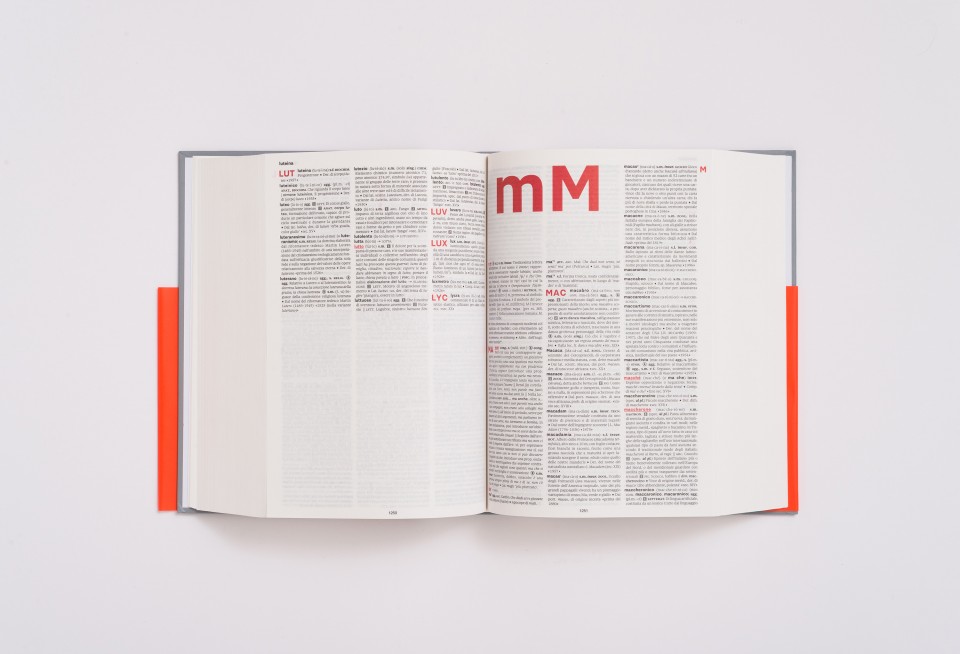
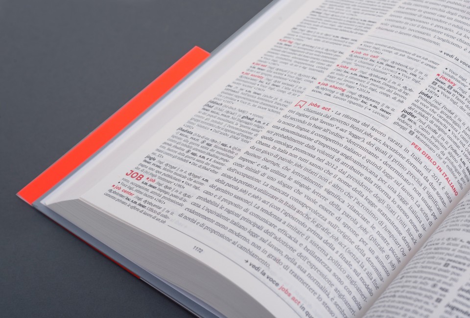
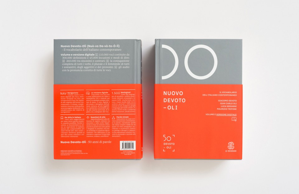
Devoto-Oli is one of the most important Italian dictionaries, published by Le Monnier. The new edition “Nuovo Devoto-Oli” and a new logo were specifically designed to celebrate the dictionary’s 50 years anniversary. The main purpose of the design was to create a new idea of a dictionary, an enjoyable and easy-to-use tool able to improve the mastery of a language. The volume was made lighter both in terms of reading and navigation. A special microtypography has been set including hierarchies, use of colour, and symbols that define the new text organisation. The typefaces used are Sole Serif by Cast Foundry and Nitti Grotesk by Bold Monday.
Nuovo Devoto-Oli was honoured with the “Certificate of Typographic Excellence” TCD64 & Bronze at Laus Awards.
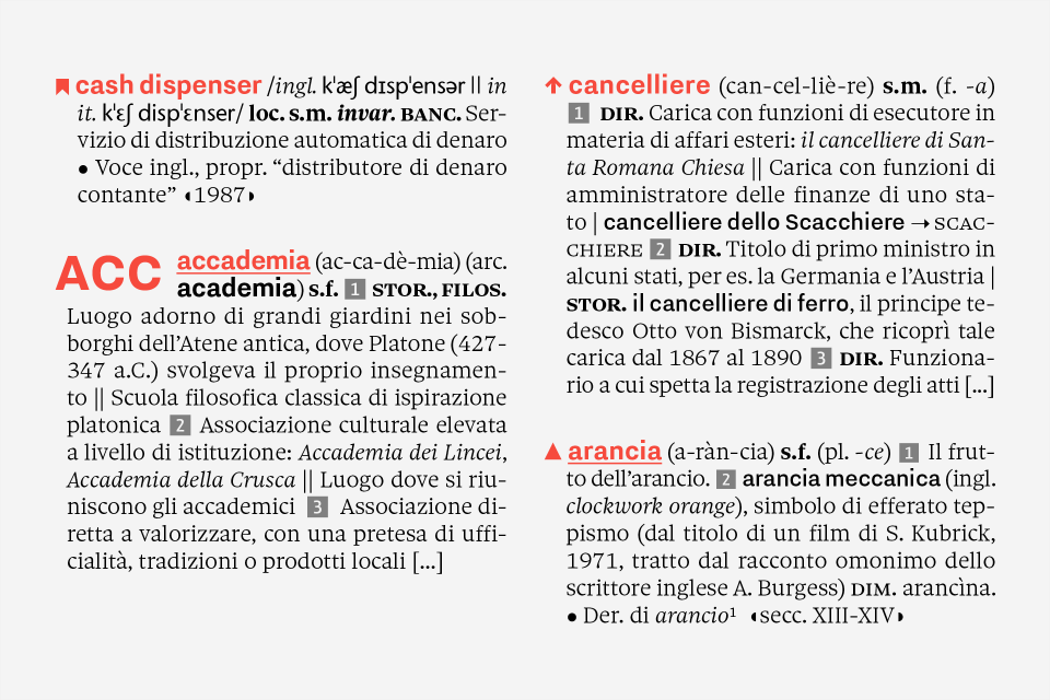
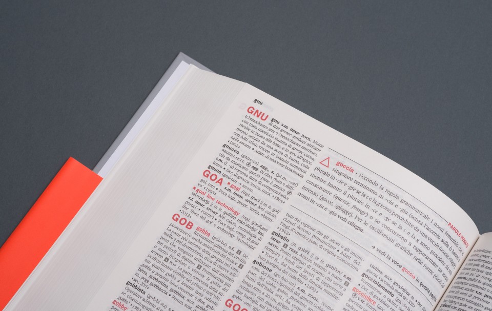
The colour highlights what the reader should see at a first sight, while the drop cap letters help the words research on the page. One of the main innovations was the introduction of three new sections that point out the most used words and common mistakes. These features represent special words, and each one has its own symbol and a two-columns-box, as an in-depth analysis. The page opening is marked by a big letter, both in lowercase and uppercase, nested in a white square inside the three-columns grid.
“Nuovo Devoto-Oli” redesign embraced every feature making the volume stand out in the bookshelf with its cropped-book jacket, its microtypography and a new logotype.
Collections
An overview of our wide fields of action
-
Logos & Trademarks
What makes a brand memorable and unique.
-
Environments & Exhibits
Designing for spaces: from signage to cultural display, from retail to events
-
Art & Culture
We had the chance to work for museums, institutions and organization in Italy and worldwide
-
Educational
Designing for school publishing
-
Type Design
We love typography, we design typefaces, from lettering to complete custom type families.
Case Studies
selected projects
-
Layout, installations, and multimedia content
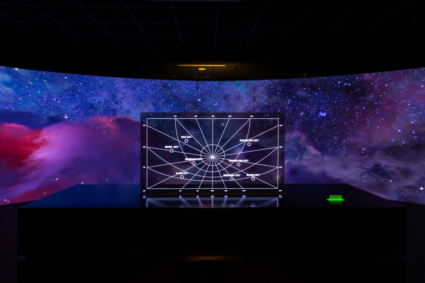
The Future Unfolds
An immersive and interactive journey to explore the future of mobility
-
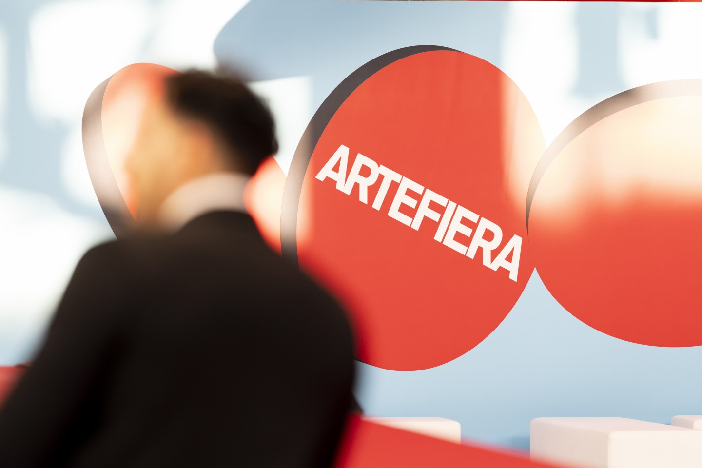
visual identity
Artefiera Bologna 2025
A vibrant, pop-inspired restyling marks the 48th edition
-
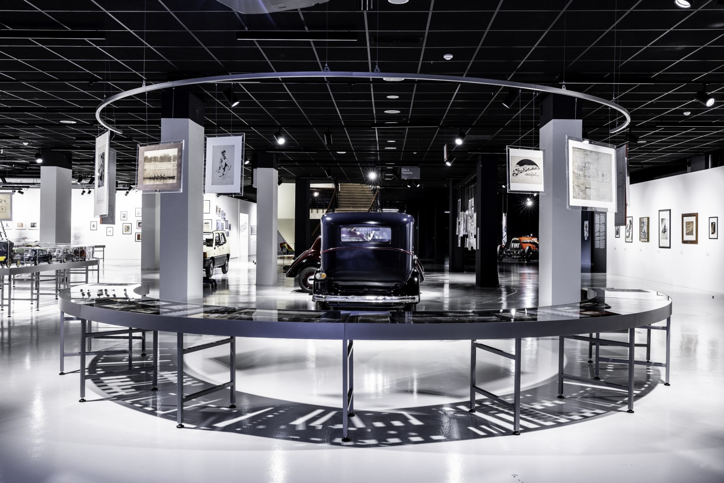
exhibition design
125 Volte Fiat
An exhibition celebrates FIAT’s 125th anniversary
-
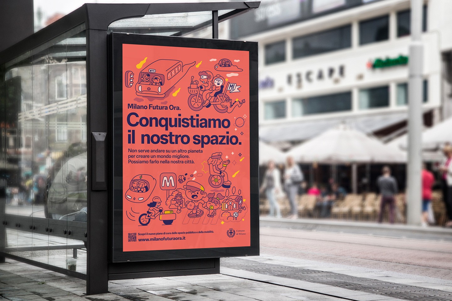
ADI Design Index 2025
Conquistiamo il nostro spazio
OOH campaign and website on shared public spaces and active mobility in Milan.