Virgin Fibra
Visual identity for a new member of the Virgin family.
A brand identity project for Virgin Fibra, the newborn company in the Virgin family, launched to the Italian broadband market in partnership with Open Fiber to provide high-performance connections using only pure fiber.
Based on an accurate analysis of the new company and the benchmark of its competitors, we combined elements from Virgin DNA and those specific to Virgin Fibra.
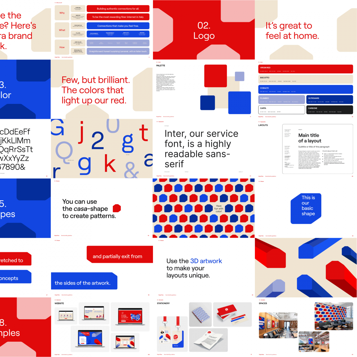
All this, is collected in a detailed Brand Identity Guideline that spans from the logo and colour palette to the tone of voice and the visual expression applied across everything from digital and photography to environment and merchandise.

The challenge was to build an entirely new identity capable of making the new brand stand out among the many players already operating in the telecommunication market while staying true to the Virgin spirit and embodying its own principles: simplicity, the Italian touch, the Virgin touch, and authenticity.
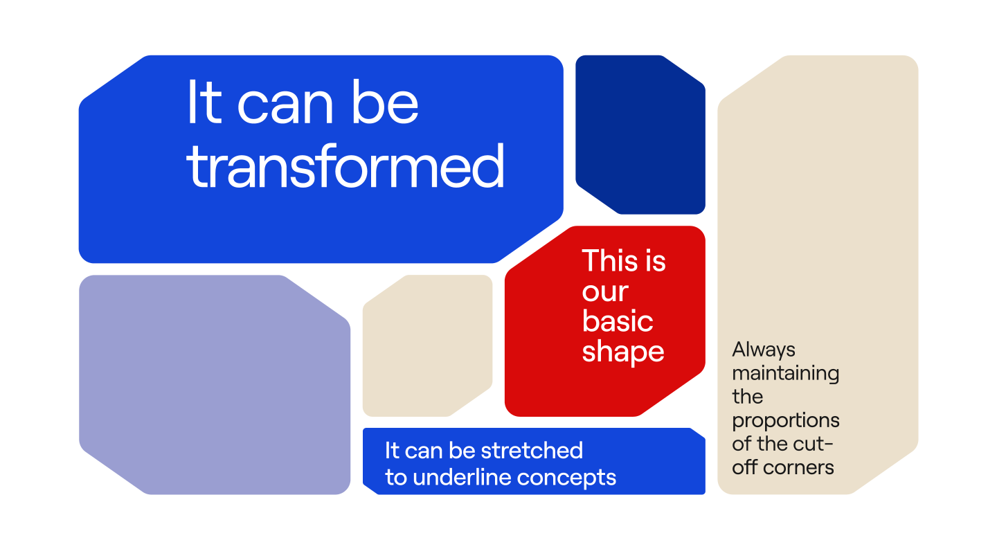
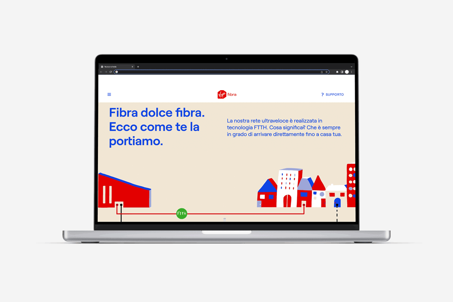
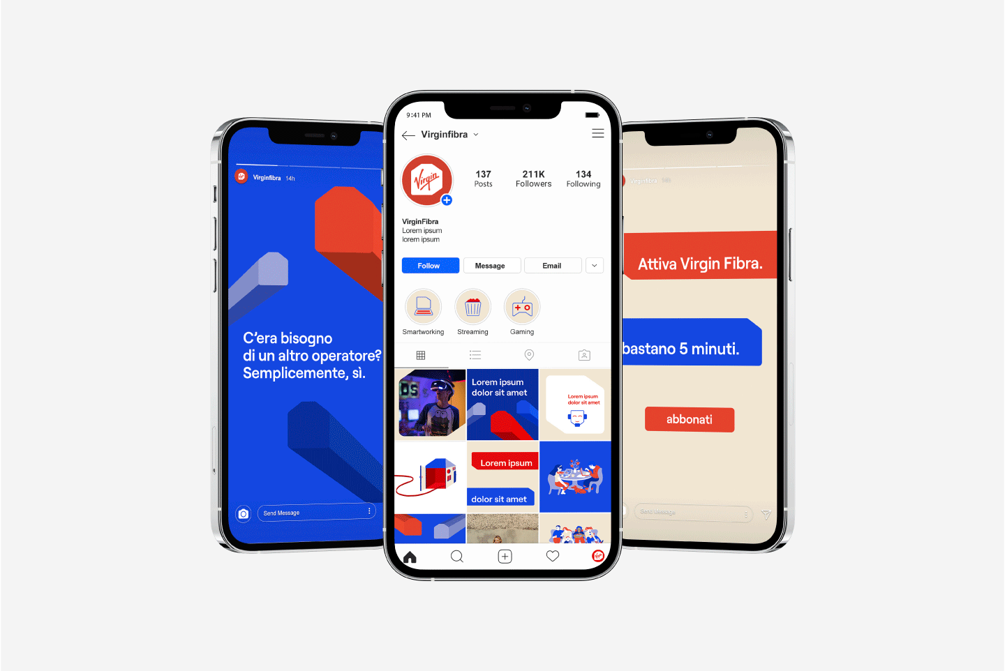
Virgin Fibra is the first Virgin service to enter its customers' homes. That is why we put the Virgin lettering in a simple shape that reminds a house, the casa-shape. Fibra, the Italian word for fibre completes the brand and points to their offer.
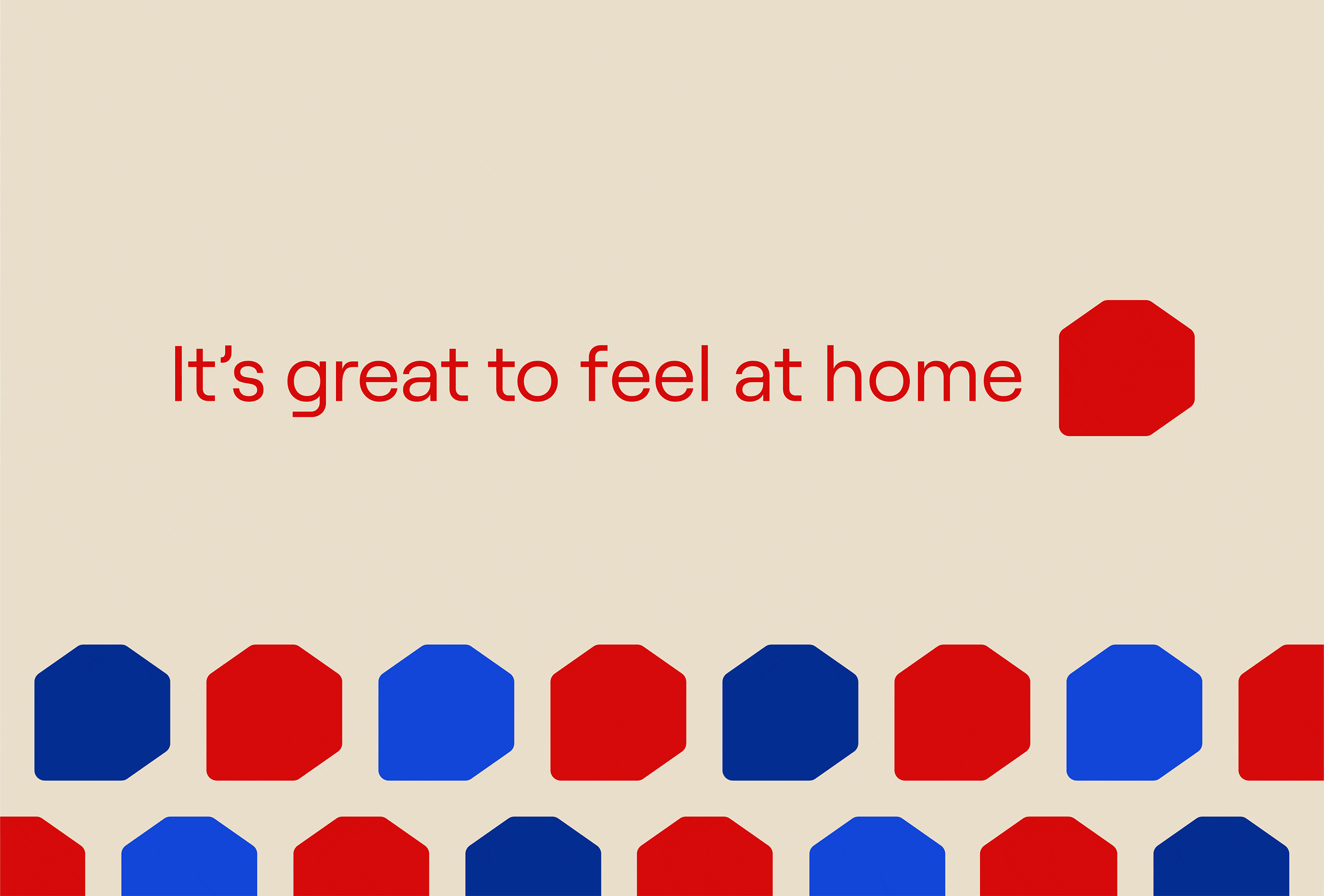
We created an image that shows the human side of technology and provides a familiar feeling, from a bright colour palette and contemporary typography to the symbolic casa-shape that can form abstract patterns and 3D artworks.
The basic shape can be extended to the entire visual language to be used for different communication needs. Following a set of simple rules, it can be stretched to underline concepts, and partially exit from the sides of the artwork.
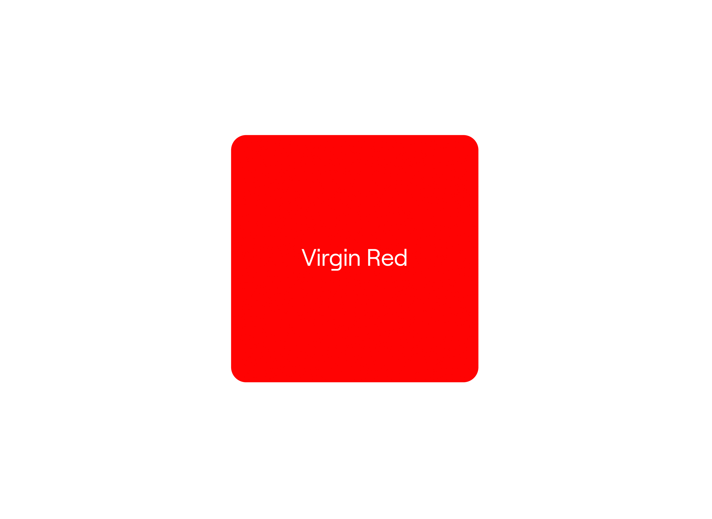
A few brilliant colours light up the distinctive Virgin Red supporting the brand recognizability.
In addition, pastel tones complete the brand palette and enhance the brand identity creating a balance between saturated and opaque tones.
Together, the colours of Virgin Fibra refer to a familiar feeling, creating a palette with an all-encompassing, yet cool feel that aspires to be timeless.
In collaboration with
Sound Design - Dario Moroldo
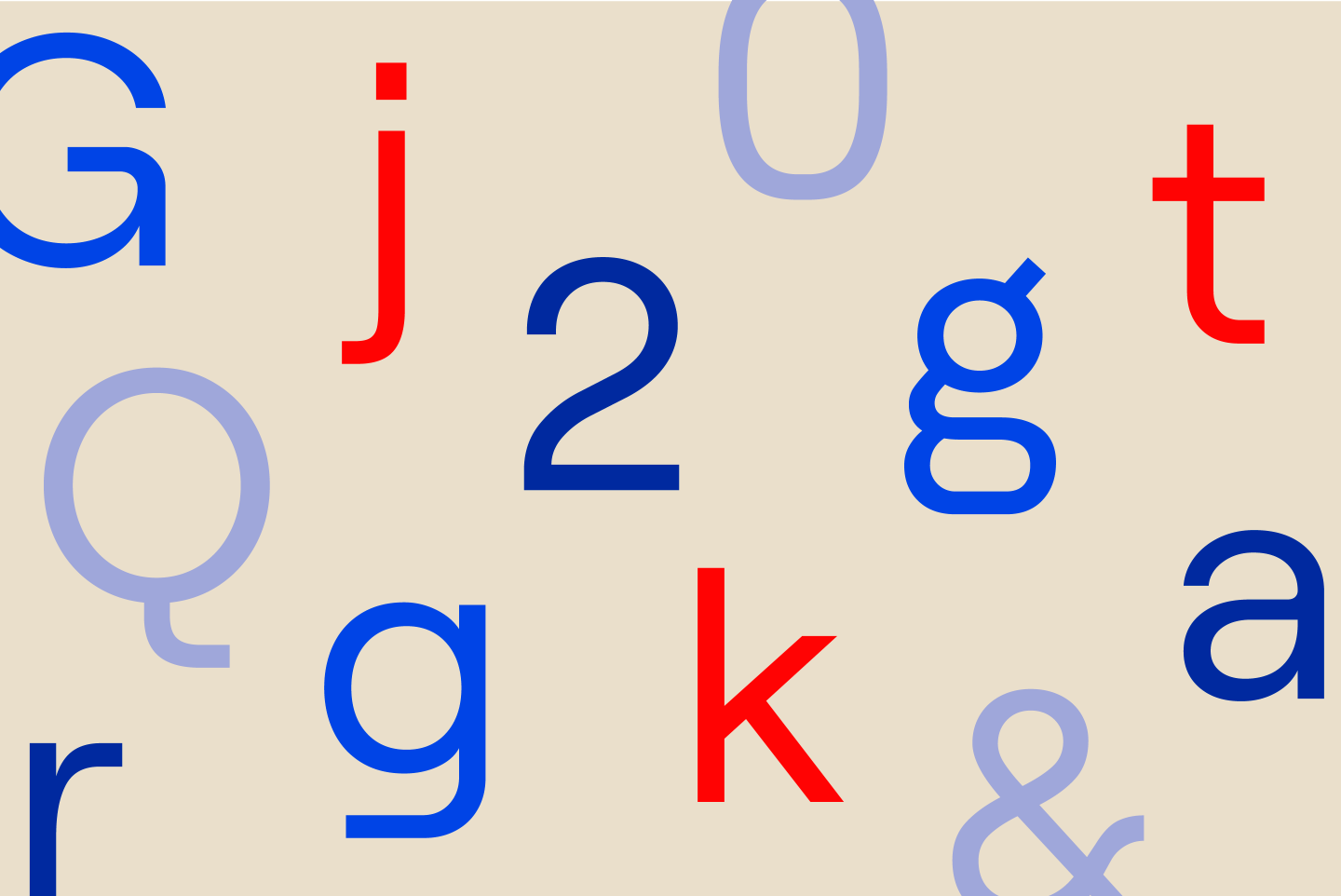
Font in use
Roobert by Displaay
Inter by Rasmus Andersson

Collections
An overview of our wide fields of action
-
Logos & Trademarks
What makes a brand memorable and unique.
-
Environments & Exhibits
Designing for spaces: from signage to cultural display, from retail to events
-
Art & Culture
We had the chance to work for museums, institutions and organization in Italy and worldwide
-
Educational
Designing for school publishing
-
Type Design
We love typography, we design typefaces, from lettering to complete custom type families.
Case Studies
selected projects
-

Layout, installations, and multimedia content
The Future Unfolds
An immersive and interactive journey to explore the future of mobility
-

visual identity
Artefiera Bologna 2025
A vibrant, pop-inspired restyling marks the 48th edition
-

exhibition design
125 Volte Fiat
An exhibition celebrates FIAT’s 125th anniversary
-

ADI Design Index 2025
Conquistiamo il nostro spazio
OOH campaign and website on shared public spaces and active mobility in Milan.