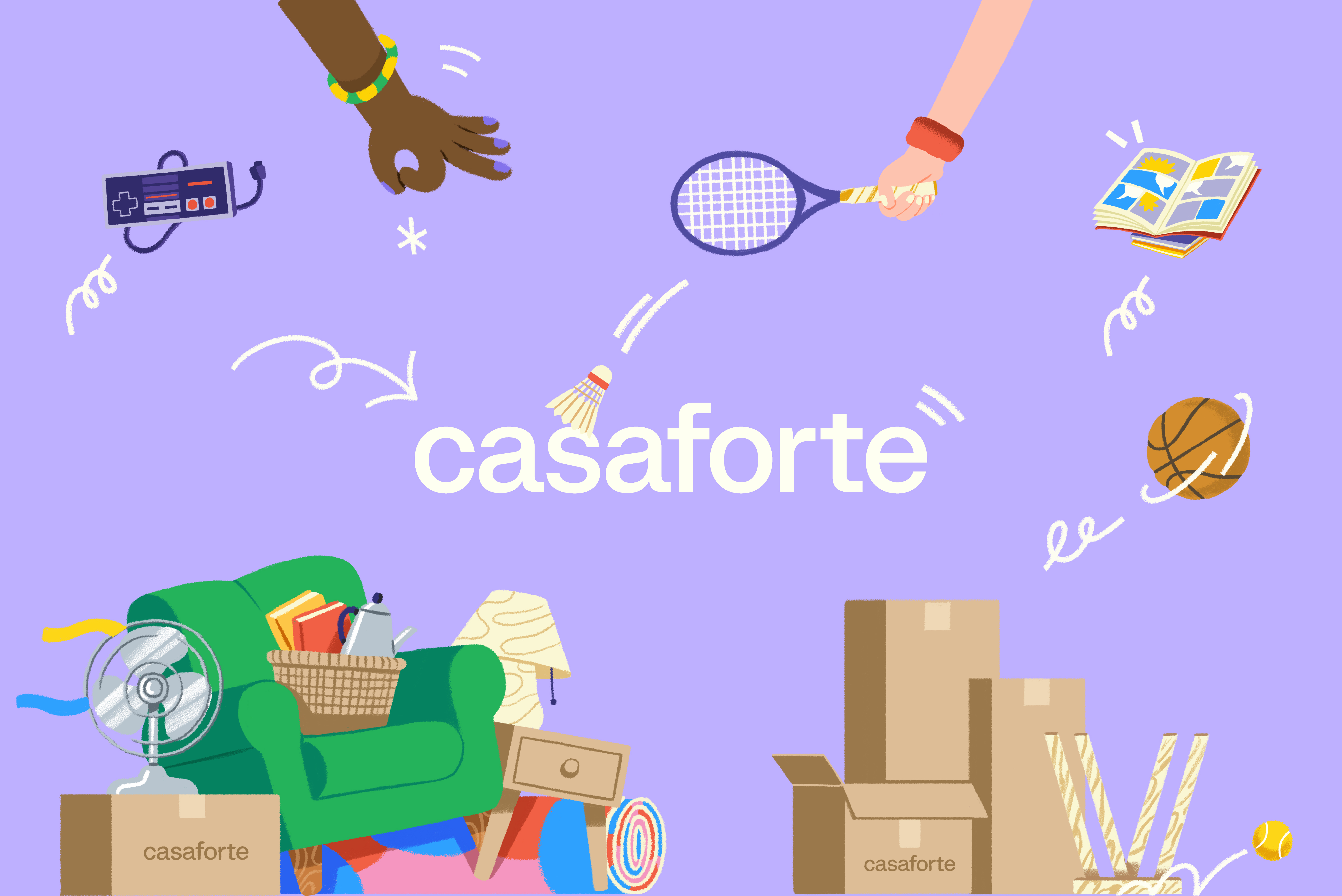
Casaforte - The neverending storage
Rebranding and communication campaign
Casaforte is an Italian pioneer in self storage. After years of building a solid reputation around trust, security and quality, the brand entered a new phase: growing without losing what made it credible in the first place.
Our work began with this tension. Rather than replacing an established identity with a new one, we looked for a way to make its existing strengths move forward — turning solidity into energy, experience into relevance, and reliability into a more contemporary expression.
Strategy, visual identity and communication were developed as one system. The result is a brand that moves beyond the idea of storage as a functional service, positioning Casaforte as something more immediate: a simple, secure and always-available answer to one of everyday life’s most persistent problems — finding space.
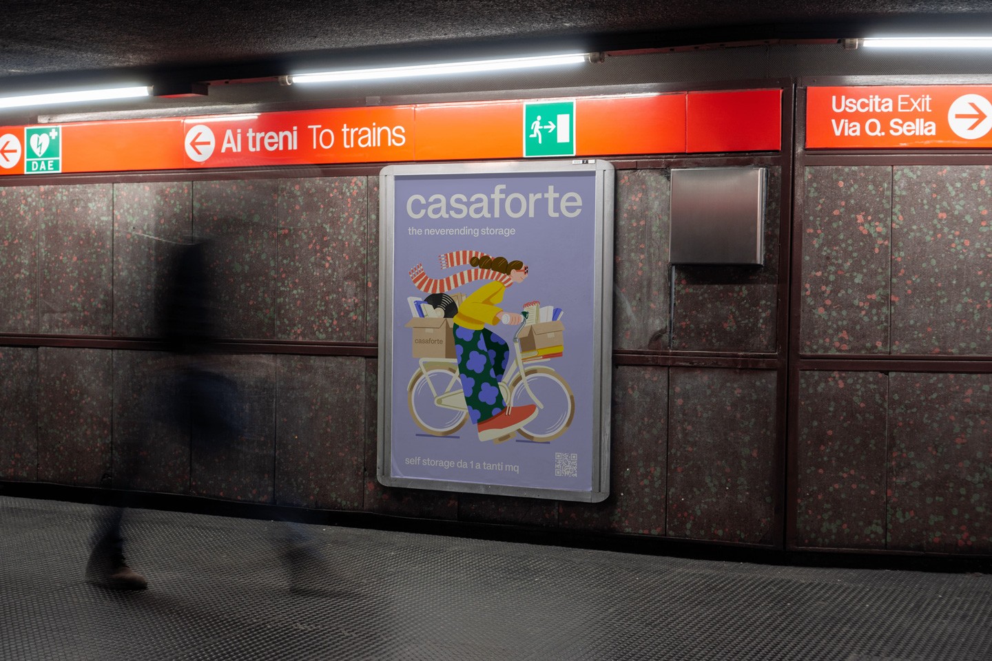
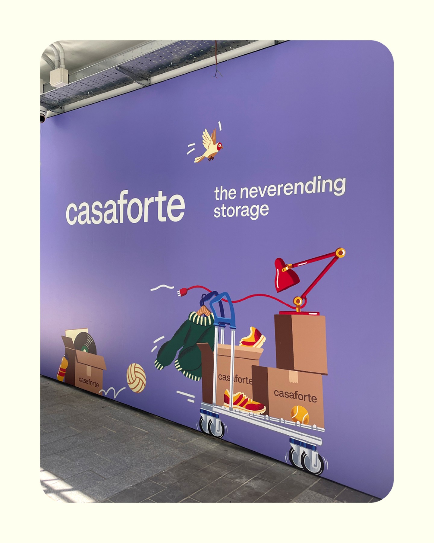
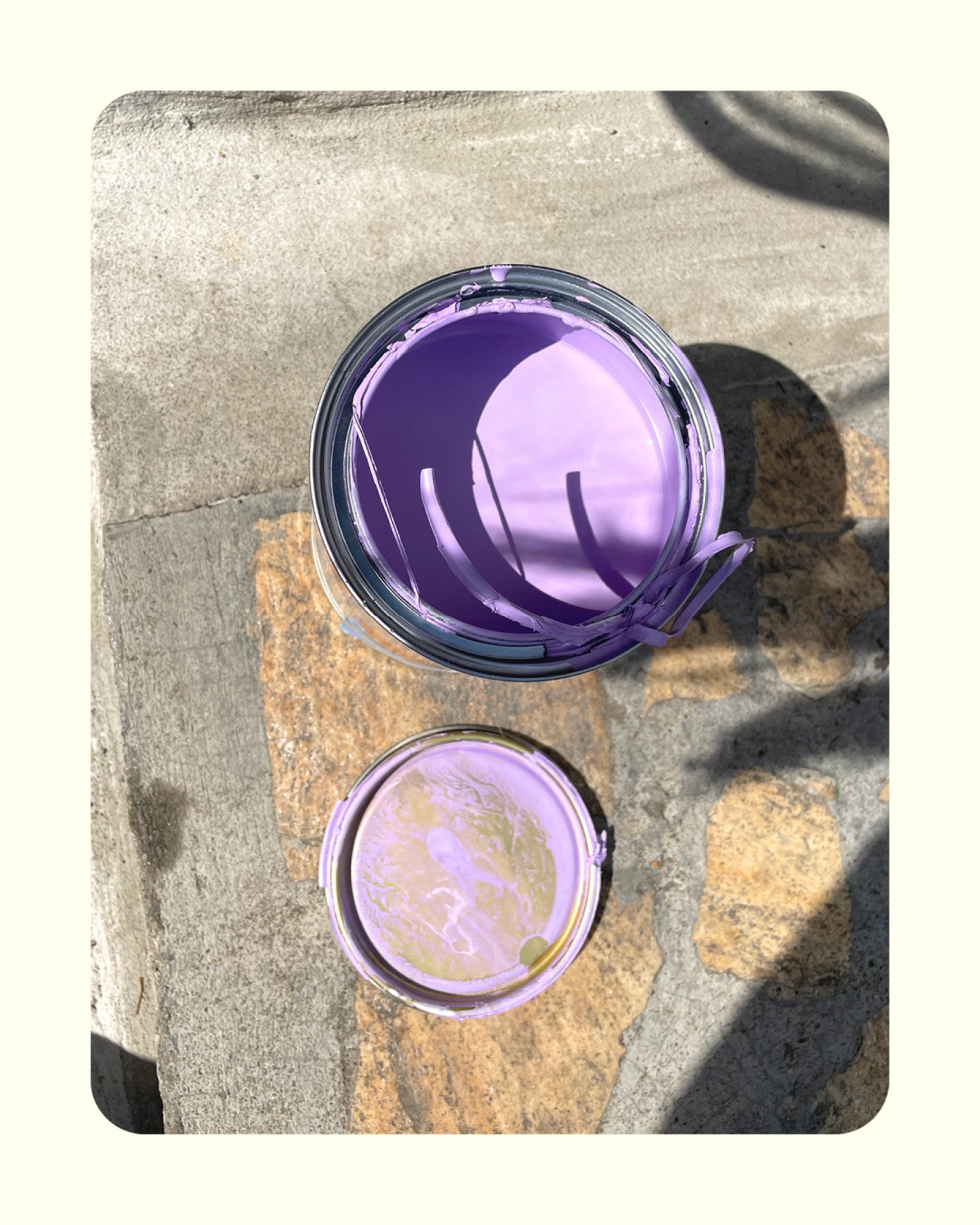
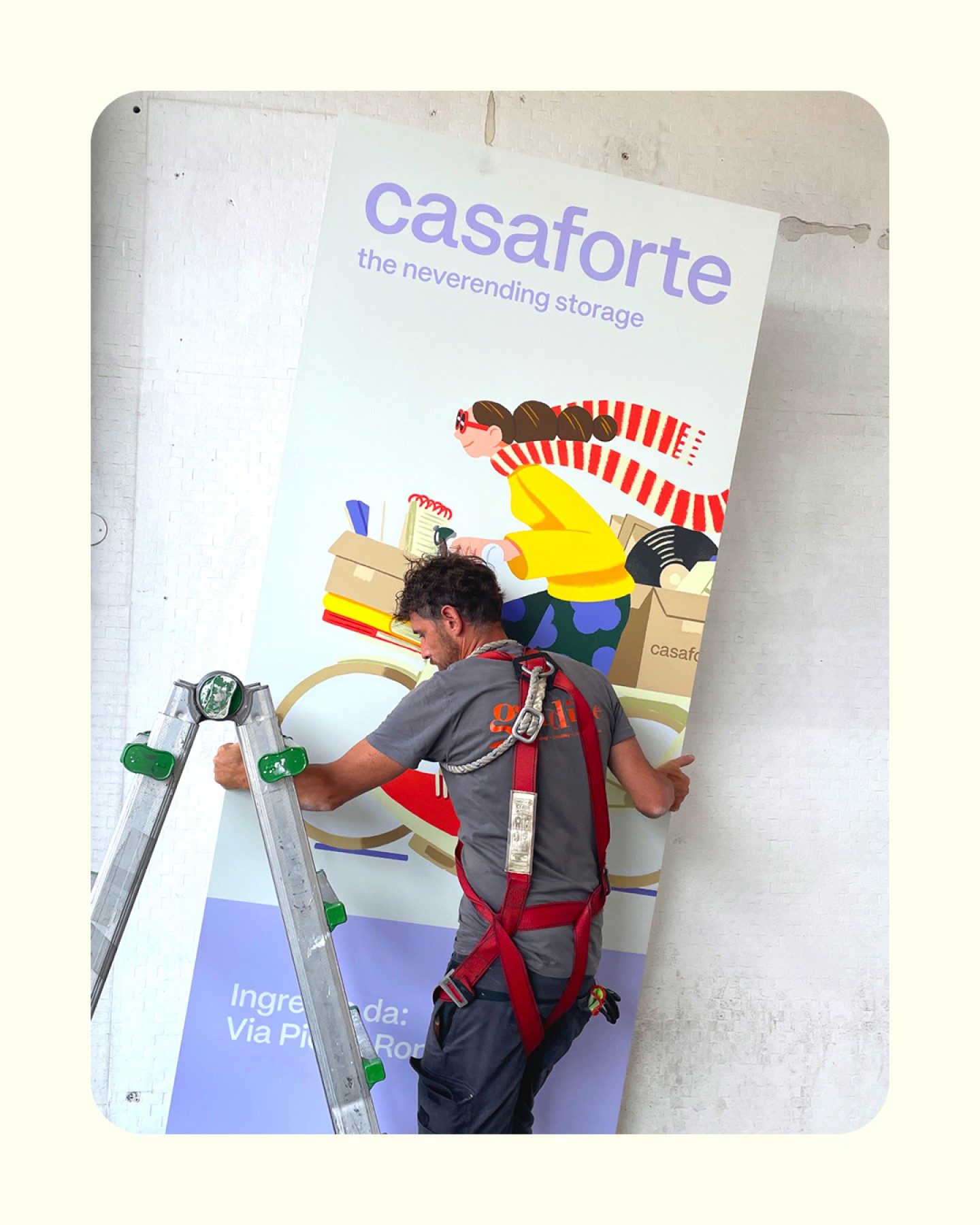
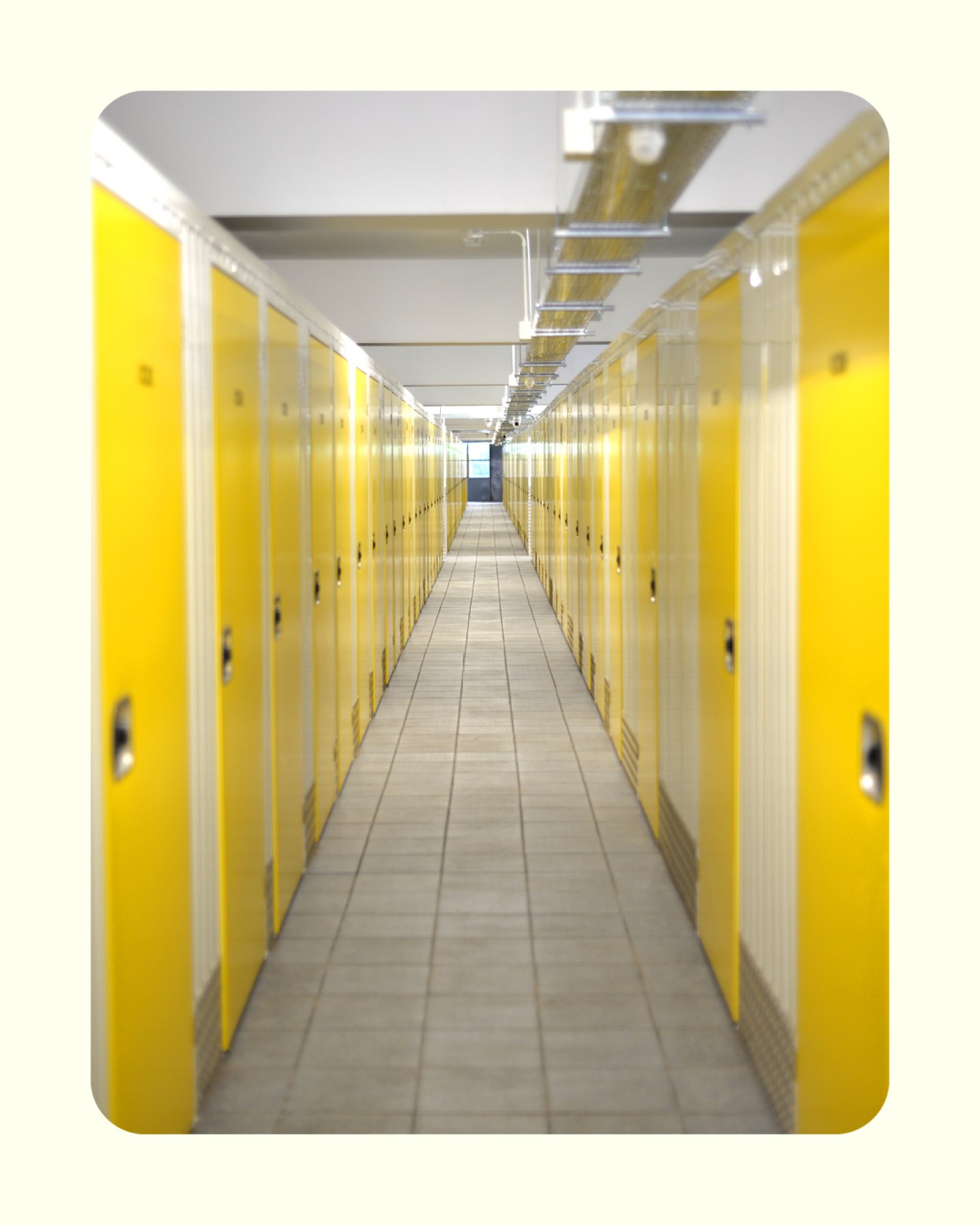

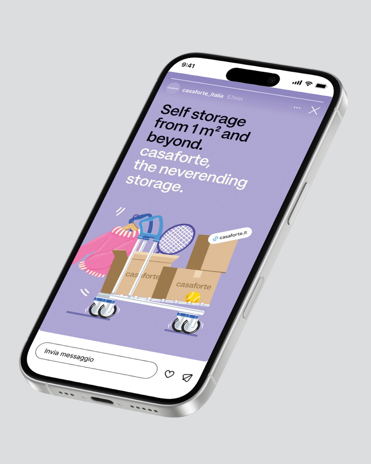
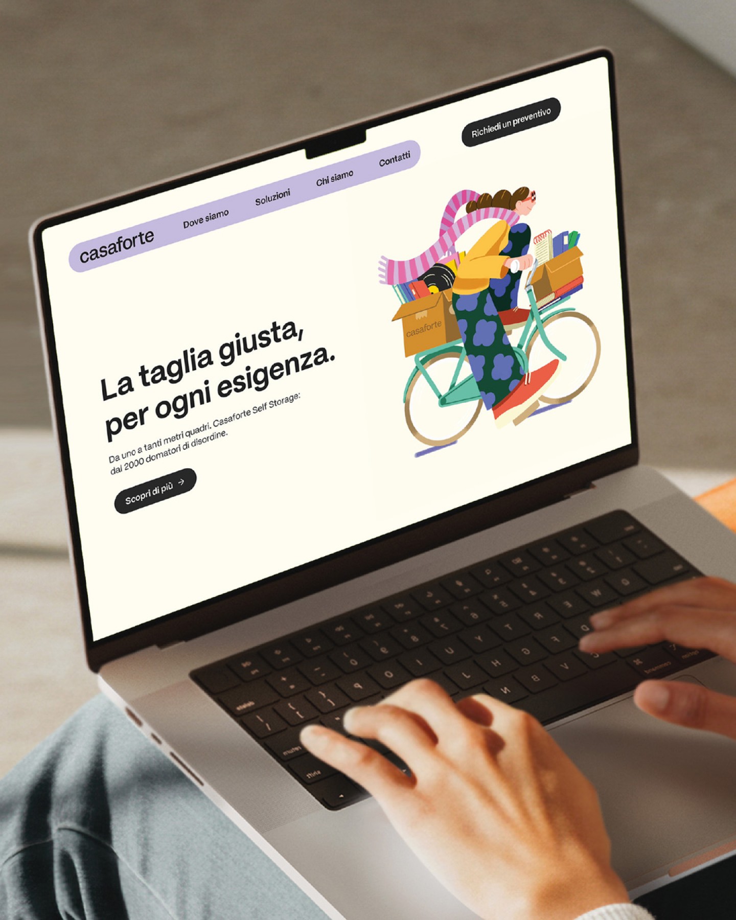
Casaforte helped introduce self storage to Italy, building its reputation over time through experience, reliability, security and the quality of its spaces.
Today, the category has changed. Self storage is no longer an unfamiliar service to explain, but an increasingly mature market in which brands need to be more distinctive, more relevant and more connected to people’s lives. Casaforte had reached a point where evolution was necessary. Not a rupture with the past, but a shift in perspective.
The challenge was to hold two seemingly opposite qualities together: the authority of an established company and the energy of a brand ready for its next chapter.
We therefore started from what was already there, asking how an identity built on solidity could become more dynamic without becoming less trustworthy. How could experience become a source of movement rather than something static? How could a brand rooted in security feel lighter, closer and more contemporary?
For us, the answer was not to add a new layer to the brand, but to find the idea capable of connecting what Casaforte already was with what it wanted to become.
Approach
The process started from conversation. Through an internal workshop, we brought together different perspectives within the company to explore its language, values, ambitions and contradictions. We believe this kind of exchange is essential to branding: before designing an identity, you need to understand the culture that gives it meaning.
Two distinct energies emerged. One was pragmatic, reliable and concrete, the Casaforte people already knew. The other was more ambitious, dynamic and open to the future, the Casaforte wanted to become. Rather than choosing between them, we treated the tension as a design opportunity.
The strategic work was about finding a common language between these two dimensions: one that could retain authority while introducing more energy, lightness and recognisability.
This led us to reconsider the role of self storage itself. Instead of talking about square metres, units and storage capacity, we looked at the human situation behind the service. Because people rarely need storage for the sake of storage, they need it because life changes.
A house gets smaller. A family grows. A move takes longer than expected. A hobby takes over a room. Objects accumulate. Plans change.
What Casaforte offers is not simply a place to put things. It offers the possibility of making space when life requires it. That became the starting point for the new brand narrative.
CONCEPT
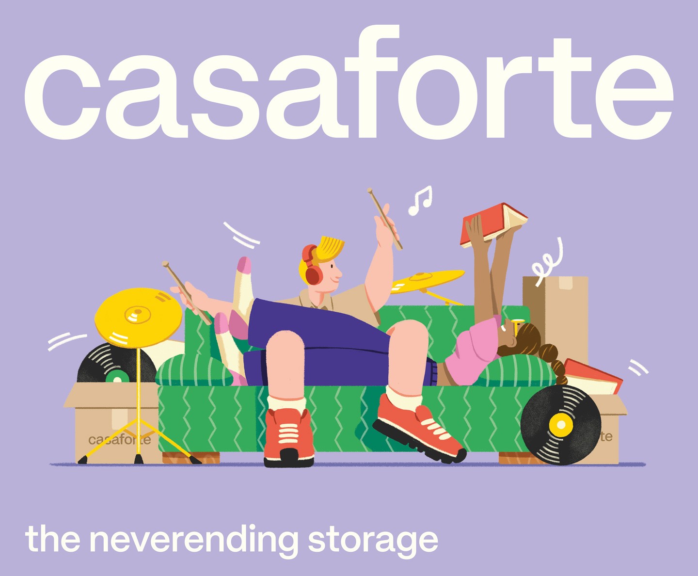
"The neverending storage" turns this simple observation into the central idea of the brand.
Casaforte becomes a solution that is always there when space is needed. Flexible enough to adapt to different people, moments and circumstances.
This shift also changes the way self storage is communicated. Rather than focusing on the technical function of storing things, the brand focuses on the situations that make people need storage in the first place. The result is a language that is more human, immediate and open-ended.
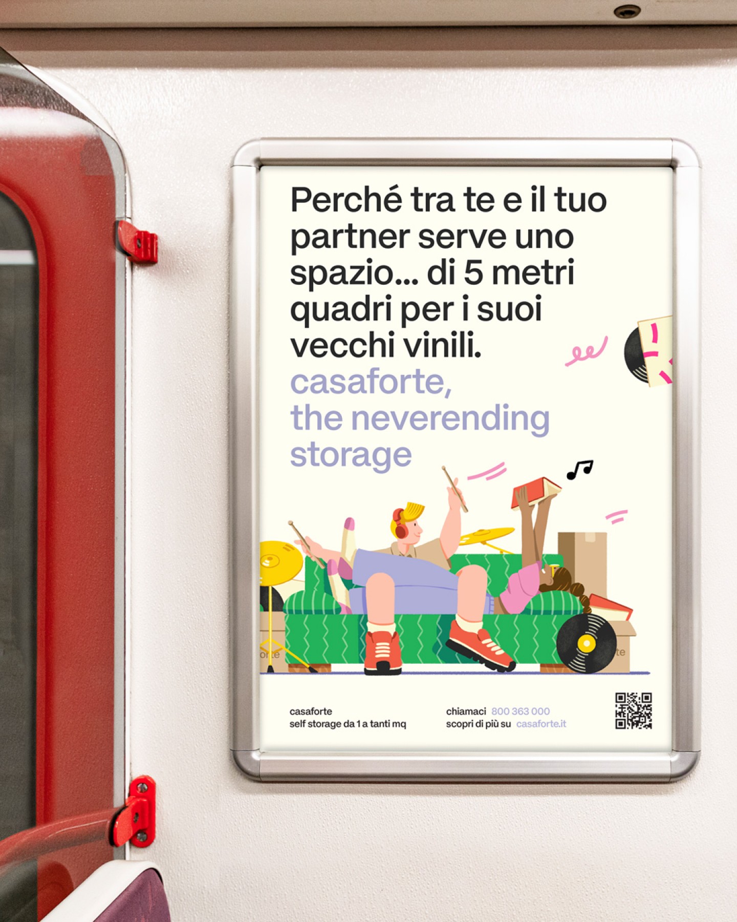
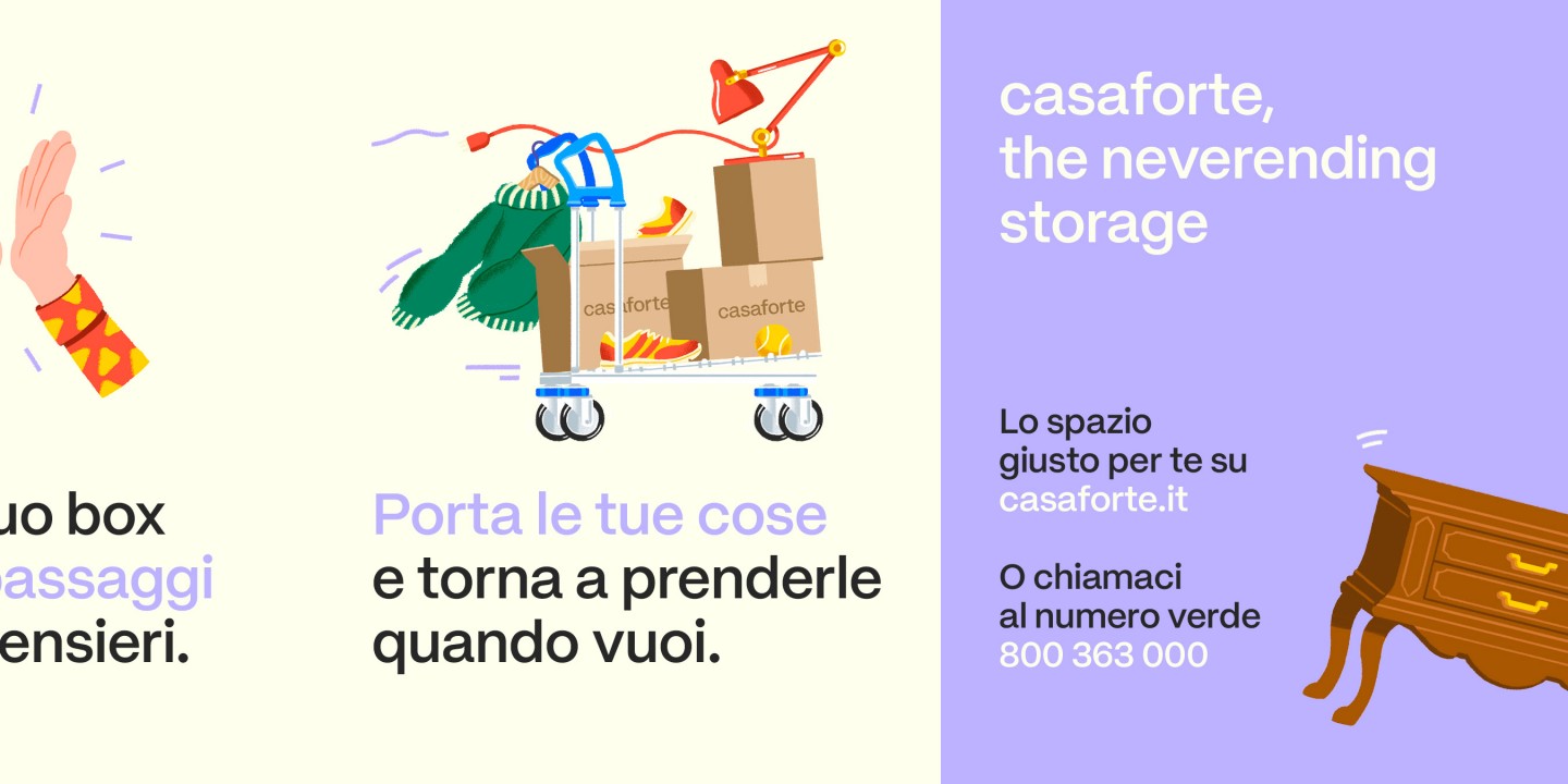
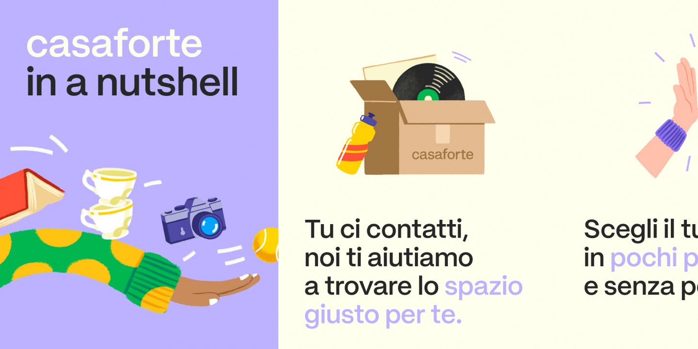
Visually, the identity translates this attitude through colour, movement, energy and illustration. The system is designed to be flexible rather than fixed, allowing the brand to respond to different stories while remaining recognisable.
For the launch, we developed seven micro-stories around one universal experience: the struggle to find space.
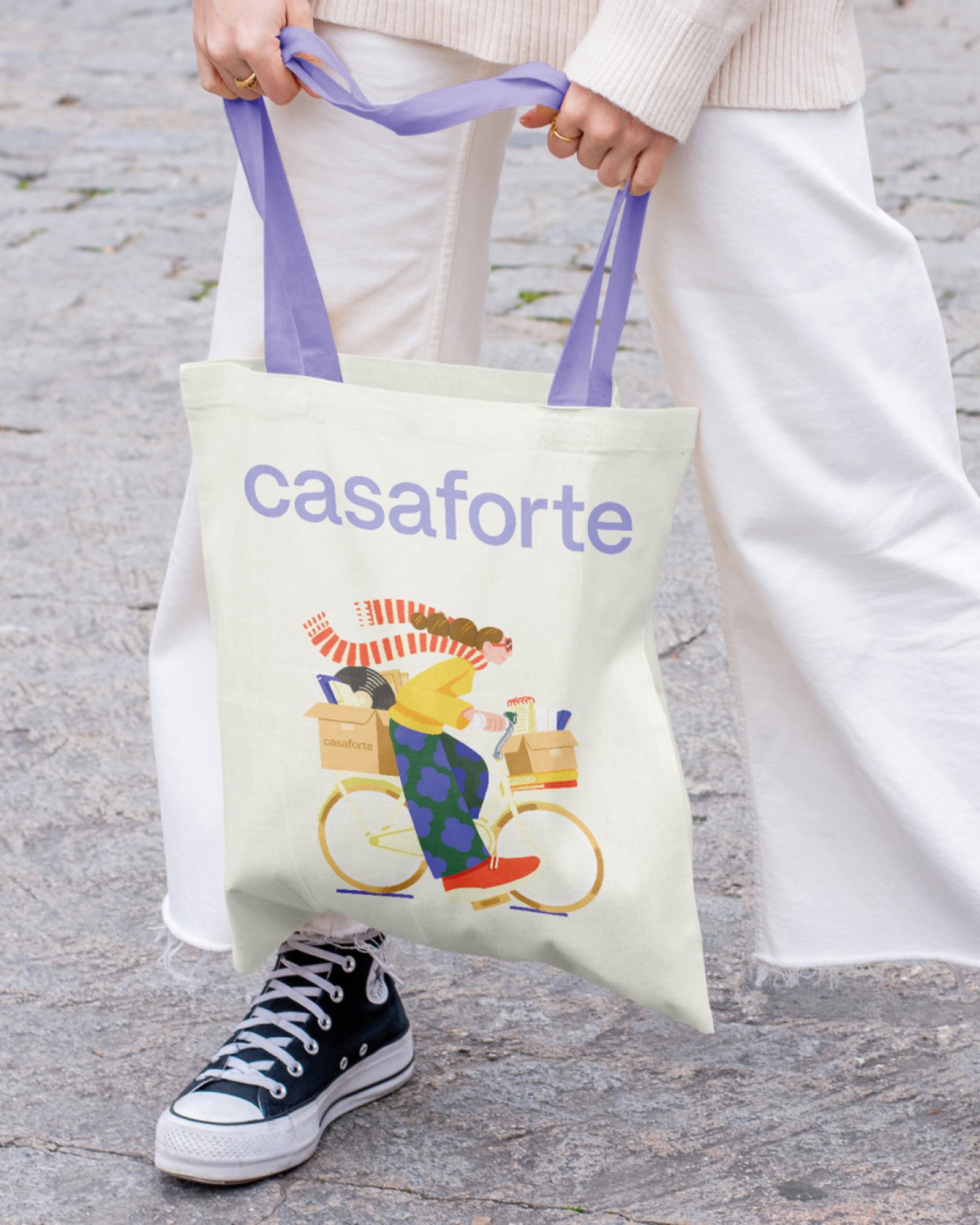
Illustration became the ideal medium to tell them. It allows everyday situations to be exaggerated, simplified and made instantly recognisable, creating a visual language that is accessible without being generic, and playful without losing the sense of trust that defines Casaforte.
In this way, the new identity does not simply describe a storage company. It gives shape to a more universal idea: there is always more life to make room for.
What we did
Brand strategy & positioning
Brand concept — The Neverending Storage
Visual identity & graphic system
Art direction
Illustration system
OOH Advertising campaign
Social media
Website
Corporate materials
Signage system
Environmental graphics & installations
Applications across Casaforte locations
Communication graphics across physical and digital touchpoints
Branded uniforms
in collaboration with
Illustrations — Lorenzo Besozzi
Web development — Bluedog
Collections
An overview of our wide fields of action
-
Logos & Trademarks
What makes a brand memorable and unique.
-
Environments & Exhibits
Designing for spaces: from signage to cultural display, from retail to events
-
Art & Culture
We had the chance to work for museums, institutions and organization in Italy and worldwide
-
Educational
Designing for school publishing
-
Type Design
We love typography, we design typefaces, from lettering to complete custom type families.
Case Studies
selected projects
-
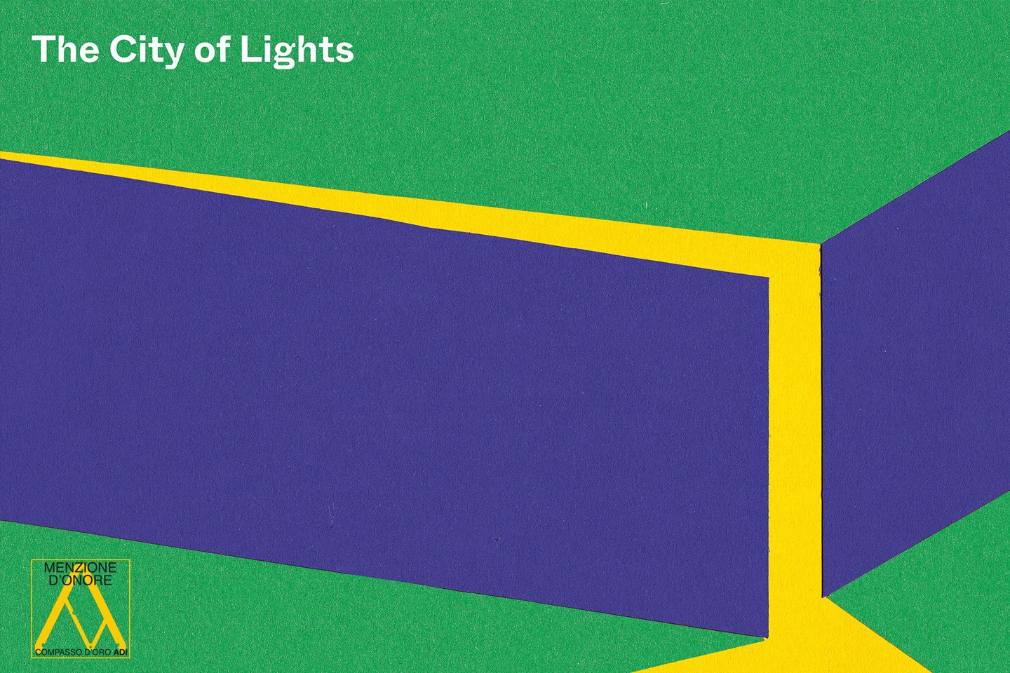
The City of Lights
Visual identity and exhibition graphics for the renewed Euroluce 2023
-
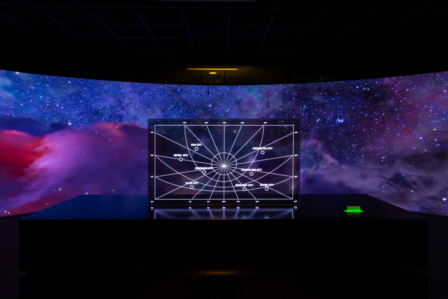
Layout, installations, and multimedia content
The Future Unfolds
An immersive and interactive journey to explore the future of mobility
-

visual identity
Artefiera Bologna 2025
A vibrant, pop-inspired restyling marks the 48th edition
-
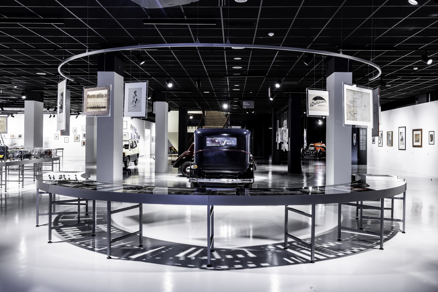
exhibition design
125 Volte Fiat
An exhibition celebrates FIAT’s 125th anniversary