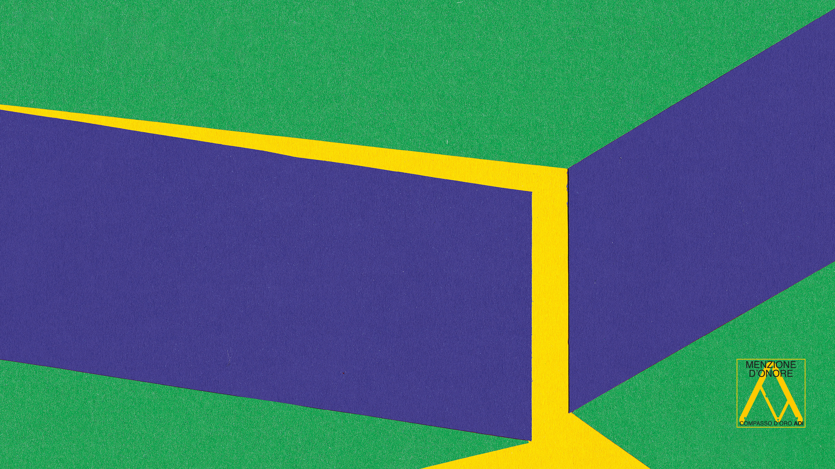
The City of Lights
Visual identity and exhibition graphics for the renewed Euroluce 2023
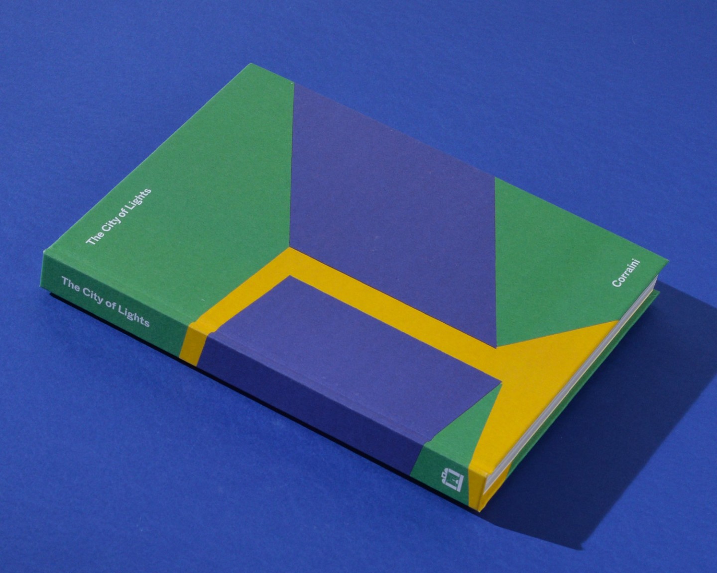
Our visual identity and exhibition graphics for Euroluce 2023, the biennial lighting fair for interiors and outdoors within Salone del Mobile, is a simple yet powerful visual referring to the surprising and innovative experience introduced by the edition, The City of Lights.
The image evokes an atmospheric space filled with light that gradually opens, as if allowing light to explode in all its magic. Conceived for the first edition of the renewed Euroluce format — a plural and multidisciplinary program structured around exhibitions, installations and events dedicated to light — the visual identity reflects a new idea of the fair experience, placing people, culture and interaction at its centre.
The project was awarded an Honorable Mention at the 29th Compasso d'Oro ADI.
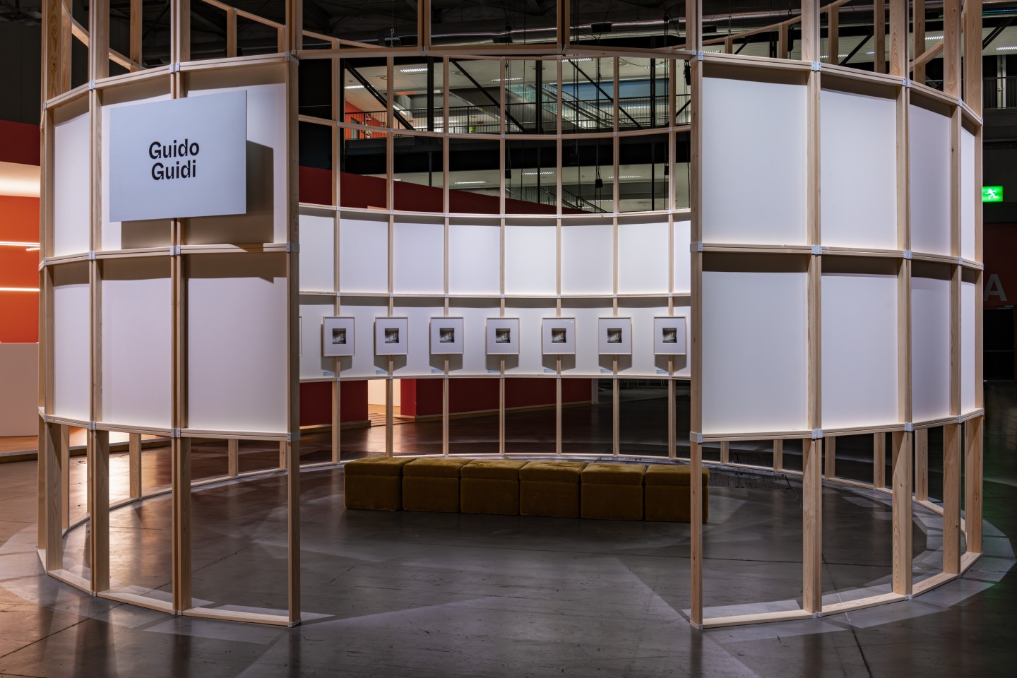
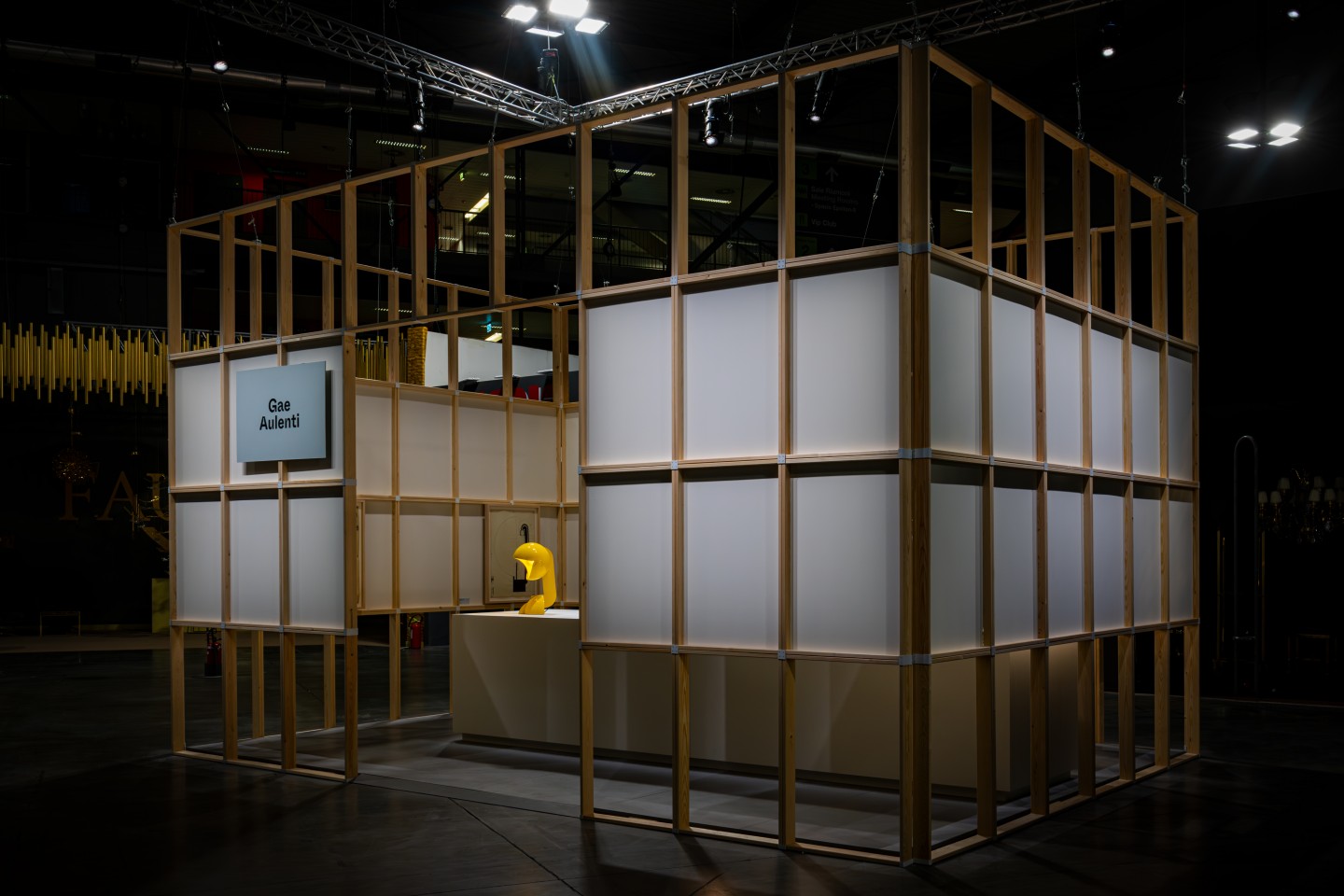
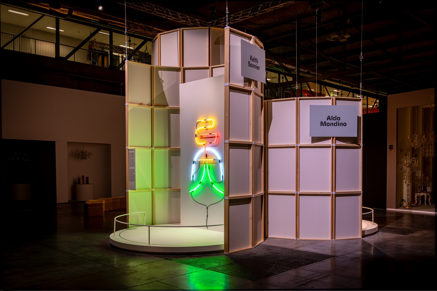
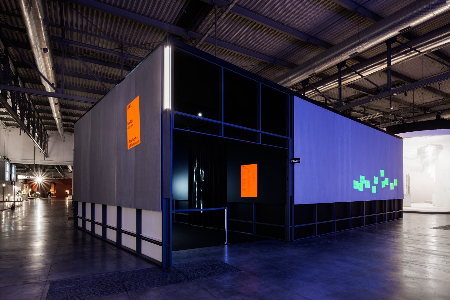

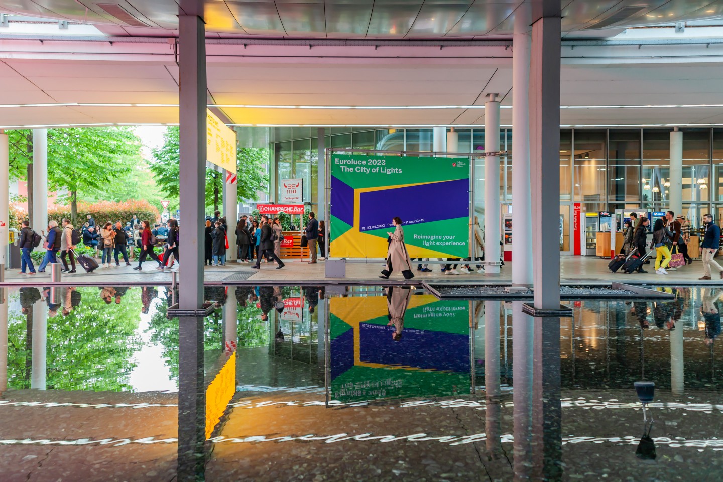
Euroluce is the International Lighting Exhibition held biennially within Salone del Mobile.Milano 2023. For its 31st edition, The City of Lights, we developed the visual identity and communication design of the exhibition, starting from a simple but powerful visual concept that reflects the innovative and unexpected experience introduced by this new format.
The image conceived evokes an immersive space filled with light that gradually opens, as if allowing light to expand and unfold in all its expressive potential. The exhibition is conceived as a contemporary “city”, where light becomes both subject and medium of a new cultural and spatial experience.
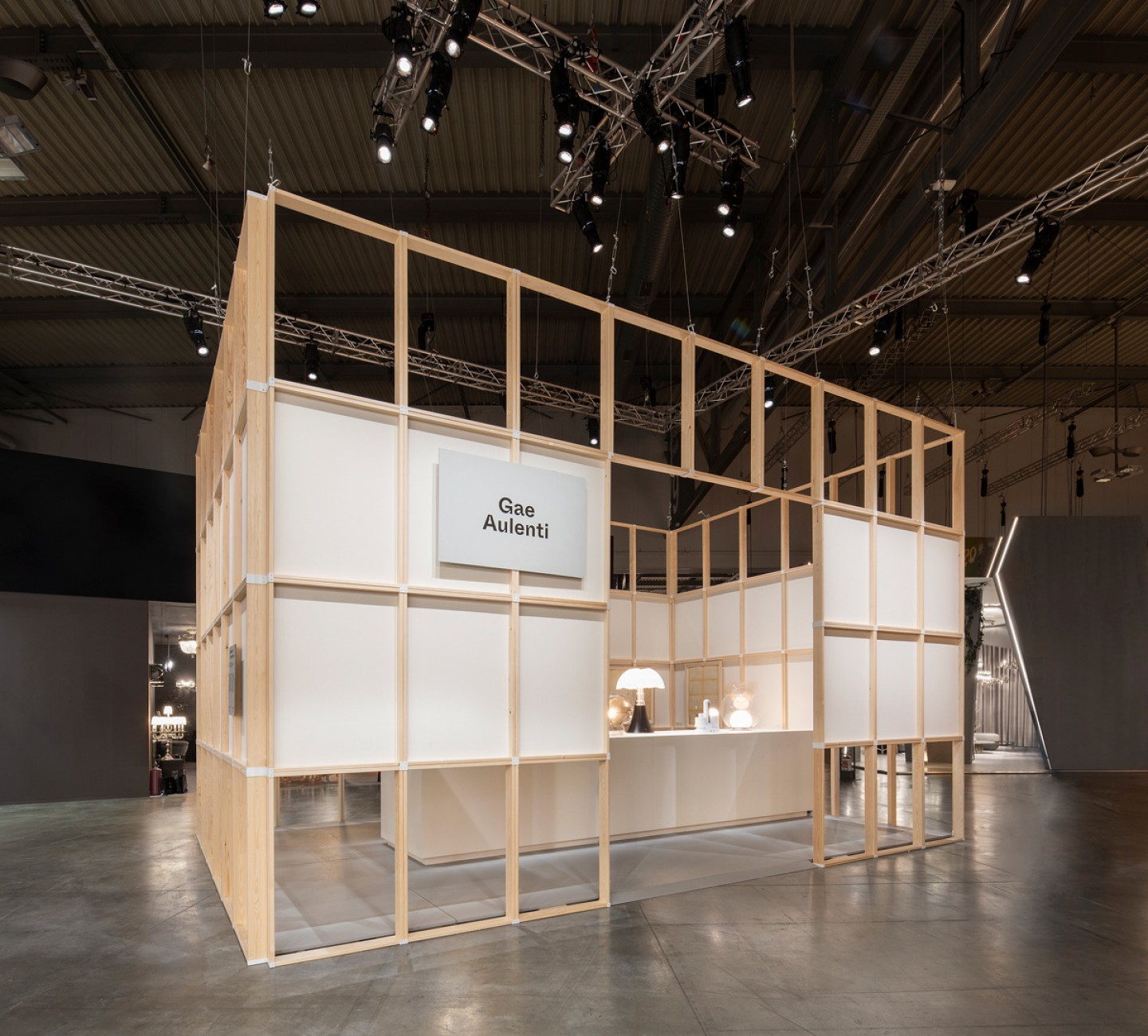
Euroluce 2023 responds to a radical rethinking of the trade fair system, placing people at the centre of the experience. The exhibition is designed on a single level through an urban planning approach to layout, where public spaces and environments—each designed by different architects—are integrated into a coherent spatial system dedicated to meetings, culture and the arts.
Within this framework, light is no longer treated only as a functional or technical object, but as a complex system encompassing technology, architecture, interaction, sustainability and new materials, reflecting a broader idea of human well-being.
We asked illustrator Giovanni Pastori to interpret our concept through his collage-based visual language. The result is a metaphysical and imperfect composition, created through cut paper and layered forms, where a few essential elements define a volume that appears to open and release light from within.
The visual becomes an invitation: a space that slowly reveals itself, capturing the moment in which light expands and transforms the perception of architecture, design and space.
communication campaign
The campaign was developed as a multi-format system, including advertising posters and animated versions for Out-of-Home (OOH) activation across the city and within the fair context.
The poster image translates the idea of Euroluce as a luminescent environment that gathers and contains light, gradually opening to reveal both its technical and emotional dimensions. It invites visitors into an expanded experience of light as an essential component of design and architecture.
exhibition graphic & wayfinding
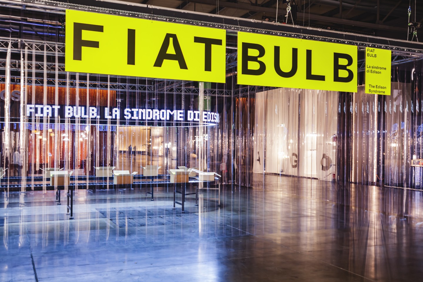
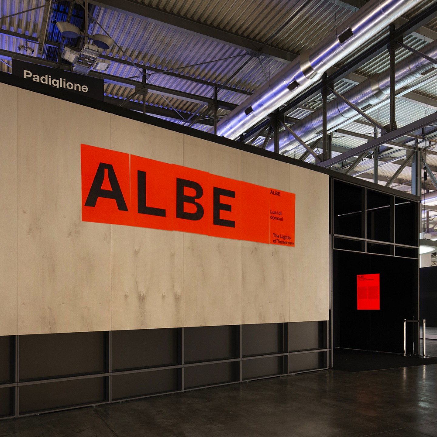
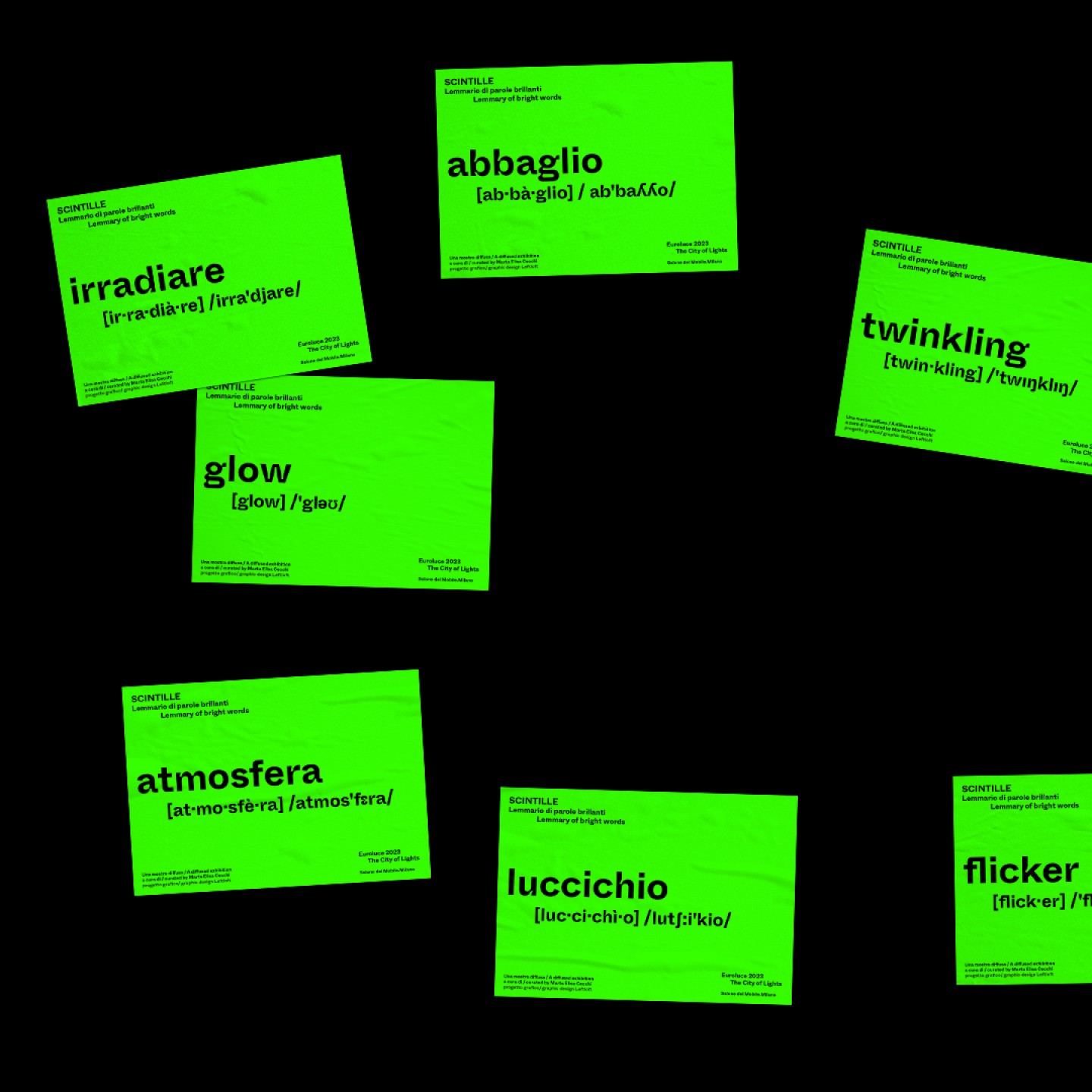
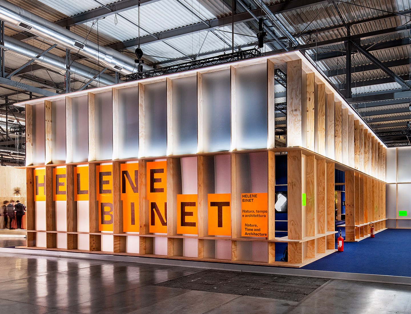
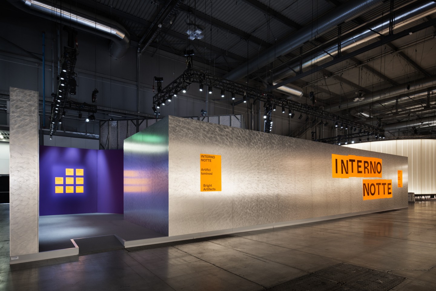
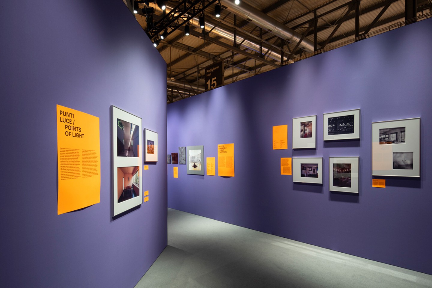
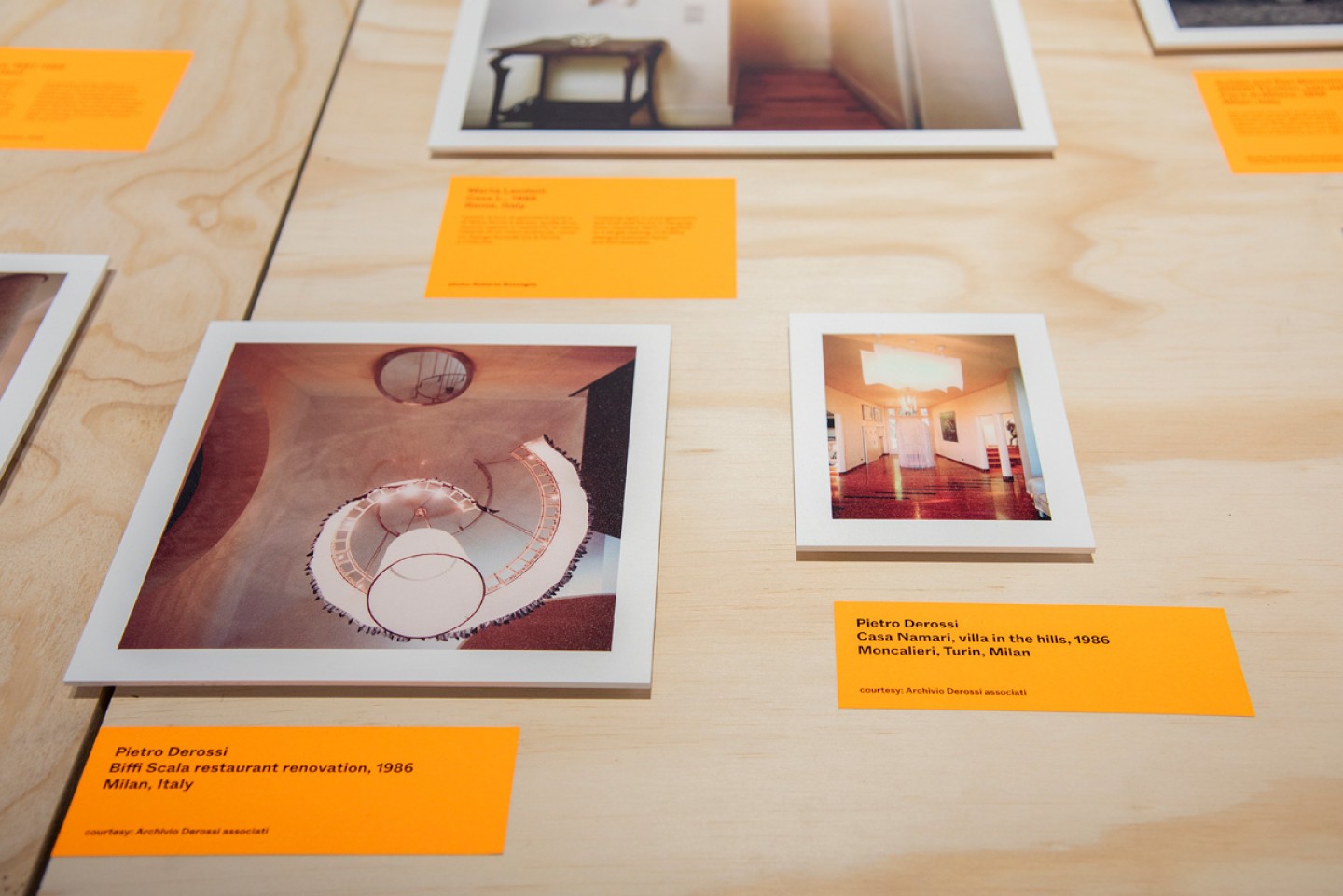
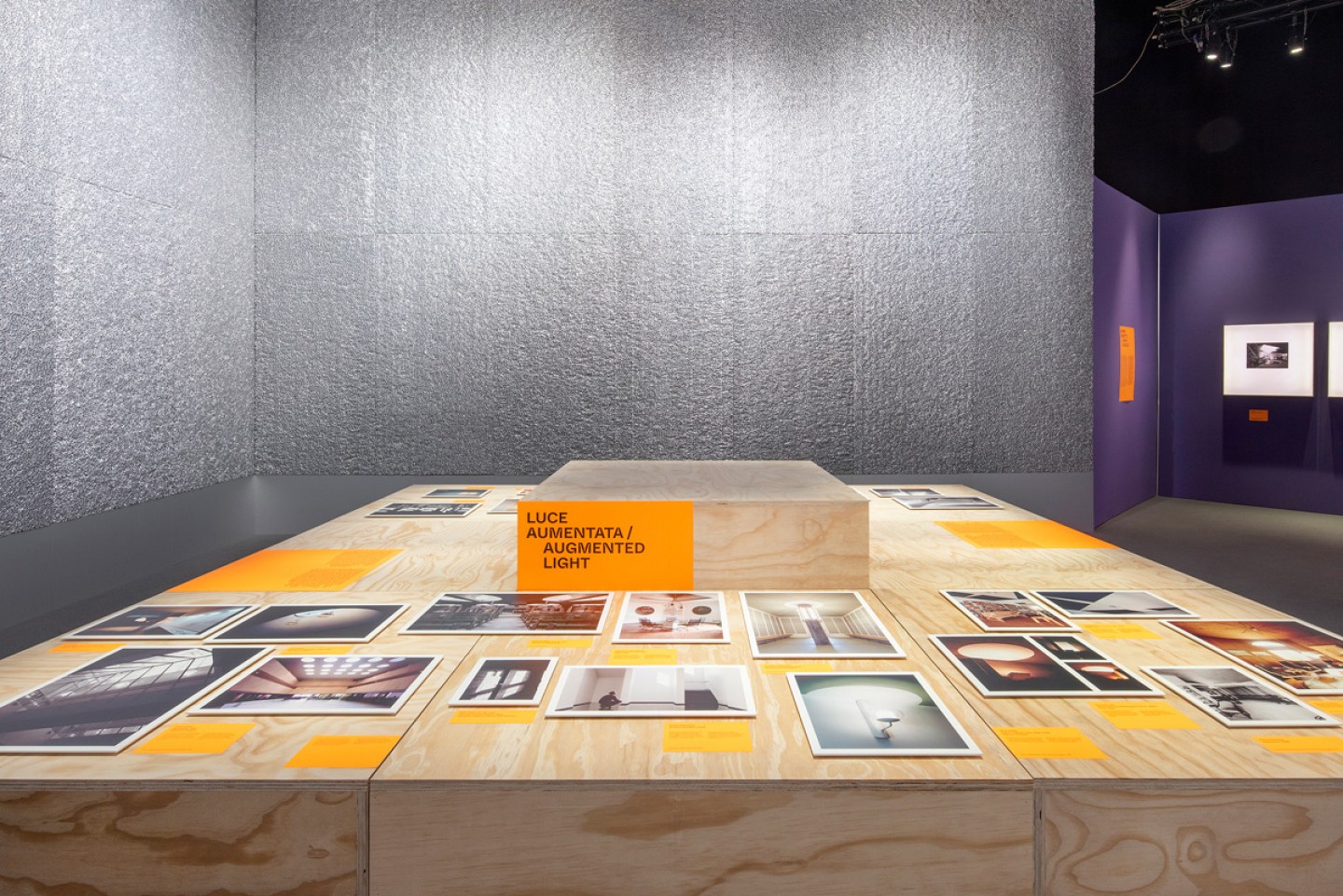
Alongside the visual identity, we developed the exhibition graphics and signage system guiding visitors through the new layout of the biennial, accompanying them from exhibition to exhibition and across the different installations.
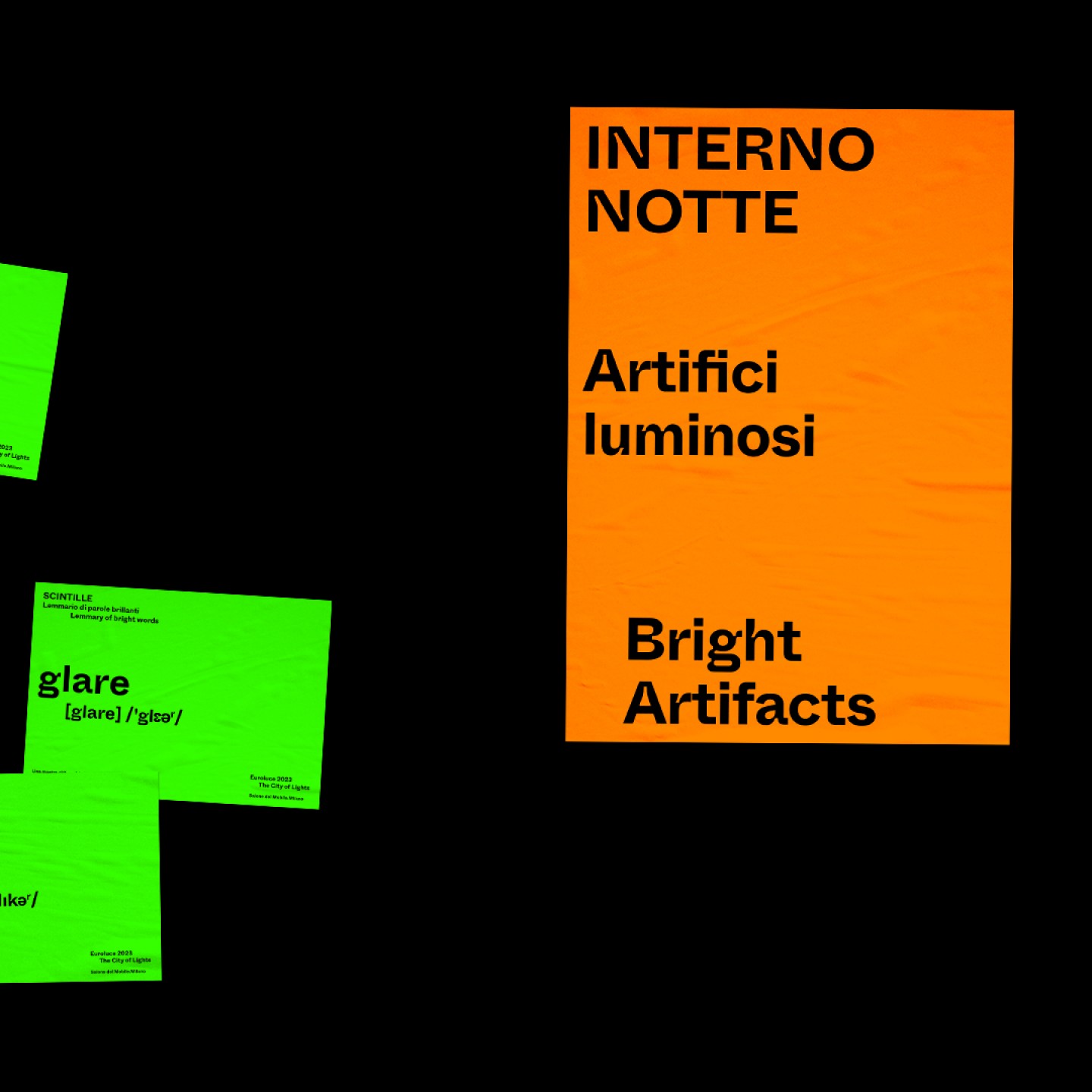
The information system, made of fluorescent paper, starch glue and black ink, colonises the exhibition spaces without structural support, occupying empty surfaces as posters or urban interventions. These “brutal” graphic marks become immediate visual signals, establishing a common thread across the heterogeneous cultural program of Euroluce.
Type in use #whyteinktrap by @abcdinamo
Photos: Carola Merello, Alessandro Russotti, Andrea Mariani
What we did
Visual Identity
ADV Campaign
Exhibition graphics
Wayfinding
COLLABORATORS
Illustrations Giò Pastori
Collections
An overview of our wide fields of action
-
Logos & Trademarks
What makes a brand memorable and unique.
-
Environments & Exhibits
Designing for spaces: from signage to cultural display, from retail to events
-
Art & Culture
We had the chance to work for museums, institutions and organization in Italy and worldwide
-
Educational
Designing for school publishing
-
Type Design
We love typography, we design typefaces, from lettering to complete custom type families.
Case Studies
selected projects
-
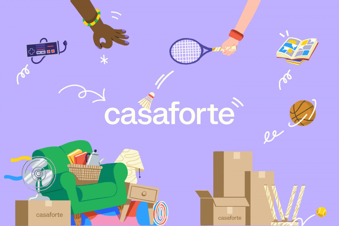
Casaforte - The neverending storage
Rebranding and communication campaign
-
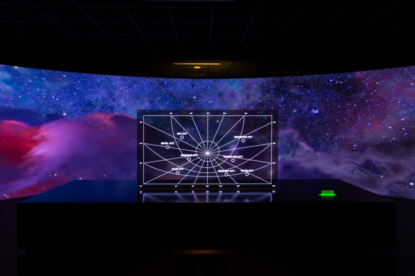
Layout, installations, and multimedia content
The Future Unfolds
An immersive and interactive journey to explore the future of mobility
-

visual identity
Artefiera Bologna 2025
A vibrant, pop-inspired restyling marks the 48th edition
-
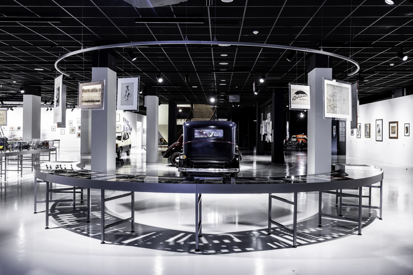
exhibition design
125 Volte Fiat
An exhibition celebrates FIAT’s 125th anniversary