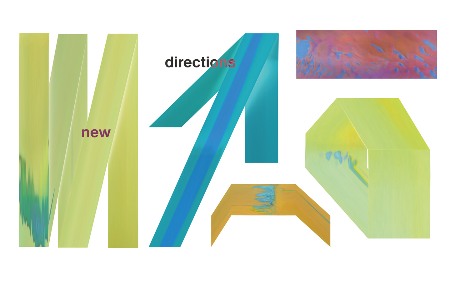
Miart - New Directions
A syncopated language expresses the evolving and open character of an art fair
On the occasion of its thirtieth edition, miart 2026 commissioned us to develop its visual identity for New Directions, a concept reflecting the fair’s evolving nature through expanded spaces, new perspectives, and renewed formats. Inspired by New Directions and the improvisational language of jazz, we developed a visual identity based on a constantly shifting system of shapes, movement, and colour. Like a musical composition built around a shared theme, abstract visual elements interact and recombine in ever-changing ways, creating dynamic choreographies that echo the diversity and experimentation of the artworks presented throughout the fair.
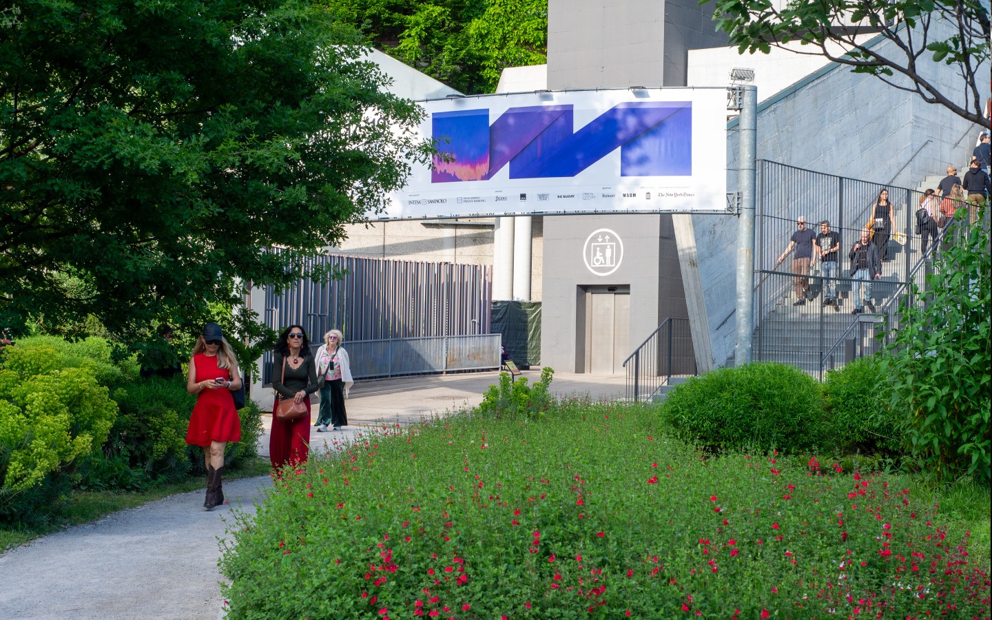
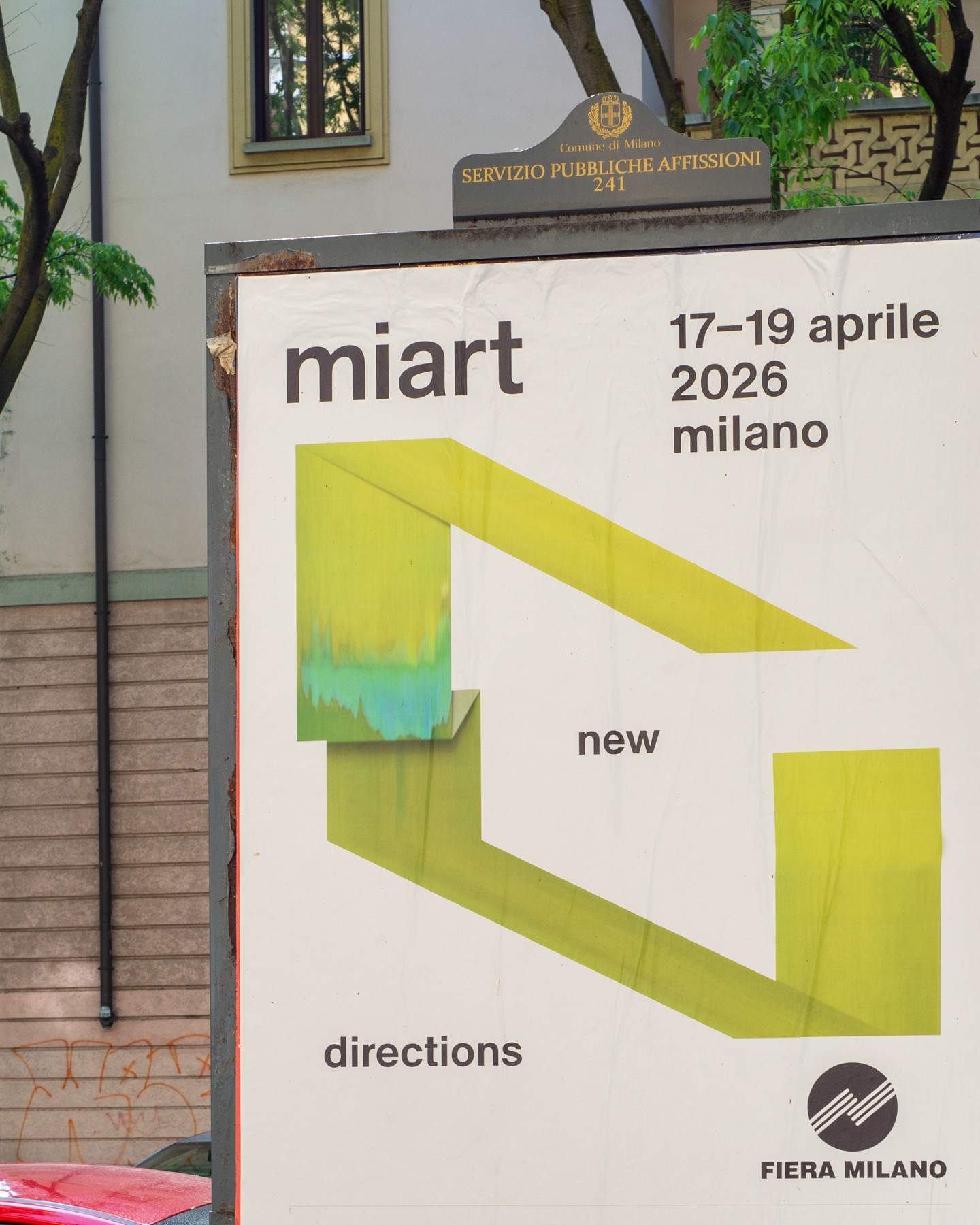
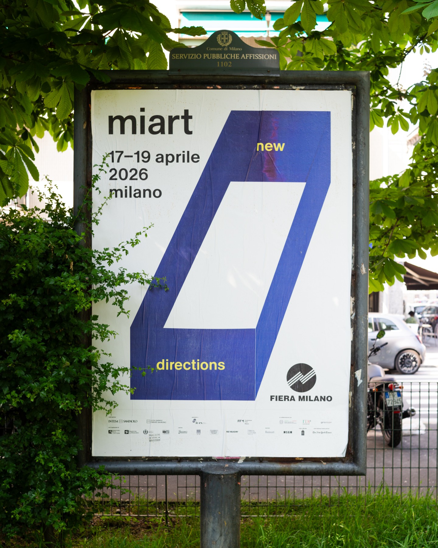
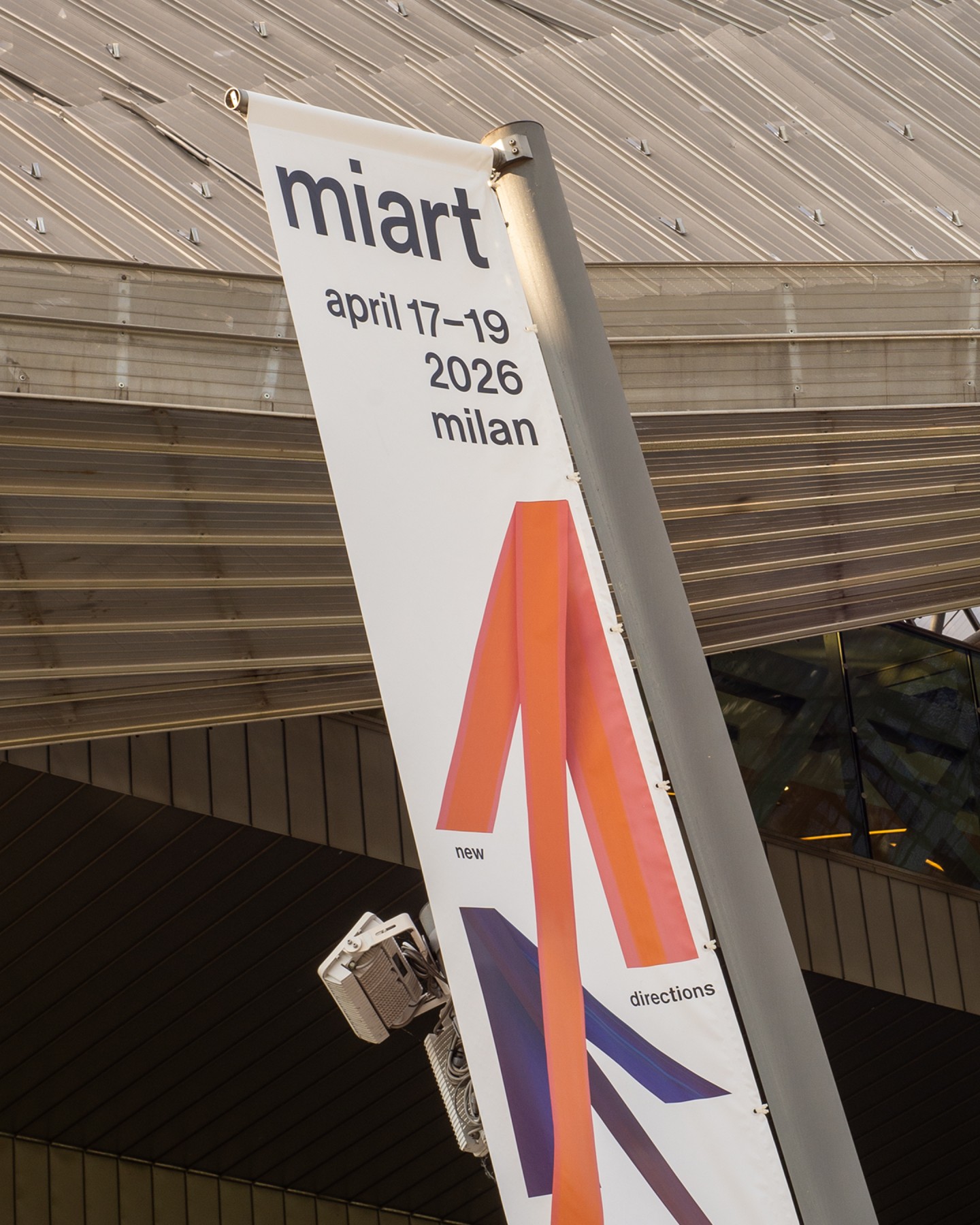
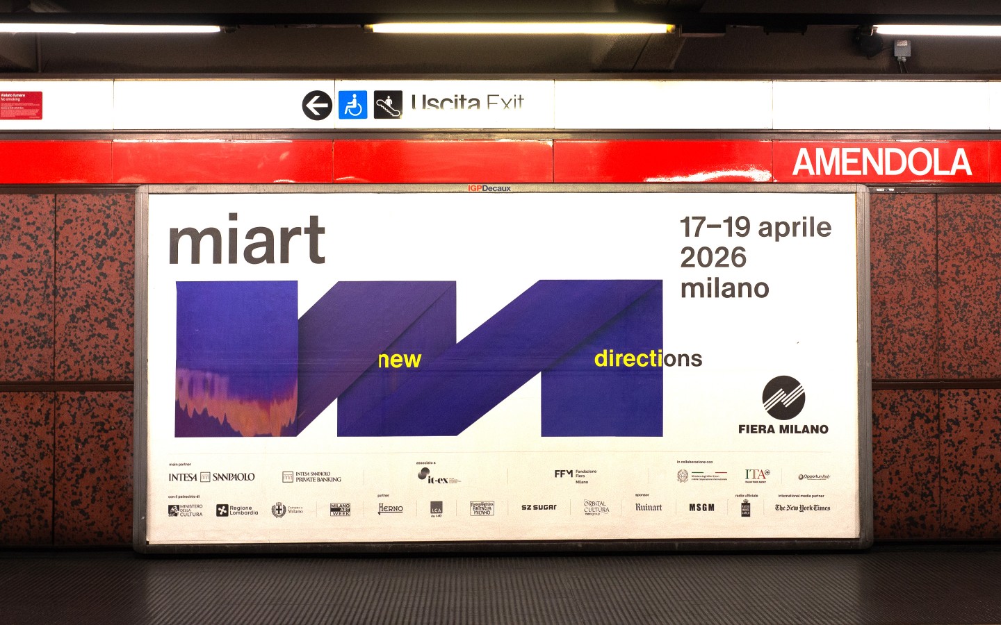
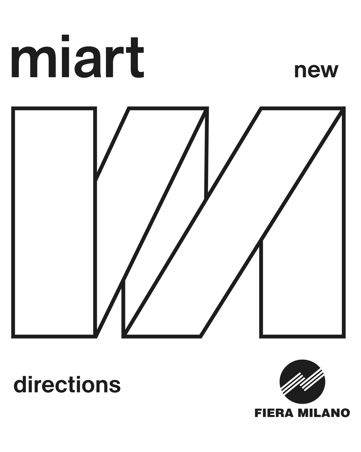
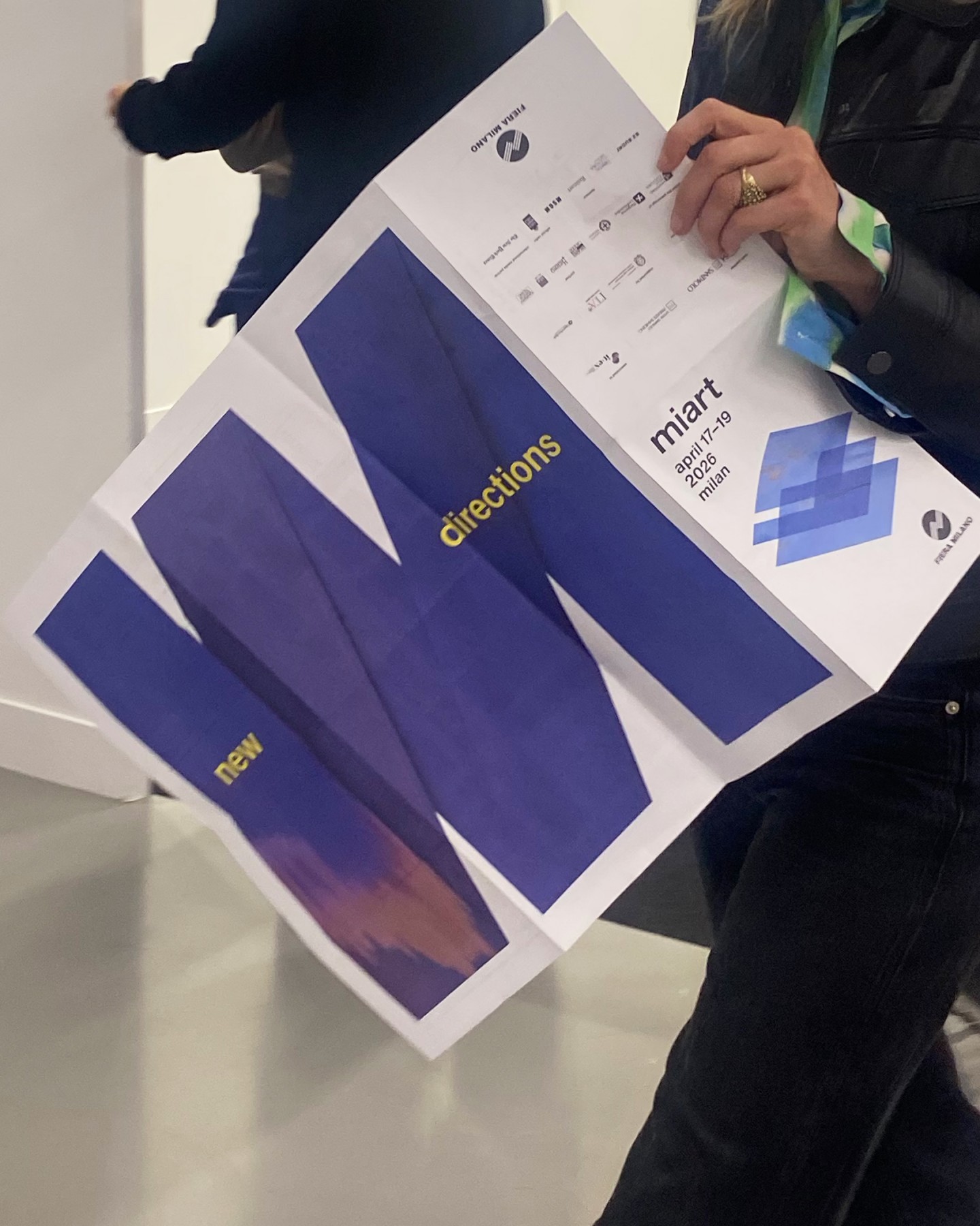
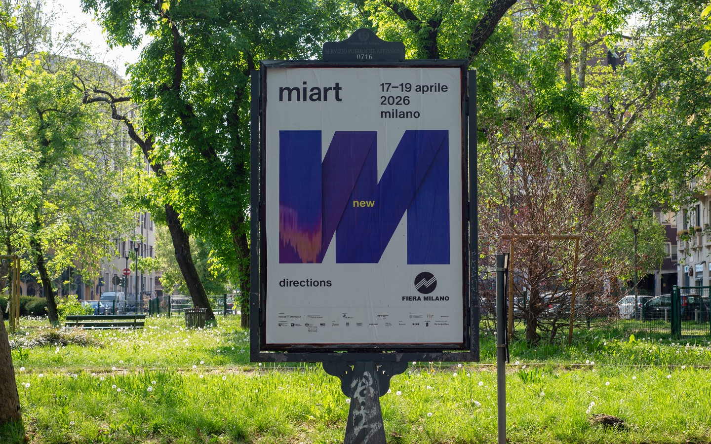
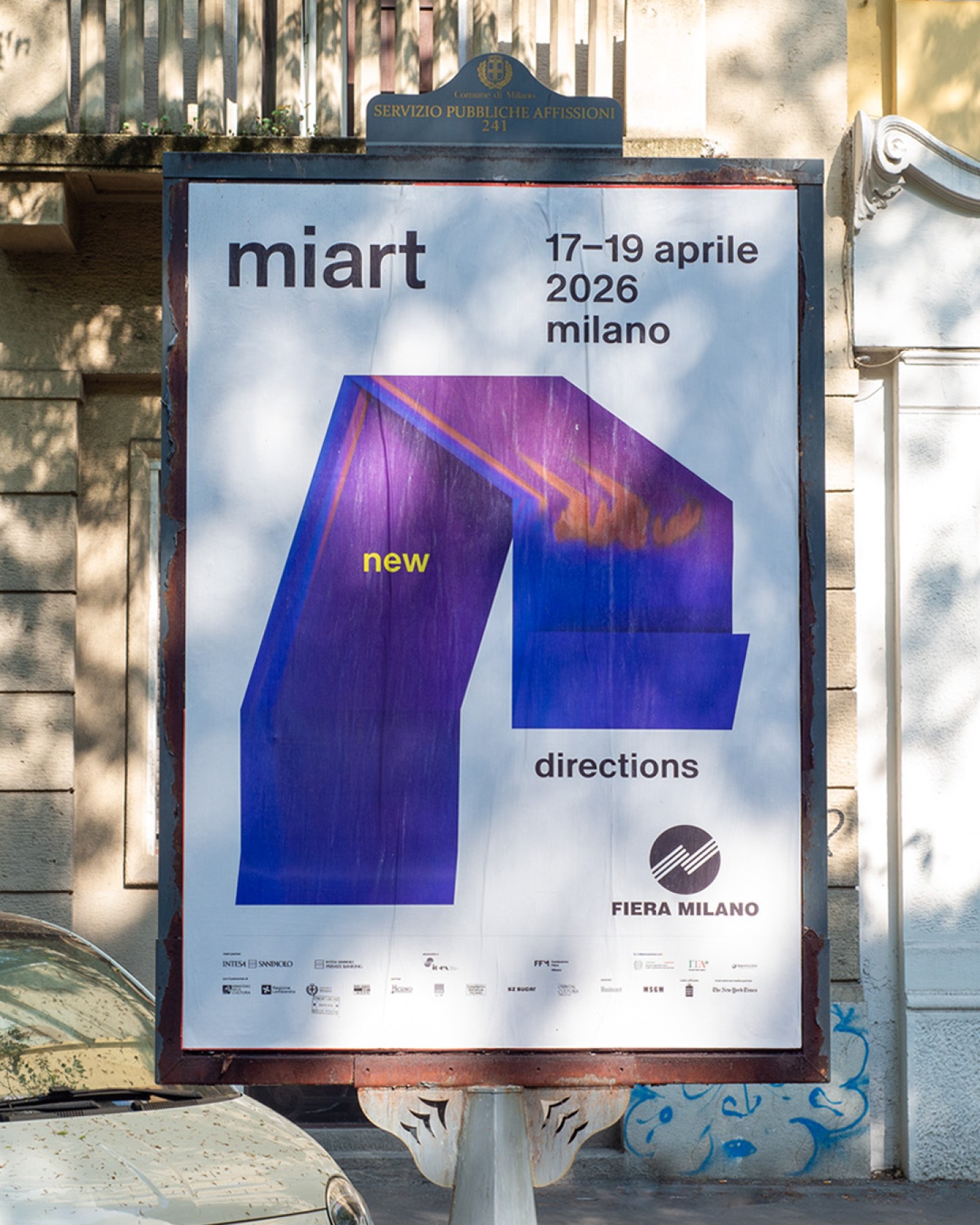
On the occasion of its 30th edition, miart 2026 commissioned us to develop the visual identity for its 2026 edition, New Directions.
Inspired by the evolving nature of the fair and by the improvisational language of jazz, the project explores the relationship between structure and freedom, continuity and transformation. Conceived as a dynamic and evolving visual system, the identity reflects miart’s openness to new perspectives, formats, and artistic directions while maintaining a strong and recognizable voice.
“How can a visual identity embody the plurality and constantly evolving nature of a contemporary art fair?” The project approaches New Directions as a reflection on improvisation understood not as randomness, but as a structured and collective process of transformation. Inspired by the idea of a musical composition built around a shared theme, the identity is conceived as an open framework in which variation is not accidental but generated through a defined set of relationships. The system is based on a logic of rules rather than fixed outcomes, allowing for continuous adaptation while maintaining coherence. Within this perspective, communication is treated as a field where meaning emerges through repetition, variation, and reinterpretation across time and formats.
concept
The identity translates this framework into a visual system defined by interaction, modulation, and variability.
The graphic field operates as a compositional space where elements are not fixed but constantly reconfigured according to context.
Typography, colour, imagery, and layout function as active components of the system. Typography defines rhythm and hierarchy, colour introduces variation and continuity, images shift in relation to their application, and layouts generate multiple spatial configurations from the same underlying structure.
Rather than illustrating improvisation as a metaphor, the system behaves according to its logic: structured variation across a consistent set of visual parameters.
Through this mechanism, the identity expresses the evolving and open nature of miart 2026, while maintaining recognisability across all applications.
visual structure
Together, these elements create a coherent visual language that expresses the openness, experimentation, and diversity of miart 2026.
The identity is built through a set of interdependent visual variables. Modular layouts allow flexible compositions across different formats and contexts. Typography is treated as an active element, shaping rhythm and hierarchy within the system. Images adapt according to their application while maintaining a consistent visual approach. Colour works as a dynamic system that shifts across the identity, reinforcing a sense of movement. Abstract graphic forms introduce rhythm and structure, generating variation and continuity at the same time.
identity applications
The visual system was designed to extend coherently across all communication touchpoints, adapting fluidly between physical and digital environments.
Print and editorial materials, motion graphics, environmental applications, digital communication, and signage all become part of a unified visual composition where elements continuously transform while remaining recognisable.
Like a jazz composition interpreted through different performances, each application becomes a variation on the same theme — reinforcing the evolving and participatory character of the fair.
What we did
Visual identity concept
Advertising and social communication materials
Print and digital communication materials
Motion and environmental applications
Collections
An overview of our wide fields of action
-
Logos & Trademarks
What makes a brand memorable and unique.
-
Environments & Exhibits
Designing for spaces: from signage to cultural display, from retail to events
-
Art & Culture
We had the chance to work for museums, institutions and organization in Italy and worldwide
-
Educational
Designing for school publishing
-
Type Design
We love typography, we design typefaces, from lettering to complete custom type families.
Case Studies
selected projects
-
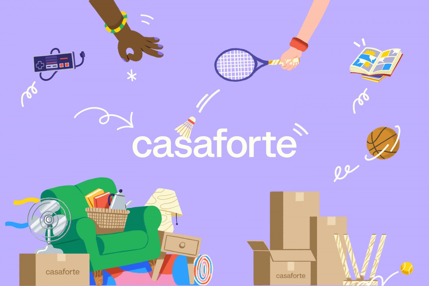
Casaforte - The neverending storage
Rebranding and communication campaign
-
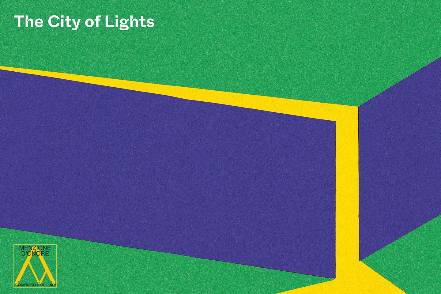
The City of Lights
Visual identity and exhibition graphics for the renewed Euroluce 2023
-
Layout, installations, and multimedia content
The Future Unfolds
An immersive and interactive journey to explore the future of mobility
-

visual identity
Artefiera Bologna 2025
A vibrant, pop-inspired restyling marks the 48th edition