Torino: la città degli inizi
Shaping Turin's new City Brand through research and strategic design
How to design the image of a city that resists a single definition.
Turin’s new City Brand is the outcome of a research-led design process combining data, participation and strategic thinking to transform the city’s complexity into a platform of possibilities.
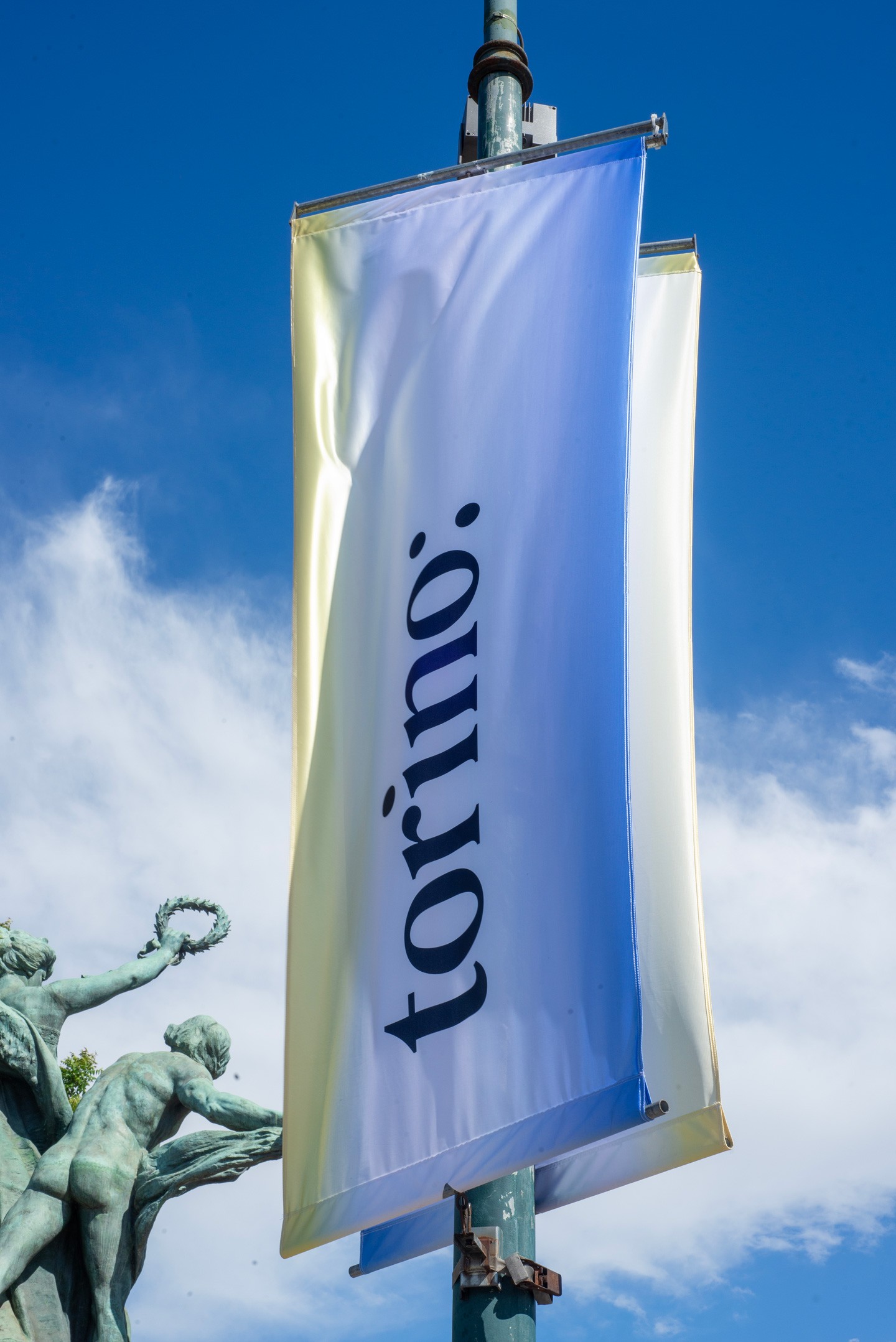
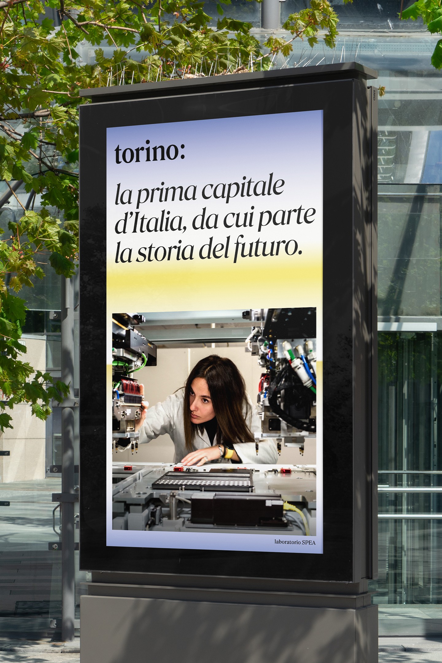
At the heart of the project lies "torino:" a simple yet powerful design device that turns the city's name into the beginning of a conversation. More than a logo, it positions Turin as the City of Beginnings: a place where residents, students, entrepreneurs, visitors, and future generations are invited to become active participants in the city's evolving story.
Turin resists simple definitions.
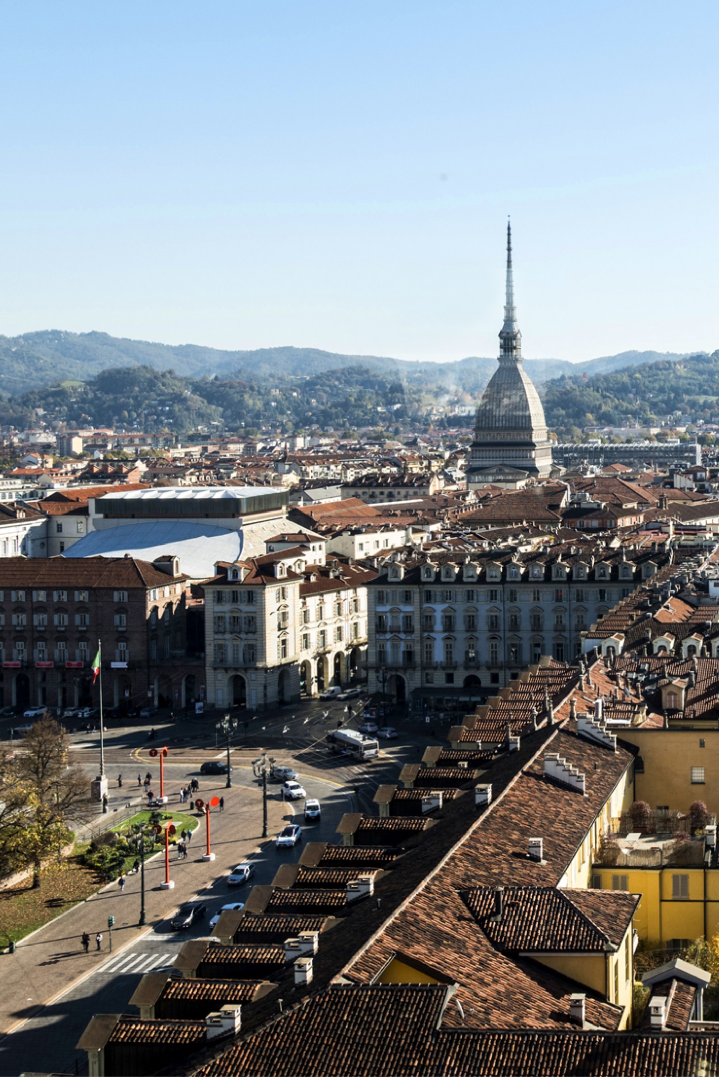
Over the years, the city has been shaped by different narratives—from the Savoy capital to the industrial city and the legacy of the Olympic Games. Today, none of these alone can fully represent Turin. The city continues to evolve through new forms of knowledge, innovation, culture, entrepreneurship, and civic life.
For design, this represents a clear challenge: how can an identity be built without reducing complexity? How can a city whose character emerges from the coexistence of different elements find a shared language?
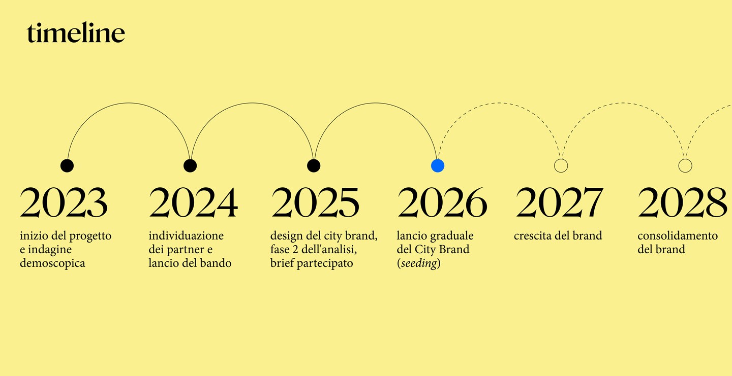
The new City Brand, developed by Leftloft after winning an international competition in 2025, responds to this challenge.
Building on a research and listening process initiated by the Municipality of Turin together with key local institutions and organisations, we translated this collective understanding of the city into a new identity system.
The project transforms research, data, and local perspectives into a flexible platform capable of expressing Turin's plurality and evolving with the people who shape it.
Approach
Rather than starting with a logo, we began by understanding the city.
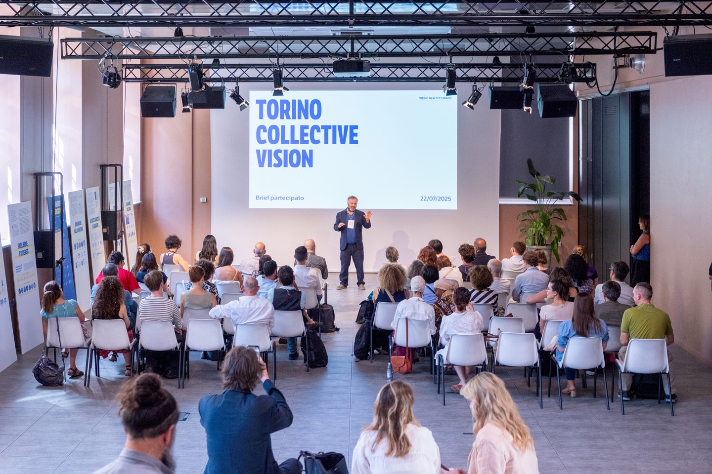
The first phase of the project focused on a direct engagement with the people who live, work and shape the city.
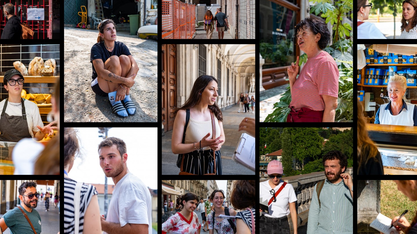
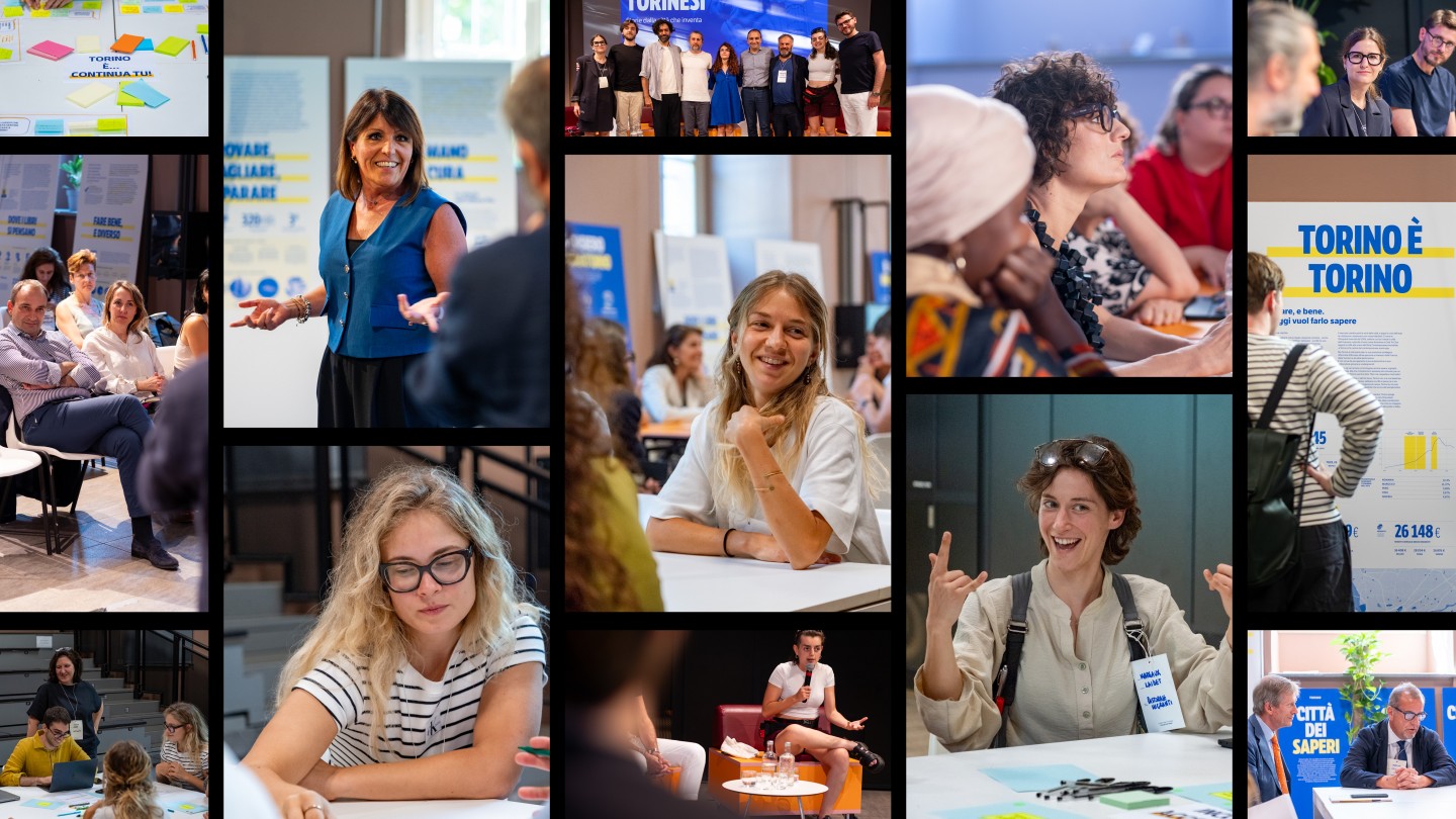
The research combined demographic studies with 50 in-depth interviews involving people from the economic, cultural, social and institutional spheres of Turin. We also organised five neighbourhood walks with participants selected to represent different audiences and perspectives. They took us through the places, people and everyday experiences that shaped their relationship with the city.
The research also extended to a broader audience through online questionnaires distributed during major public events, allowing us to gather perspectives from a wider cross-section of Turin’s population.
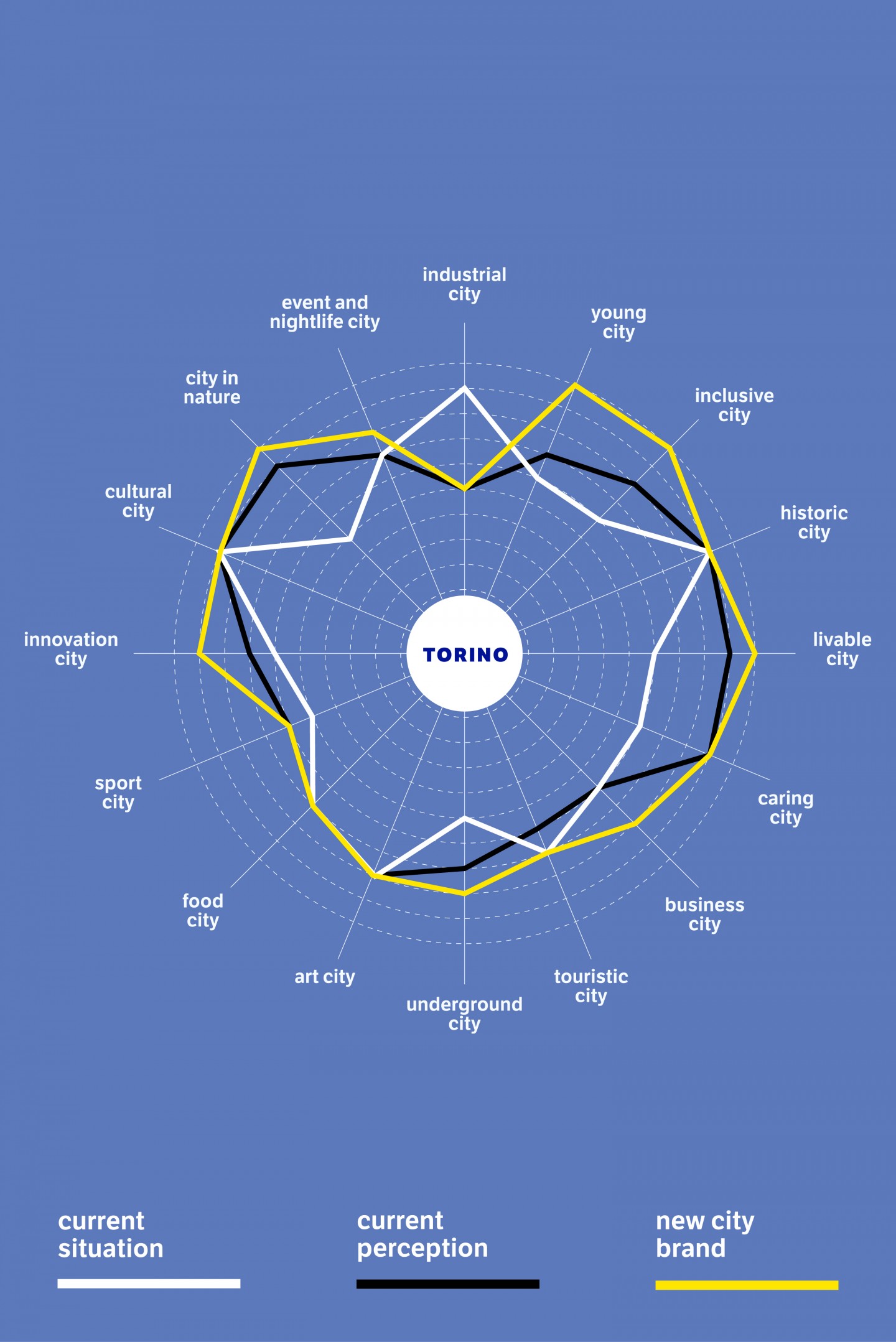
We then developed a Perception Index to measure Turin’s international perception among tourists and non-residents, analysing sentiment and comparing the city with other urban centres around the world with similar demographic and socio-economic profiles.
Together, these different layers of research revealed a gap between the city Turin actually is and the way it is commonly perceived and communicated. This led to a key strategic decision: the first audience for the new City Brand had to be the people of Turin themselves. Before changing the way the city was seen from the outside, the project needed to strengthen the way Turin was understood from within.
The research was then brought together through a collaborative workshop, where the different perspectives, experiences and findings were discussed and interpreted collectively. This process helped translate a broad body of research into a shared understanding of the city’s contemporary identity.
The results were collected in a shared document mapping the qualities, perceptions and opportunities that emerged throughout the process. This became the basis for defining five pillars of Turin’s contemporary DNA: a city of knowledge, a city in nature, a city where quality of life matters, a plural city, and a city where things can happen.
We understood these values as complementary dimensions of a single identity. Turin’s strength does not lie in a single defining characteristic, but in its ability to hold many possibilities together. This became the foundation of the project.
CONCEPT
The research showed that Turin's strength does not lie in a single defining characteristic, but in its ability to hold many possibilities together.
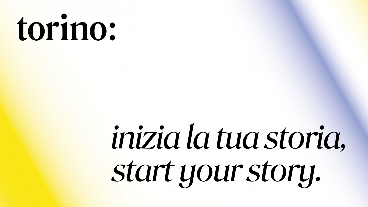
This idea takes shape as a simple graphic device: "torino:".
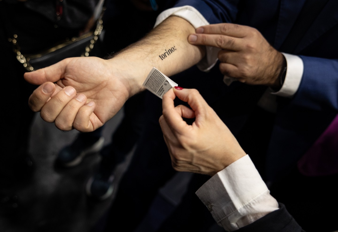
By adding a colon to the city's name, the logotype becomes an invitation to continue the story. A minimal intervention transforms it into an open system, creating space for different perspectives, experiences and possibilities.
The payoff "Inizia la tua storia" reinforces this idea of openness: Turin is presented as a place that leaves space for people, ideas, and new beginnings. A city where everyone can contribute to the open narrative introduced by the colon.
Rather than defining the city through a single image, the City Brand provides an open and flexible identity system that can evolve together with the people who shape it.
The visual identity extends the concept, translating the idea of openness into a language that is coherent, distinctive, and flexible.
Every element, from typography to colour, contributes to an identity system that adapts to different contexts, audiences and applications while maintaining a strong and consistent presence.
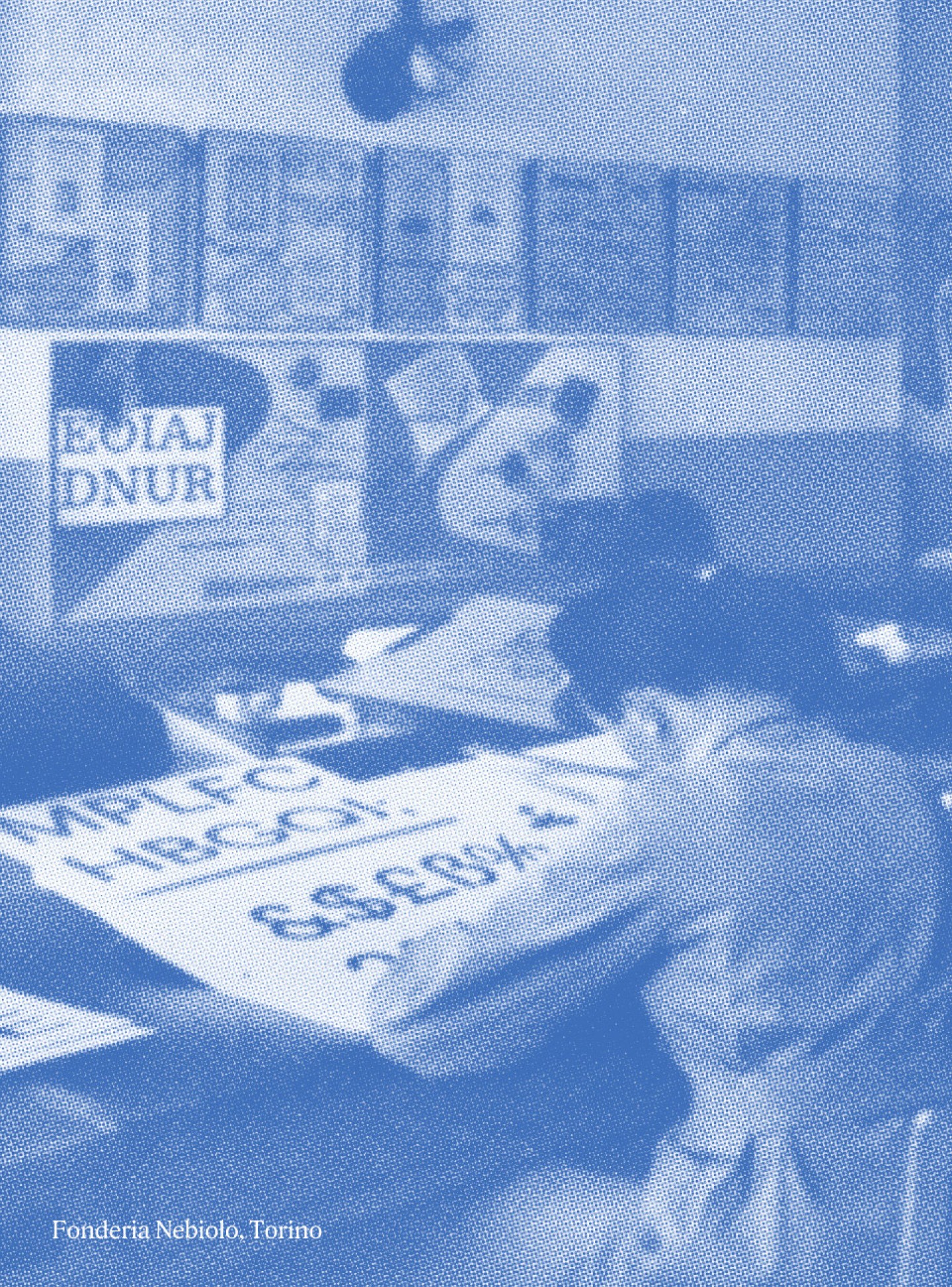
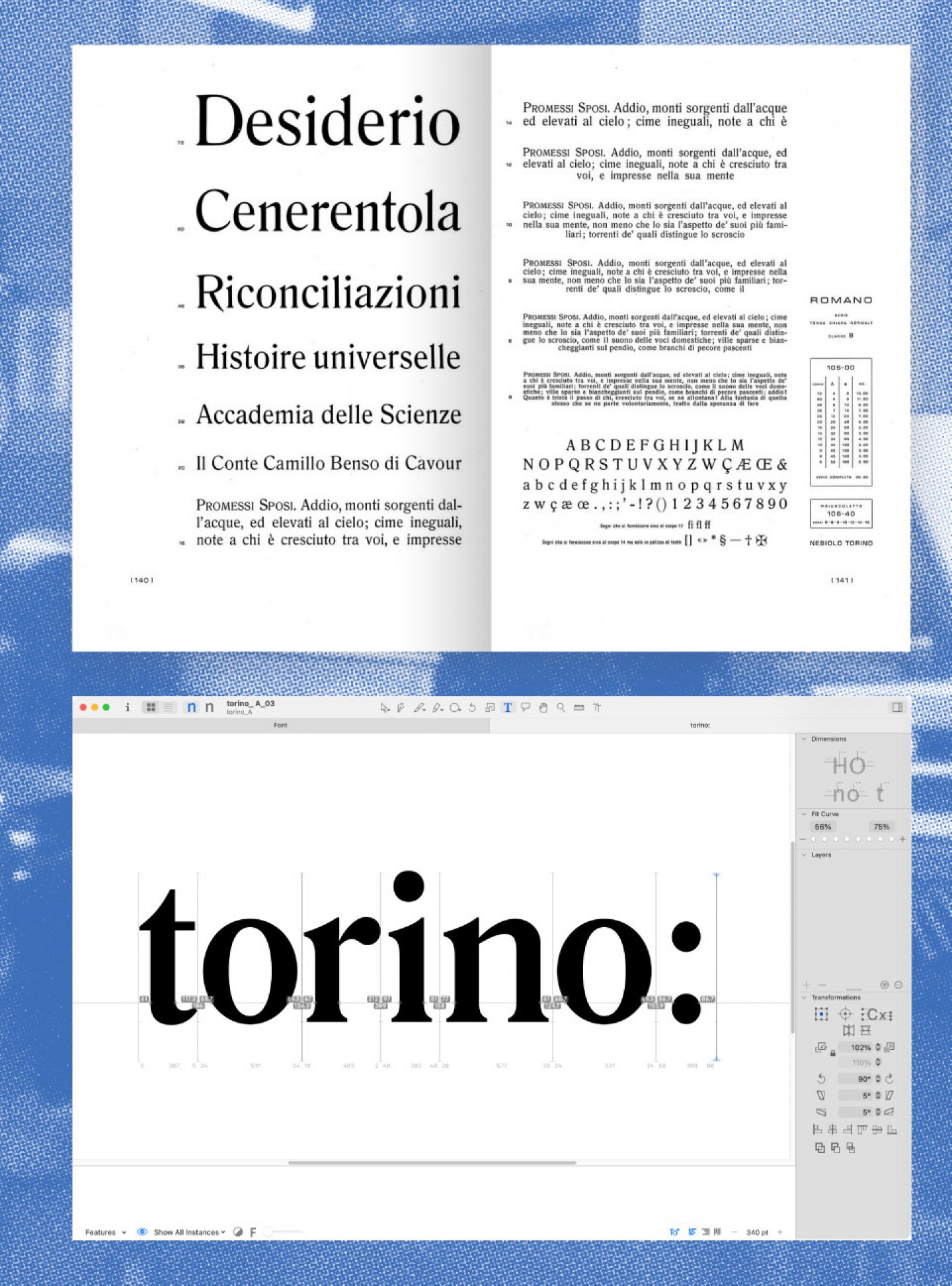
The logotype is custom-designed drawing inspiration from Romano, to pay tribute to Turin's typographic heritage and the legacy of the historic Nebiolo foundry. Its understated elegance reflects the city's cultural identity, while the use of lowercase introduces a more contemporary, accessible and inclusive tone. The lowercase initial transforms Turin from a proper name into an open narrative: not a fixed definition, but a story that can be continuously explored and expanded.
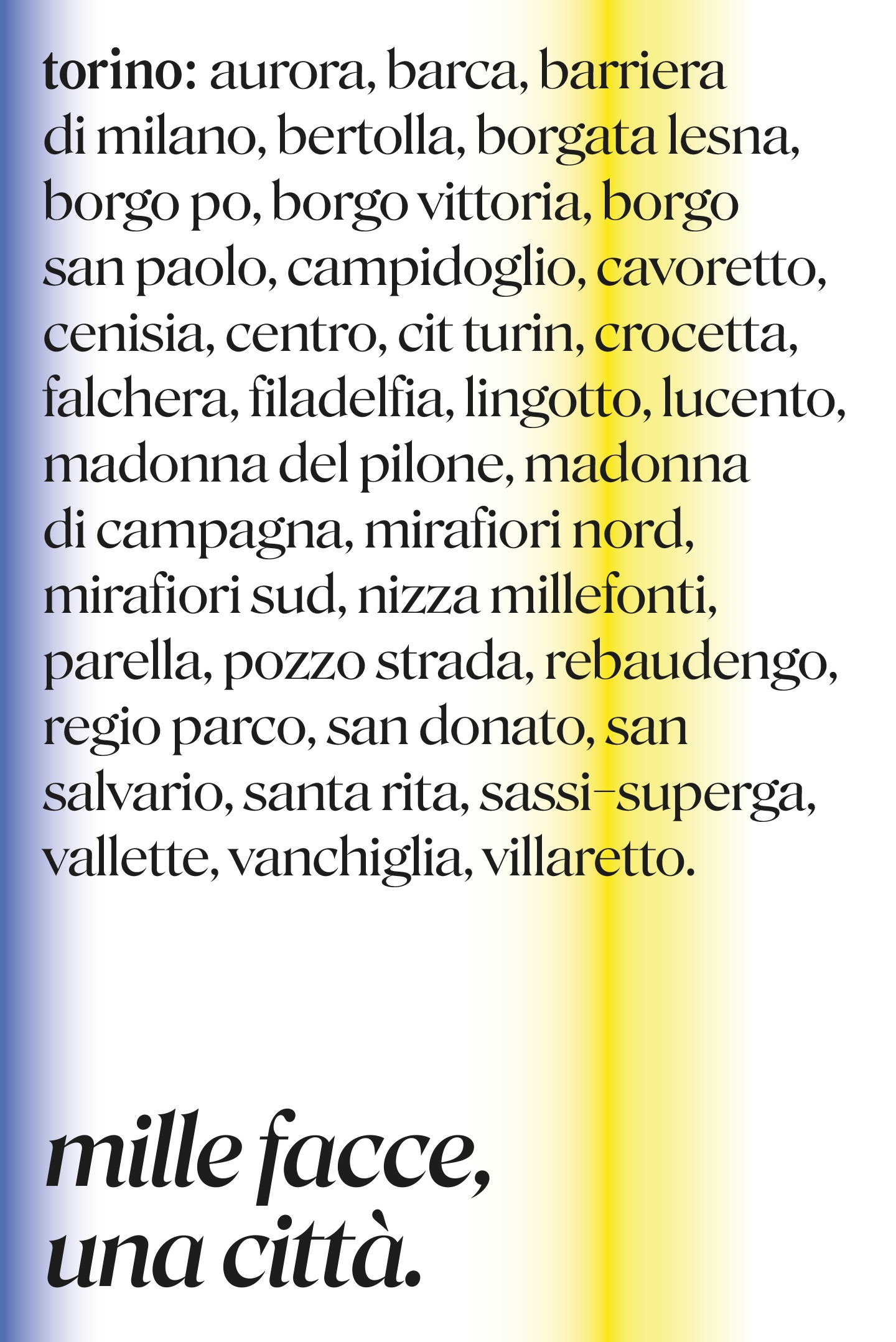
The colour system follows the same principle. A black-and-white foundation is complemented by gradients derived from Turin's institutional colours—yellow and blue—which expand into a broad and evolving chromatic palette.
Like the colon that defines "torino:", the visual identity is designed to remain open. Rather than a fixed identity, it provides a flexible framework that can evolve together with the city.
communication campaigns
The launch strategy translated the openness of the new City Brand into a series of campaigns designed to involve the city and the people who live it.
The activation strategy was guided by the principle "Torino first". Before speaking to visitors, investors, or external audiences, the new City Brand needed to resonate with the people who live in the city every day.
The community is not the audience of the brand — it is the brand itself. People do not simply represent Turin’s identity; they actively shape it.
The launch strategy translated this approach into a series of campaigns designed to express Turin’s identity through its places, communities and stories.
Quartieri - Neighbourhoods
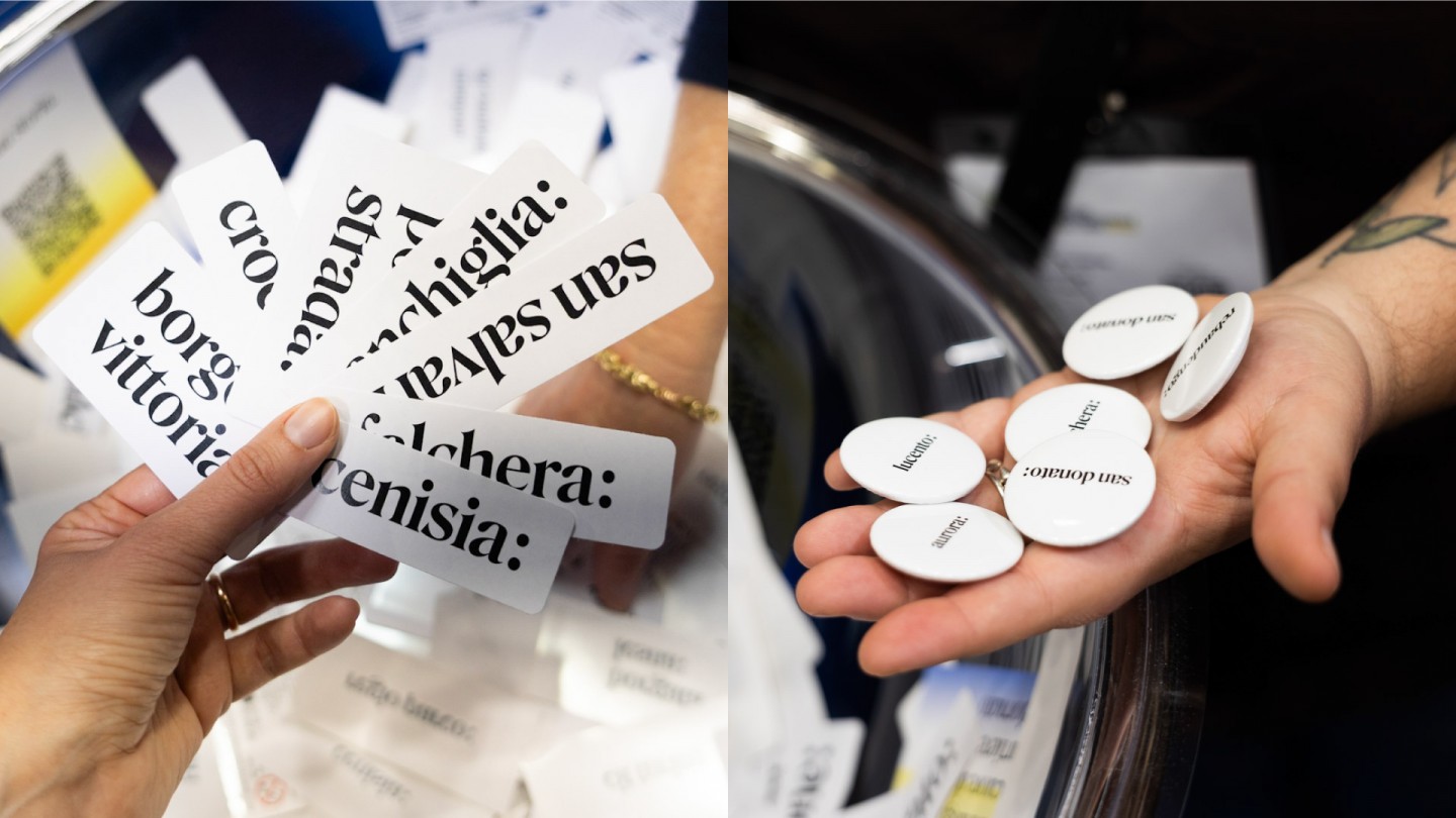
The first campaign starts from the places where belonging is strongest: the neighbourhoods people live in.
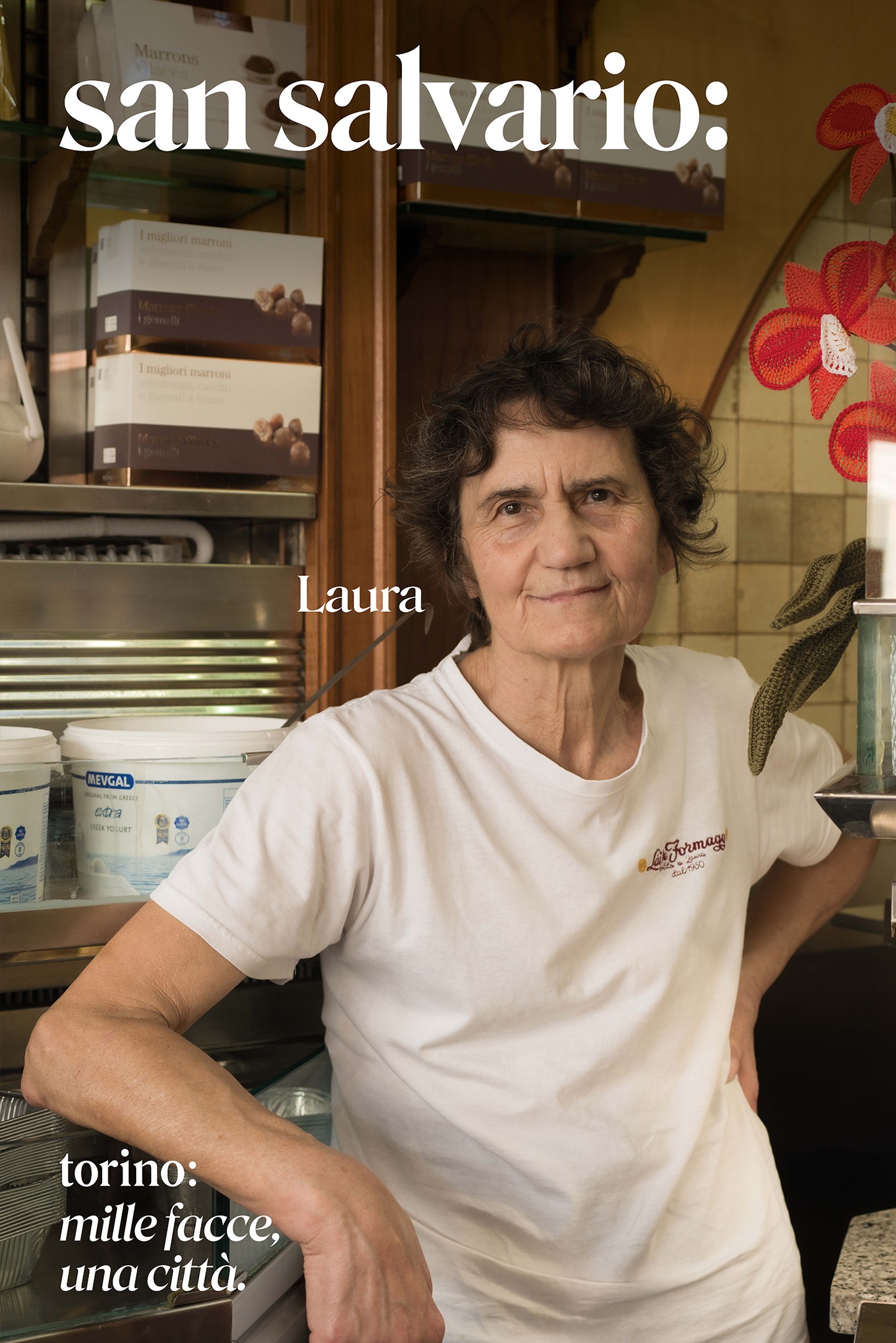
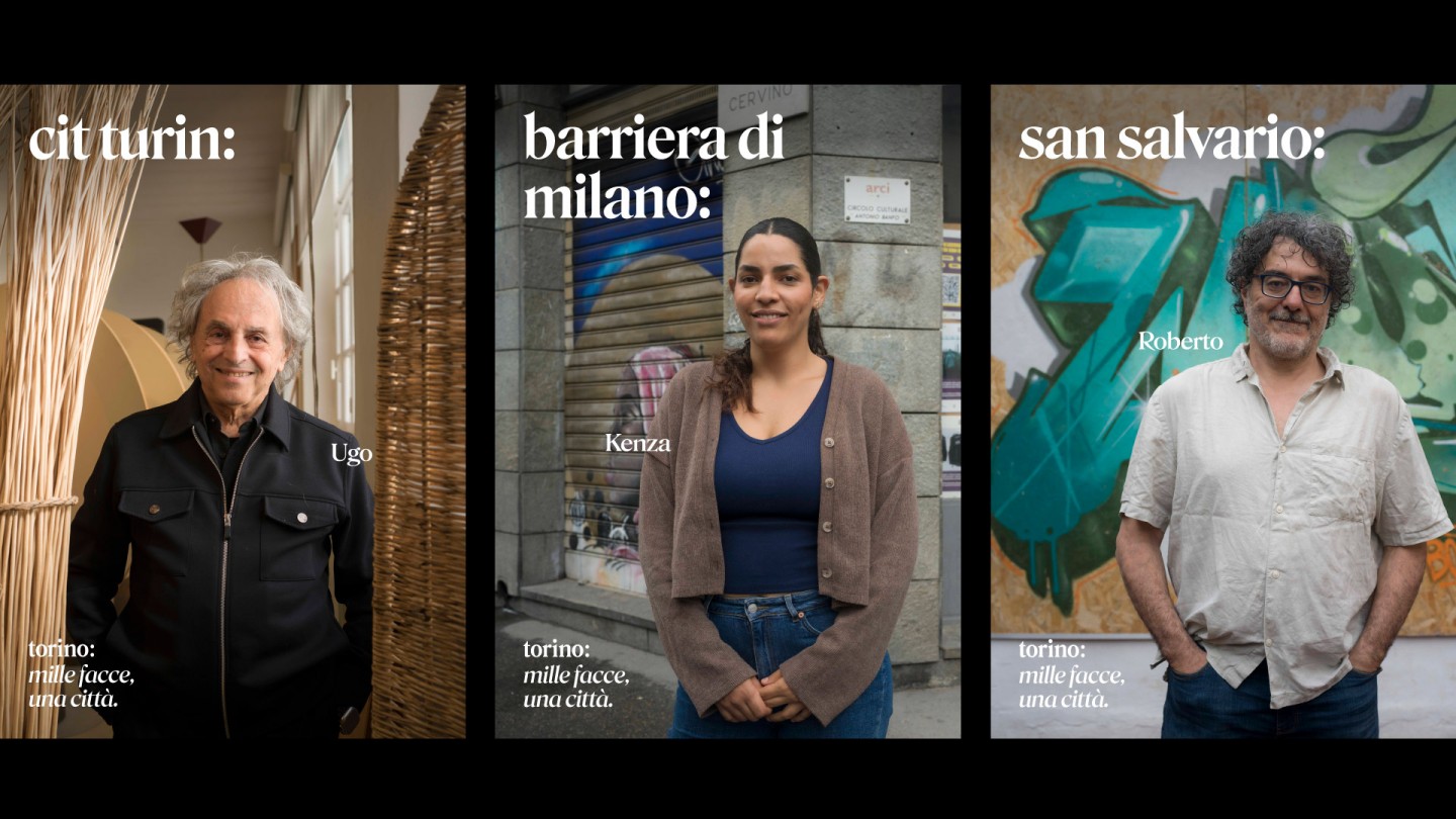
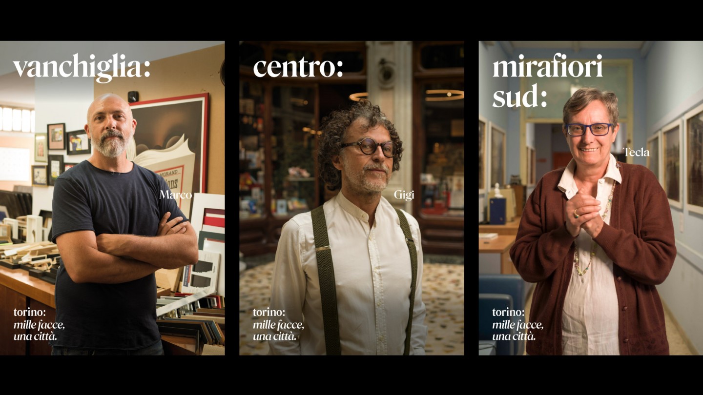
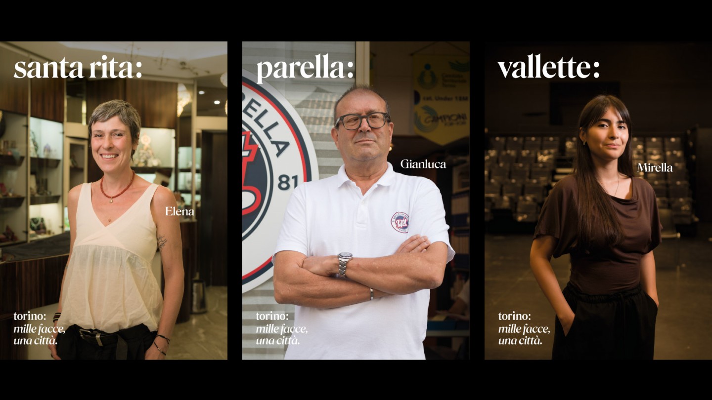
Through 300 photographic portraits distributed across Turin’s 34 neighbourhoods, the campaign brings visibility to local stories, people and everyday identities that together compose the city’s contemporary character.
The neighbourhoods become a way to discover Turin through the experiences of those who inhabit it. The flexibility of "torino:" also allows the creation of neighbourhood sub-brands, reinforcing the idea of a city that is both unique and made of many different identities.
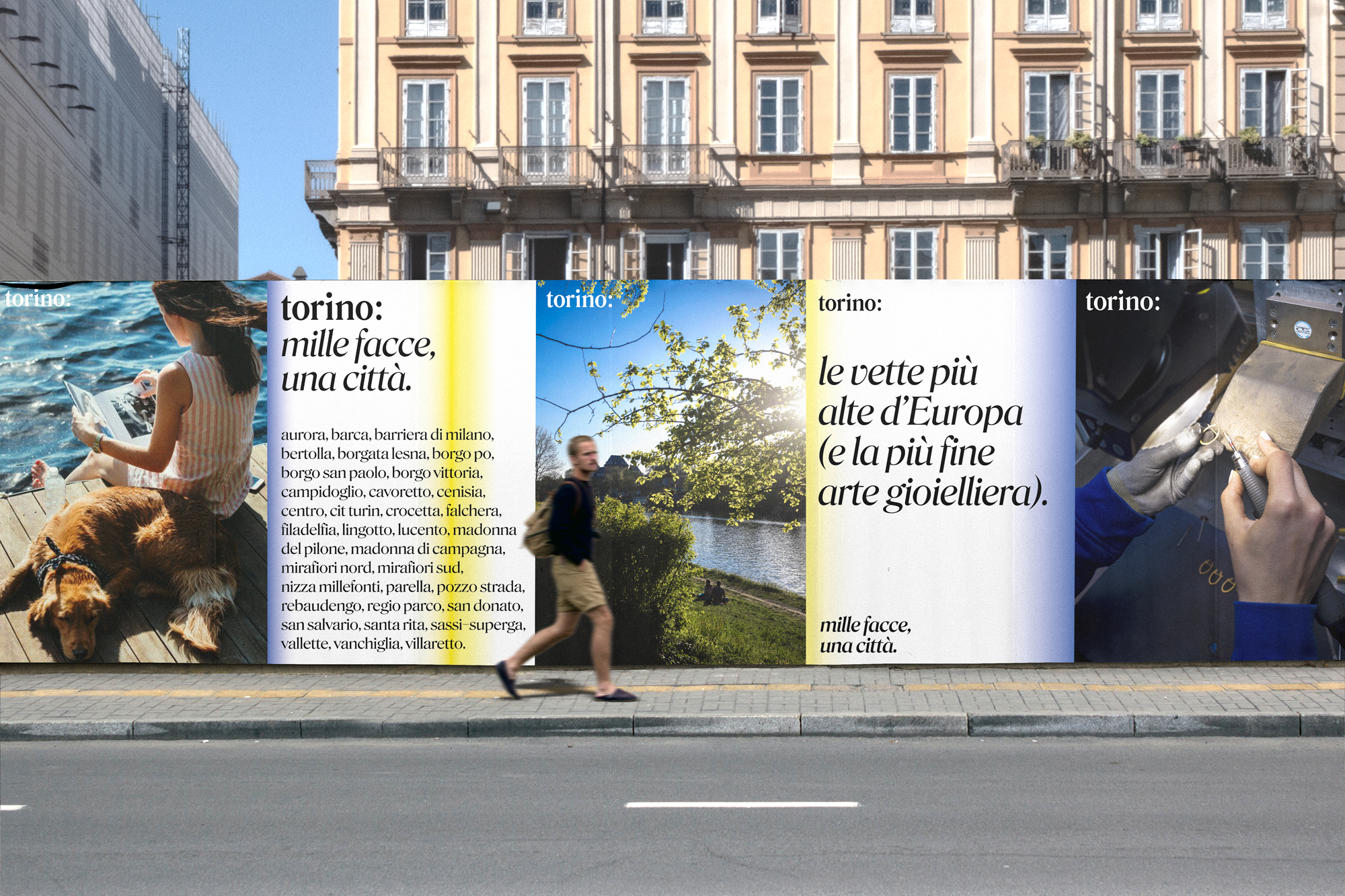
Mille facce, una città - A thousand faces, one city
If "Quartieri" tells the story of Turin’s places, "Mille facce, una città" tells the story of the people who make the city.
A series of photographic portraits gives visibility to the plurality that emerged throughout the research process. Here, the brand becomes a gesture of recognition: when "torino:" appears alongside a portrait, it no longer works as an institutional signature, but as a statement of belonging.
Every face becomes an expression of the city. Together, these portraits tell Turin’s story through the people who live it, shape it and contribute to its continuous evolution.
What we did
Strategic Research & Place Branding
Research process, scenario analysis, participatory design and stakeholder engagement to define Turin’s identity framework.
Brand Strategy & Identity System
Positioning, verbal identity, visual identity, brand architecture, typography and colour system.
Communication & Campaign Strategy
Launch strategy, campaign concepts, content systems and communication tools to activate the City Brand.
Art Direction & Brand Activation
Creative direction, photography framework and activation guidelines to support the brand’s evolution across different contexts.
in collaboration with
Data Analisys Stefano Micelli - Upskill
Participatory events Bam Strategie Culturali
Consultancy Anna Gilardi - Stilema
Copy Lucia Moschella
Photo Daniele Ratti, Mattia Muscatello, Marzia Allietta
Type in Use - custom type by Leftloft, and Rosindale by David Jonathan Ross, DJr
Collections
An overview of our wide fields of action
-
Logos & Trademarks
What makes a brand memorable and unique.
-
Environments & Exhibits
Designing for spaces: from signage to cultural display, from retail to events
-
Art & Culture
We had the chance to work for museums, institutions and organization in Italy and worldwide
-
Educational
Designing for school publishing
-
Type Design
We love typography, we design typefaces, from lettering to complete custom type families.
Case Studies
selected projects
-
Casaforte - The neverending storage
Rebranding and communication campaign
-
The City of Lights
Visual identity and exhibition graphics for the renewed Euroluce 2023
-
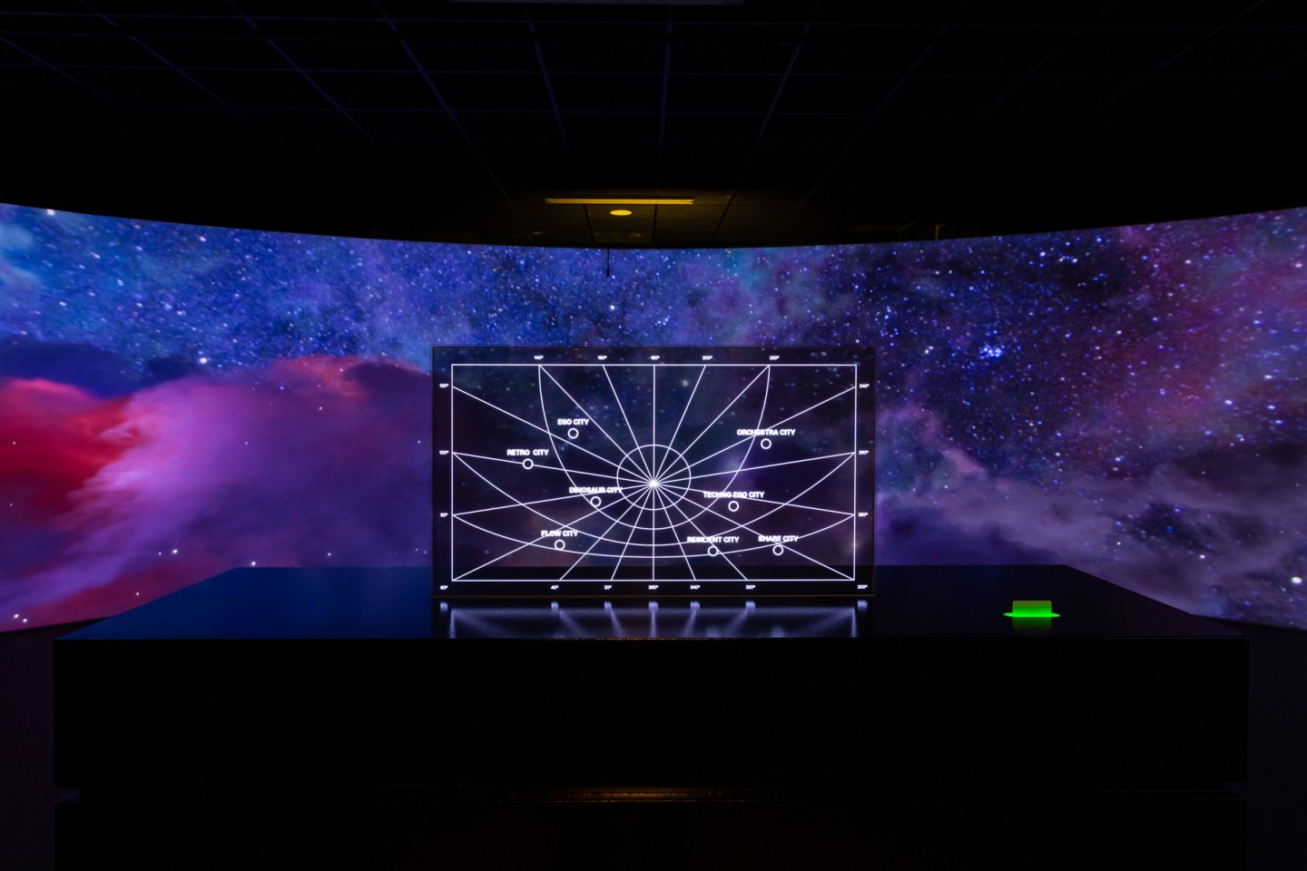
Layout, installations, and multimedia content
The Future Unfolds
An immersive and interactive journey to explore the future of mobility
-

visual identity
Artefiera Bologna 2025
A vibrant, pop-inspired restyling marks the 48th edition